Nature Photographers Network
This is the preserved archive of the original Nature Photographers Network. The community continues at naturephotographers.network.
Waimea Canyon & RP
‹ PreviousLandscape GalleryNext ›

Waimea Canyon & RP

by David Schoen

Gallery: LandscapePosted March 27, 20171,656 views12 comments
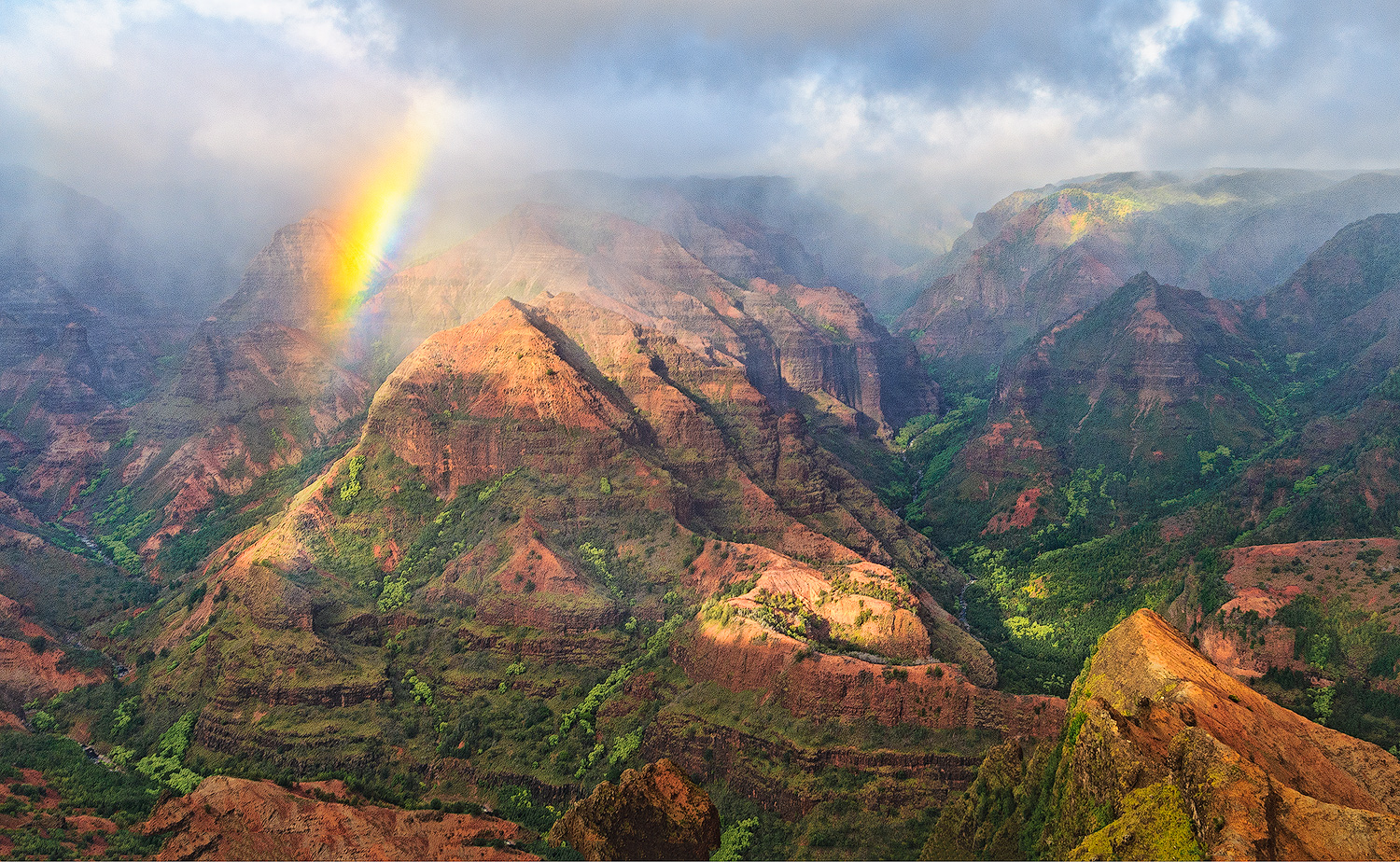
This is an image taken several years ago at Waimea Canyon on Kauai.  I've recently reworked it and am looking for some feedback to see if anyone else has any further suggestions for improvement.  I haven't been posting in this gallery very often primarily because the Pacific Northwest weather has not been conducive for landscape photography unless one is a harbor seal.  Thanks for constructive criticism.   I've just started experimenting with the new Tony Kuyper V5 panel on this image.

iso 100, 12-24 mm at 24 mm, f8, 30th, D300, full frame, Topaz & TK V5

Comments

12 comments
Comment posted by Lon Overacker on March 27, 2017 at 11:56 PM
David,

One of the grandest views around (have not seen personally.)  I really like the mix of grees with the warmer earth tones and the dappled light helps make this engaging.

I wasn't there, so hard for me to judge, but going on all I can see here, I think the yellow/orange is too much.  Can you blame that on the new V5 panel?  enlightened blush

I don't know if my eyes are fooling me, but here appear to be diagonal rays of light as well.  Way cool image, just unsure about the intensity of the meaty part of the bow. Again, I wasn't there...

Lon
Registered on November 24, 2006, 521 Posts, 19147 Comments
Comment posted by John Williams on March 28, 2017 at 1:31 AM
We have been a bit wet, haven't we blush

This is dripping richness in the larger view David. You caught some great conditions, I really like the splashing of light and the way the mist hangs on the distance. Nice to catch that rainbow too! Some of the misty areas look a little noisy, but that's a real reach for a nit on a wonderful image.
Registered on September 6, 2007, 221 Posts, 5985 Comments
Comment posted by Aaron Feinberg on March 28, 2017 at 5:41 AM
Looks like a great afternoon up there! :)
Registered on October 26, 2009, 399 Posts, 2789 Comments
Comment posted by scott lanz on March 28, 2017 at 9:07 AM
Spectacular image, David.  Talk about being in the right place at the right time. Wonderful atmosphere and light, and the rainbow makes this truly special. The larger view looks a bit grainy or blurry or something, but I can't tell the cause of that. I am assume some uploading issue. Like Lon, I noticed that the orange/yellow colors dominate the rainbow, but I think most people would think nothing of it.  
Registered on November 14, 2003, 840 Posts, 12902 Comments
Comment posted by David Schoen on March 28, 2017 at 10:22 AM
I can answer a few questions about the graininess or noise and the saturation of the rainbow.  This was set up as a print and the sharpening was done for inkjet using Nik sharpening.  I did use the new TK V5 action set at 25% to resize for the web.  I used the TK V5 luminosity masks to help separate the rays of light coming through the rainbow from the left corner which increased the yellow orange saturation.  It looks more natural on the print which is on heavy weight matte paper.
Registered on November 6, 2006, 1213 Posts, 4587 Comments
Comment posted by Igor Doncov on March 28, 2017 at 1:06 PM
This came out real well for you. Reminds me of the landscape paintings that came out during the romantic era in the early 19th century. As such I generally like the level of saturation except perhaps for the greens which in some spots seem over the edge. The red end of the rainbow seems a bit strong as well. Great job in seeing this and conveying a sense of the place. 
Registered on November 22, 2014, 189 Posts, 2733 Comments
Comment posted by Preston Birdwell on March 28, 2017 at 4:57 PM
I love the composition and the wonderful light. The saturation, for a Web image, is little heavy, especially greens and yellows.The tonal scale works, and the light is lively. Great view of the canyon, in great conditions, David.
--P
Registered on November 1, 2003, 471 Posts, 5188 Comments
Comment posted by Harry Lichtman on March 28, 2017 at 7:38 PM
Magnificent scene you captured here.  Wonderful comp and lighting.  My 1st impression is that it is overly bright, especially in the more shady areas.  Yellows in the rainbow appear a bit strong.  This image could be processed in several directions, so stick with what pleases you. High drama for sure.
Registered on September 17, 2010, 304 Posts, 3507 Comments
Comment posted by Dave Dillemuth on March 29, 2017 at 11:54 AM
This is stunning, David! Great job catching this passing moment. Processing looks good but I could see backing the vibrance down a touch in the orange/reds.
Registered on December 10, 2015, 104 Posts, 1112 Comments
Comment posted by David Schoen on March 29, 2017 at 1:06 PM
Thanks to everyone for looking at this and providing feedback.  Here is a repost done with a slightly sharper raw file taken a few seconds later. 
Registered on November 6, 2006, 1213 Posts, 4587 Comments
Comment posted by Igor Doncov on March 29, 2017 at 4:59 PM
Aside the sharpness, the absence of that black frame helps the repost.
Registered on November 22, 2014, 189 Posts, 2733 Comments
Comment posted by David Schoen on March 29, 2017 at 5:41 PM
Igor and anyone in the know:  how did the black frame get there?  Unless I inadvertently hit something, I did not put it there.  I don't see it on my images in other galleries and I think I follow the same workflow when I post on this site.  The black frame is not present when I enlarge the smaller image and compare the first to the repost.
Registered on November 6, 2006, 1213 Posts, 4587 Comments