
Nature Photographers Network
This is the preserved archive of the original Nature Photographers Network. The community continues at naturephotographers.network.
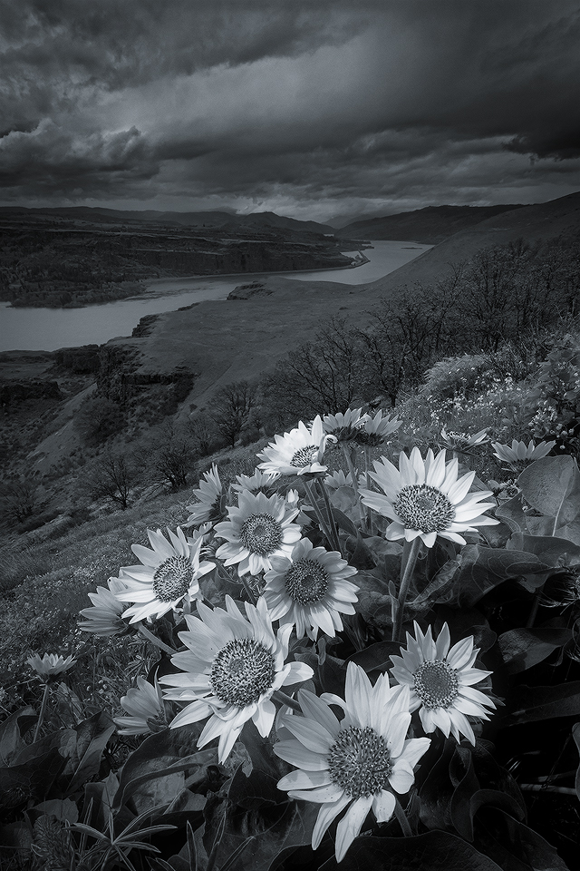
Stormy West [+alt]
‹ PreviousLandscape GalleryNext ›

Stormy West [+alt]

by John Williams

Gallery: LandscapePosted June 21, 20172,704 views14 comments

This year was the first time I’ve done this hike in the Columbia River Gorge. I hiked it in the middle of the day as a scouting venture, then went back the following weekend to try and catch good light. Despite an optimistic forecast, the light didn't happen. I enjoyed the hike (it’s a beauty), but left without getting out the camera.

I decided to go back to one of the images I had taken while scouting, and see if I could play with black and white. I find these flower images to be a little challenging, but here is an attempt; I’d love your thoughts on it.

Truth in processing:
-The Interstate is on the edge of the far bank of the Columbia, and I’ve cloned the semi-trailers out since they made odd white spots.
-The wind was whipping when I took the two frames used to blend this, and that center flower is duplicated between the two images; it’s the same flower as the one just behind and above it. (I could have used a single image, but the foreground would be slightly soft if printed large.)

Nikon D7100
Nikon 12.0-24.0 mm f/4.0 at 12 mm (18mm equiv.)
Blend of 1/180 and 1/500 at f/22 and ISO 400
Two images for DOF and DR

Comments

14 comments
Comment posted by John Williams on June 21, 2017 at 11:00 PM

This trail has the most Poison Oak I’ve ever seen in one place, and I really react to the stuff. I had Gryff, my dog, with me, and we spent several hours meticulously threading the needle of the trail to avoid the misery on each side. When I took the above shot, I locked Gryff’s retractable leash and clipped it to my belt since Poison Oak was about six feet away from where I was perched. I turned to pack up and this is was the scene behind me. Apparently I did not lock the leash, and Gryff had clambered right through the vile weed to gain a better view as he patiently waited. (That’s Poison Oak leafing out in front of Gryff.)

We hiked back down to the car no longer paying attention to the oak since it was game over. I drove the short distance to Lyle, where the tiny market fortunately had isopropyl alcohol. I purchased a couple bottles and rubbed Gryff and myself down well. Gryff was not impressed. We had a miserable 30 minutes while the smell cleared from the car, but fortunately I never developed a rash!

Registered on September 6, 2007, 221 Posts, 5985 Comments
Comment posted by gary phillips on June 22, 2017 at 12:18 AM
This is pretty cool, John.  I love this as a b/w.   Beautiful job with the blend and the sky is  wonderfully stormy.  There would be no way I could keep my dog out of the poison oak.  Something to keep in mind, as we are taking a trip to Oregon next month. I love the glow of the flowers and I might selectively dodge some other areas of the image so that the light doesn't look isolated to just the flowers.  I don't know if that makes sense, because it would be a very minor adjustment. Beautiful work as always.
Registered on October 24, 2013, 185 Posts, 4136 Comments
Comment posted by John Williams on June 22, 2017 at 10:18 AM
(I prefer to process with a darker background. This will look too dark on NPN's default white; I recommend clicking on it to view it on the darker background.)

Thanks for the feedback Gary! I was trying to focus the attention on the flowers and purposely toned down the contrast in the background. But your point is well taken, and looking at this with new eyes today I may have taken that theme a bit too far. Here's an alternate to compare. Here's an alternate to compare.

Where will you be in Oregon?
Registered on September 6, 2007, 221 Posts, 5985 Comments
Comment posted by Mark Seaver on June 22, 2017 at 10:35 AM
John, I like the view with it's emphasis on the flowers even as it shows a very invinting setting.  I was going to comment about there being too much focus on the flowers, but the repost takes care of that, with a better balance between the flowers and the surroundings.  The repost also has considerably more pop with the extra contrast.
Registered on January 23, 2011, 1103 Posts, 17270 Comments
Comment posted by gary phillips on June 22, 2017 at 12:23 PM
The repost looks spot on, especially when viewed on the dark background.  We are going to a wedding in Portland and the quilt show in Sisters.  My wife is an avid quilter.  Then we are off to Crater Lake, then over to the coast for a week.  Can't wait for the cooler temps, it's more than oppressive here.  
Registered on October 24, 2013, 185 Posts, 4136 Comments
Comment posted by Daniel Rappaport on June 22, 2017 at 12:49 PM
Have thought of trying a monochrome of Gorge balsamroot, but haven't had the gumption to do it. This works really well with that angry sky.  The brightened repost is even better. 
Registered on September 9, 2009, 294 Posts, 2006 Comments
Comment posted by Jim Hansen on June 22, 2017 at 6:46 PM
I really love this John.  Makes me want to get up there with a camera!  The flowers really stand out against that canyon, river, and angry sky.  Prefer the repost for reasons mentioned by others.  B&W works well here.
Registered on May 5, 2011, 161 Posts, 908 Comments
Comment posted by scott lanz on June 23, 2017 at 7:22 AM
Really good, John. Excellent comp and conversion. I like the bit of light and contrast in the sky you brought out in the repost, but I like the original sky equally.
Registered on November 14, 2003, 840 Posts, 12902 Comments
Comment posted by Harley Goldman on June 23, 2017 at 11:24 AM
Excellent! The repost nails it for me.  I can relate to the poison oak thing. I get it very easily. Glad to hear you did not get the vile stuff. 
Registered on November 19, 2003, 586 Posts, 11271 Comments
Comment posted by Harry Lichtman on June 24, 2017 at 7:53 PM
The re-post is much more to my liking.  Lots of drama in the clouds that gets a little lost for me in the original.  Everything looks too grey. The lighting looks pretty flat, which can make BW conversion difficult.  The flowers pop, grand view.
Registered on September 17, 2010, 304 Posts, 3507 Comments
Comment posted by Doug Koepsel on June 25, 2017 at 11:42 AM
I think the revision with the greater contrast is a big improvement.  The whiter flowers still contrast and stand out very well in the scene.
Registered on April 1, 2010, 196 Posts, 1592 Comments
Comment posted by Eva McDermott on June 26, 2017 at 1:03 PM
I definitely like the repost better John.  The B&W adds a lot to the dramatic view.
Registered on January 4, 2009, 1015 Posts, 13229 Comments
Comment posted by Tony Kuyper on July 1, 2017 at 11:53 AM
I like the original just fine.  It's a great palette of grays that just shimmers like a monochrome image should.  Very nicely composed and developed.
Registered on November 1, 2003, 364 Posts, 22328 Comments
Comment posted by Igor Doncov on July 3, 2017 at 4:52 PM
Both versions are fine. The first one is a bit moodier while the 2nd is more in line with 'how it should be'. I think the first one tells a better story. Yes, the original is a more profound image IMO.
Registered on November 22, 2014, 189 Posts, 2733 Comments