Nature Photographers Network
This is the preserved archive of the original Nature Photographers Network. The community continues at naturephotographers.network.
Refreshing Waters 2.0 (+ 2.1)
‹ PreviousLandscape GalleryNext ›

Refreshing Waters 2.0 (+ 2.1)

by Brian Schrayer

Gallery: LandscapePosted July 22, 20173,082 views8 comments
Edit:  Please see repost below.

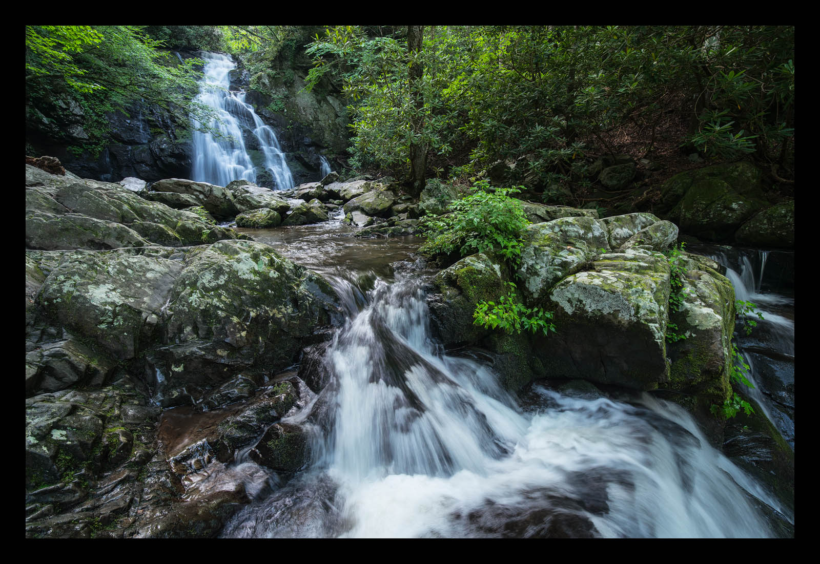
Here is an alternate comp from this location.  I have been working to refine a horizontal comp from this location for the last two years, but my previous attempts always fell short of what I was aiming for. 

As with the vertical comp this is a blend of two exposures to capture the texture in the water with a faster shutter speed.  I captured the horizontal comp before the vertical comp.  In the vertical comp, the sun had begun to filter through a bit more which created more of a warm glow.  I processed the horizontal comp to taste for the white balance so as not to introduce too warm of a color cast in the water, but I probably have some room to warm it up.  I brightened the shadows in the area in the upper right hand corner, but I intentionally left it somewhat dark as there is just a lot of clutter up there from the rhododendron, and I wanted to direct the viewer's eye to the water fall so I felt like having that area darker helped in that regard as well.

As always all comments and critiques are welcome!  I'm particularly interested to know if you prefer the vertical or horizontal comp. 

For quick reference here is the vertical comp.

Capture Info:
15 mm
Base Exposure:  f/16 @ ISO 400, 1/5 sec.
Water Exposure:  f/16 @ ISO 1600 1/20 sec.

Processing Info:
Manual blending of the two exposures to bring in the water detail from the faster shutter speed.
Minor cloning of distracting elements
Luminosity masks for targeted tonal adjustments
TK's vibrance mask
Vignette

Comments

8 comments
Comment posted by scott lanz on July 23, 2017 at 7:13 AM
Both images are excellent, Bryan. Interesting to compare them side by side. This image does have more of a cyan or bluish tone, and I think I would reduce that a bit more. As for the comps, I like being able to see where the waterfalls cascade off to the right in the horizontal. Having this makes the horizontal comp work well. In fact, I wish you had more room on the far right versus the far left, but there may have been a good reason not to have included more on the right. I think I prefer this comp overall. I like the closer view of the water at the bottom. But I prefer the light in the vertical.
Registered on November 14, 2003, 840 Posts, 12902 Comments
Comment posted by Brian Schrayer on July 23, 2017 at 9:07 AM
Scott, I agree about the cyan / bluish tone after looking at this again.  Here's a repost with a color balance adjustment to warm it up a bit.  I also brightened the mid-tones a bit as well. 

I also see your point about having more room on the right hand side.  My thought process when composing this was that I wanted to include as much of the bright green trees in the upper left hand corner as I could and on the lower right hand corner I wanted to show as much outflow as I could.  I didn't have much room to step backward as I was on a small rock ledge in front of the foreground cascade.  Also, I don't find the rhododendron on the right hand side of the frame to be that interesting.  I don't find the rhododendron that grow in the lower elevations of the park to be as attractive as the catawba rhododendron that grow in the higher elevations.  The catawba rhododendron put on purple blooms in June and have bright vivid green leaves.  In contrast, the leaves on these rhododendron are more of a pale army green color and these did not have any blooms.

I appreciate your insightful comments.  As I mentioned in the vertical post the comments here on NPN have been extremely valuable in helping me improve my photography. 
Registered on May 28, 2004, 114 Posts, 2890 Comments
Comment posted by Igor Doncov on July 23, 2017 at 4:48 PM
I think this horizontal version is superior to the vertical one overall. The composition is stronger and I actually like that it is cooler. It's not in the sun so it should be cooler. The issue I see is that it's not consistently cool throughout. The upper cascade is bluish and the lower is yellowish. The vegetation higher up is also cooler but that's not as noticeable. The other small issue is the blown out white in bottom center which may not be recoverable.
Registered on November 22, 2014, 189 Posts, 2733 Comments
Comment posted by Mark Seaver on July 23, 2017 at 5:32 PM
The larger versions of both posts in this thread show much better than the small version.  The reduced blue/cyan is a fine improvement, Brian.  This does look like a challenging comp. especially if you want to include that little step falls along the left edge.  I went back and looked at the vertical comp. and must say that I like it a bit better.  I find that my eyes move more smoothly along the falling water in the vertical.  Plus I like how it emphasizes the fanned out step near the bottom.
Registered on January 23, 2011, 1103 Posts, 17270 Comments
Comment posted by gary phillips on July 23, 2017 at 11:48 PM
I gonna vote for the vertical, Brian.  I love the light in that image and it does away with the darker right side.  I agree with Igor that the upper falls is definitely more on the blue side than the lower in this image.
Registered on October 24, 2013, 185 Posts, 4136 Comments
Comment posted by Ed Lowe on July 24, 2017 at 4:13 PM
Hard to choose between the horizontal and vertical versions, but I think I would give a slight edge to the horizontal one, Brian. For whatever reason I seem to see a lot of my own images horizontally whereas a while back I preferred vertical. Just comes and goes I guess. I think the repost is real close as my only suggestion would to try and remove a little cyan from the upper falls. Your blend works beautifully as does your chosen SS.

Ed
Registered on February 7, 2004, 414 Posts, 7115 Comments
Comment posted by Anil Rao on July 25, 2017 at 3:10 AM
Brian, this has turned out really well. My preference is for the horizontal format, although the vertical one is quite lovely too. I feel like I have been transported right inside the scene, something that very few photographs manage to do.
Registered on November 15, 2003, 234 Posts, 4923 Comments
Comment posted by John Williams on August 4, 2017 at 12:14 AM
Both comps work well for me here Brian, but since horizontal waterfall shots are typically much harder to find I prefer it!
Registered on September 6, 2007, 221 Posts, 5985 Comments