Gallery: LandscapePosted August 8, 20179,805 views14 comments
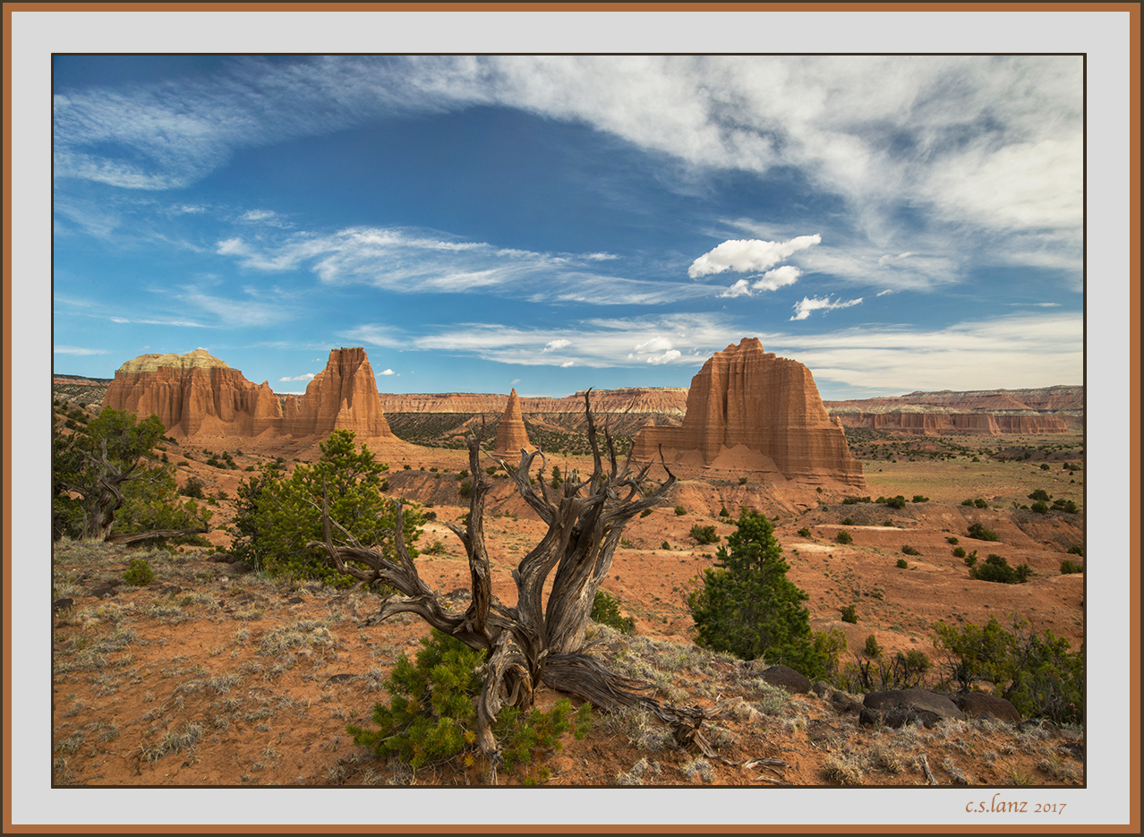
Another image from my trip to Cathedral Valley in May. D600, 18-35 @18, f18, 1/15, iso 200, cpl+ hh gnd. Thank you for looking. Suggestions, questions and other comments welcome.
Comments
14 comments
Comment posted by scott lanz on August 8, 2017 at 7:06 AM
Here is the same image but with a crop of the right side. I go back and forth on the crop. I like the background on the right, but cropping the right balances the image. Thoughts?
Registered on November 14, 2003, 840 Posts, 12902 Comments
Comment posted by Igor Doncov on August 8, 2017 at 8:43 AM
What an interesting, and common, problem. Great foreground. Great background. How to combine the two for a strong composition? You've done a good job with this yet it looks postcardsy. Good separation between bg and fg. The repost is slightly better IMO.
Registered on November 22, 2014, 189 Posts, 2733 Comments
Comment posted by Jake Alletson on August 8, 2017 at 8:47 AM
I like the cropped version as it balances better. You have great front to back sharpness. What aperture did you use?
Registered on May 3, 2016, 12 Posts, 163 Comments
Comment posted by scott lanz on August 8, 2017 at 9:36 AM
Igor and Jake, thank you for your comments. Jake, shot at f18. Thank you for asking as I overlooked it when I gave the techs when posted.
Registered on November 14, 2003, 840 Posts, 12902 Comments
Comment posted by Mark Seaver on August 8, 2017 at 11:03 AM
A terrific "red rocks" view, Scott. You've pulled the long vista, the scattered formations (and the foreground snag), and a lovely sky together very well here. I like the original because the extra space on the right adds well to the sense of distance/space that for me is such an important aspect of this part of the country.
Registered on January 23, 2011, 1103 Posts, 17270 Comments
Comment posted by Nick Bristol on August 8, 2017 at 2:36 PM
Scott, This is a beautiful image and what a wonderful view. Great colors overall and I really like the sky in this. I'm going back and forth on the crop and for the same reasons as you. I like the extra distant background in the first but the crop is a more balanced comp I guess. Think I lean towards the first one. Beautiful capture!
Nick Bristol
Lone Rock, WI.
Registered on February 1, 2004, 752 Posts, 14140 Comments
Comment posted by Igor Hoveijn on August 8, 2017 at 4:04 PM
The longer I look at it, the more I prefer the first version. In both the tree trunk is roughly at centre. But the centre of gravity of the 'rockscape' is slightly eccentric to the right whereas the centre of gravity of the 'cloudscape' is slightly eccentric to the right. Therefore, imho, the non-cropped version is more balanced than the cropped one. I especially like the big rock with the small clouds hovering above and I prefer its position relative to the frame of the first version. Just my thoughts. Well composed anyway.
Registered on November 2, 2015, 18 Posts, 192 Comments
Comment posted by Brian Schrayer on August 8, 2017 at 11:20 PM
I will say to begin with that I like this a lot. This image shows that we don't always have to put away our camera after the magic hour.
Here are a couple of my thoughts:
1. The original uncropped version emphasizes more of the expansiveness of the landscape while the cropped version seems to emphasize more of the vertical nature of the Cathedral formations.
2. The centered horizontal and vertical axes in the composition become much more obvious in the cropped version to me. The horizontal axis is obvious as it is the horizon line. The vertical axis is less obvious, but it starts with the Juniper and continues up to the pointy rock formation and continues all the way up to the apex of the arch in the clouds. In the original version, the vertical axis is just a bit off centered. I'm not necessarily a stickler to the compositional "rules", but I think that I like the off-centered vertical axis a little better.
3. I really like the arch in the clouds. I think that adds a lot of interest in the sky.
In the end my vote is for the original comp. I think the original aspect ratio seems to suit the landscape overall and it helps to off-center the vertical axis.
Registered on May 28, 2004, 114 Posts, 2890 Comments
Comment posted by Rick Turner on August 9, 2017 at 9:26 AM
Something to consider in future is to not center anchor tree and keep its branches from entering the formation in bg.
Registered on February 18, 2012, 534 Posts, 2755 Comments
Comment posted by scott lanz on August 9, 2017 at 10:00 AM
Rick, thank you for your suggestions. However, I composed this image very carefully taking into consideration the four formations, the dead juniper, the arching clouds, and the background. I, in fact, composed this to so the dead juniper would not obstruct any of the formations. Believe me when I say this was the best compromise, and I was not about to break branches off the juniper for the sake of my shot. A bit higher shooting viewpoint might have helped but was not possible because I don't carry a ladder while hiking. Not centering the juniper was not really an option given the elements I wanted to include in the image and the fact that I did not want the juniper to obstruct the formations, and the centered juniper does not bother me (or, evidently, anyone else who has commented so far), but I will be interested to see if it bothers anyone else.
Registered on November 14, 2003, 840 Posts, 12902 Comments
Comment posted by Jim Zablotny on August 10, 2017 at 8:52 PM
Hi Scott,
This shot is very nice. I like the expansiveness of the original crop over your second version. This one is super awesome. Well done...............................Jim
Registered on January 17, 2004, 705 Posts, 3594 Comments
Comment posted by gary phillips on August 12, 2017 at 4:05 PM
I'm gonna vote for the cropped version, Scott. To me it loses nothing and is more balanced. Sorry about the late response, had to go out of town for a few busy days. Lovely image.
Registered on October 24, 2013, 185 Posts, 4136 Comments
Comment posted by Paul Breitkreuz on August 13, 2017 at 12:27 PM
Scott, we never center things in our scenes, unless of course it is this one.......
For me the cropped version is an easy choice. I never crop or suggest that lightly. However, if it makes an impact for a cleaner view then I say go for it.
I've been to CRNP many times over the years, sadly, I've never made it out to this area.
On the bucket list now for sure.......very nice image overall......
Registered on February 25, 2006, 525 Posts, 8448 Comments
Comment posted by Jeffrey Sipress on August 22, 2017 at 4:56 PM
Beautiful imaging of Cathedral again, Scott. You got me to go to this place and I did a couple of weeks ago. Thanks!
Registered on February 17, 2004, 236 Posts, 1197 Comments

Comments
14 commentsNick Bristol
Lone Rock, WI.
Here are a couple of my thoughts:
1. The original uncropped version emphasizes more of the expansiveness of the landscape while the cropped version seems to emphasize more of the vertical nature of the Cathedral formations.
2. The centered horizontal and vertical axes in the composition become much more obvious in the cropped version to me. The horizontal axis is obvious as it is the horizon line. The vertical axis is less obvious, but it starts with the Juniper and continues up to the pointy rock formation and continues all the way up to the apex of the arch in the clouds. In the original version, the vertical axis is just a bit off centered. I'm not necessarily a stickler to the compositional "rules", but I think that I like the off-centered vertical axis a little better.
3. I really like the arch in the clouds. I think that adds a lot of interest in the sky.
In the end my vote is for the original comp. I think the original aspect ratio seems to suit the landscape overall and it helps to off-center the vertical axis.
This shot is very nice. I like the expansiveness of the original crop over your second version. This one is super awesome
For me the cropped version is an easy choice. I never crop or suggest that lightly. However, if it makes an impact for a cleaner view then I say go for it.
I've been to CRNP many times over the years, sadly, I've never made it out to this area.
On the bucket list now for sure.......very nice image overall......