Nature Photographers Network
This is the preserved archive of the original Nature Photographers Network. The community continues at naturephotographers.network.
layers
‹ PreviousLandscape GalleryNext ›

layers

by Ana

Gallery: LandscapePosted August 18, 2017133 views9 comments
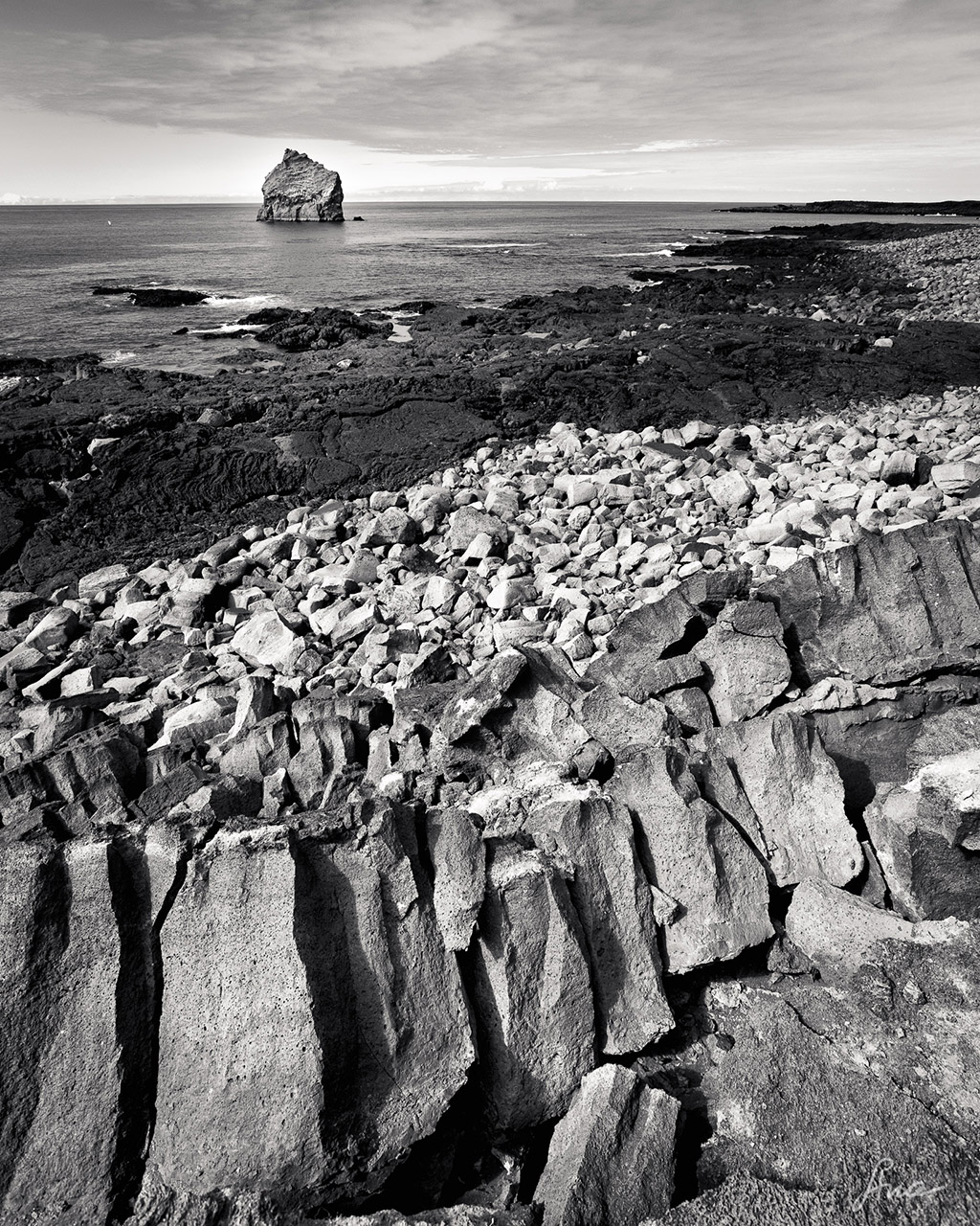
Hoping for some suggestions.  This was a tough day -- bright, blue sky and harsh.  But I liked the contrast between all the different kinds of rock.  I took this image on a trip a couple of weeks ago, so not a location I'll be back to anytime soon.  But it is the "kind" of image that I find myself taking a lot, so I'd appreciate hearing first impressions and any suggestions of how to approach this next time I find myself with a similar subject.

Comments

9 comments
Comment posted by Ana on August 18, 2017 at 7:29 AM
Color version for reference:
Registered on February 10, 2004, 191 Posts, 1446 Comments
Comment posted by Ryan Kimball on August 18, 2017 at 11:53 AM
Hi Ana. An interesting composition here. I like the fractal patterns of the shoreline rocks leading away to the horizon with the natural diagonals and the lone rock in the water balances out well with that and gives the eye a place to go once the horizon is reached. Also very well exposed given the harsh lighting conditions . I also think there is a good tonality from top to bottom. Directly below the lone rock in the water is a batch of smoother water that creates a nice set of diagonals leading back down to the shoreline, a light bit of dodging here might help accentuate that and add another subtle interesting element to the frame. I also think the bottom left corner is a bit empty. That area has the same tonal value as the rest of the jagged rocks in the bottom half but is plain in comparison. Perhaps burning it down just a bit or pulling a gradient to darken some would help balance out this section of the frame. Thanks as well for providing the color sample. 
Registered on August 14, 2017, 11 Posts, 34 Comments
Comment posted by Igor Doncov on August 18, 2017 at 5:44 PM
What an unusual and thought provoking image. I can't decide which version I like more but it might be the b&w. I might make the ocean blue just a tad less intense.
Registered on November 22, 2014, 189 Posts, 2733 Comments
Comment posted by Preston Birdwell on August 18, 2017 at 6:22 PM
Interesting textures and layers of differing rock types. I like the B&W treatment. You might consider using a B&W adjustment layer in PS and darken the blues in the sky. If the adjustment affects other areas of the image, you can paint the layer mask with black in those areas.

I also like the color version, but the drama of the B&W works better for me. You did a good job handling the dynamic range in this scene.
--P
Registered on November 1, 2003, 471 Posts, 5188 Comments
Comment posted by Lon Overacker on August 19, 2017 at 12:13 PM
Ana,

Layers indeed!  I like both the subtle and the obvious layers bottom to top and I like the sea rock up top as a focal point and balancing out the diagonal of the rocky shoreline.  My only minor suggestion would be a slight burn down of the LRC; not because it's overly bright or anything, but just to help balance the light and keeping the eye in the frame.

Beautifully composed.

Lon

edit. I just saw the color version.  I might like that even better since the colors also help distinguish the layers. Both are excellent
Registered on November 24, 2006, 521 Posts, 19147 Comments
Comment posted by scott lanz on August 19, 2017 at 5:11 PM
I prefer the B&W version, Anna, which makes good use of the layers. I personally might try adding some selective contrast to the sky in the B&W to bring out the clouds, though it is quite nice as is. 
Registered on November 14, 2003, 840 Posts, 12902 Comments
Comment posted by Brian Schrayer on August 19, 2017 at 8:06 PM
I like the contrasting light and dark tones as well as the contrasting lines shapes and textures. 
Registered on May 28, 2004, 114 Posts, 2890 Comments
Comment posted by gary phillips on August 20, 2017 at 12:54 AM
The layers are very nice Ana.  I find the image pretty flat.  It lacks the emotion that makes an image really sing.  Everything is perfectly in place, it just lacks a story.  I'm not sure that makes sense, but that's what comes to mind, for me.  Keep them coming, I like what your seeing.
Registered on October 24, 2013, 185 Posts, 4136 Comments
Comment posted by Ana on August 20, 2017 at 10:06 AM
Thanks for the comments and suggestions everyone!  I do think of this as one of those images that mostly helps you make the next image, so we'll see how I do when the next "layer cake" image comes my way.
Registered on February 10, 2004, 191 Posts, 1446 Comments