Nature Photographers Network
This is the preserved archive of the original Nature Photographers Network. The community continues at naturephotographers.network.
Hamilton Branch & RP's
‹ PreviousLandscape GalleryNext ›

Hamilton Branch & RP's

by Jim Hansen

Gallery: LandscapePosted August 20, 20171,145 views16 comments
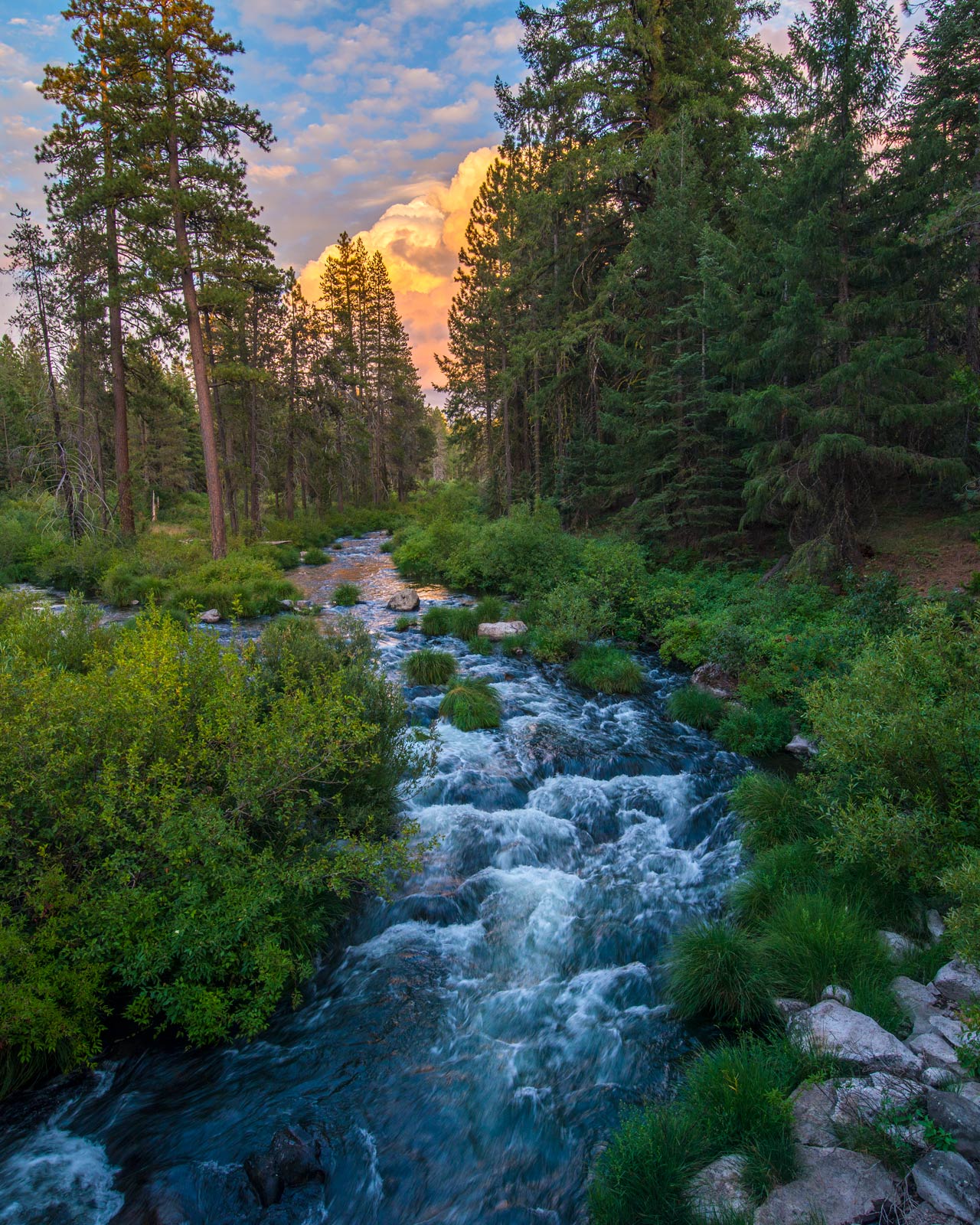
This was shot about a week ago in the Northern Sierra.  Taken from a bridge, but really wanted to get down closer to the water, but circumstances and the slippery shale and dense willows prevented it.  In retrospect, if I had gone down I may not have been able to capture the building t-storm and it's reflection on the water.  I spent a lot of time with this one, thinking I would need to blend a couple of images due to the great differences in available light between the foreground and the sky.  Unfortunately, the best sky and foreground images didn't quite make the grade.  Especially the foreground, as wind was sometimes a problem in revealing movement in some of the willows.  In the end, this was done with a single shot.  I had wanted a slower shutter speed for the water, but it wasn't to be.  I agonized over the immediate foreground, particularly the potential distractions of the piles of rocks in the lower right and the bright water in the lower left.  In the end, I left it all in, so this is converted to a vertical from a full-frame horizontal shot.  D800e, Tokina 16-28 @ 16, 1/15, f11, ISO 64.  Would be very grateful for any C&C you might have on this one.  Thanks for looking.

Comments

16 comments
Comment posted by Ana on August 21, 2017 at 8:25 AM
This works really well for me.  The S curve leading up into the gap in the trees is very inviting (this is one of the most overall graceful photos I've seen recently) and all the elements balance out beautifully.  I don't have any complaints about the rocks in the lower right --they are balanced out well by the mass of greenery and the lighter tall trunks on the left.
And that is a great storm behind the trees.  The curious onlooker in me really wants to see what's there but in the context of this image it works that all we get in a glimpse; I think the reflection in the water is very important to creating this sense that although I can't see the weather through the trees, it's coming.
The only nit to my eye is the blue in the green mass on the left.  I don't know if there are actually two kinds of vegetation but because it's such a large element in the frame I notice the color transition more.  If you have some versions that are less blue in the lower half I'd be interested to see them.  I like the image very much as is, but I do wonder how it looks with the blues toned down a bit.
Registered on February 10, 2004, 191 Posts, 1446 Comments
Comment posted by Rick Turner on August 21, 2017 at 12:36 PM
Very nice image.  Good processing and leading lines.
Registered on February 18, 2012, 534 Posts, 2755 Comments
Comment posted by gary phillips on August 21, 2017 at 12:55 PM
Very nice, Jim.  I might tone down the blues a bit, but I like the comp and the impending storm really sets this off.
Registered on October 24, 2013, 185 Posts, 4136 Comments
Comment posted by Jim Hansen on August 21, 2017 at 1:49 PM
Thanks Ana for your very thoughtful and helpful comments. Yes, you mentioned the things I like about this image; the gentle s-curve of the water as it leads in to the building storm, and the reflection on the water.  I am glad to hear it looks well balanced to you, as I was concerned about this.  I do have some difficulty detecting blues in general, however, I have included a version with the blues desaturated somewhat on the lower half.  See what you think.  Thanks again!
Registered on May 5, 2011, 161 Posts, 908 Comments
Comment posted by Jim Hansen on August 21, 2017 at 2:01 PM
Looks like NPN adds blue to the water when I load it.  There was no blue in the water prior to posting, confirmed by my "blue-sensitive" wife.  Here is another crack at it.
Registered on May 5, 2011, 161 Posts, 908 Comments
Comment posted by Preston Birdwell on August 21, 2017 at 6:33 PM
Jim,

I love the composition, and was going to suggest knocking back the blue in lower half.

You might want to check the color profile you are using for your jpegs. It should be sRGB. Both re-posts do not look any different from the original to me. You did a nice job handling the dynamic range.
--P
Registered on November 1, 2003, 471 Posts, 5188 Comments
Comment posted by Jim Hansen on August 21, 2017 at 7:48 PM
Thanks Preston.  Also, thanks Rick and Gary for your comments.  The different versions don't look any different to me either.  However, there is very minimal blue in the PP version just prior to posting.  When I convert the images for web, they automatically revert to sRGB.  To be sure, I just checked, and that box is indeed checked.  I have been drastically reducing blue channel saturation both in PP and CameraRaw.  The sliders are all the way to the left.  I also moved the hue slider away from blue and into yellow range.  I also warmed up the foreground.  Not sure what I am doing wrong??!!
Registered on May 5, 2011, 161 Posts, 908 Comments
Comment posted by Richard Teller on August 21, 2017 at 10:41 PM
I really like the composition, the colors and the clouds add frosting to the image. I just like everything about this image. 
Registered on August 23, 2010, 1162 Posts, 6692 Comments
Comment posted by Ana on August 22, 2017 at 7:21 AM
Thanks for posting the follow-up Jim.  Yeah maybe there is something going on.  Like Preston, I don't see any difference in the versions, and I've looked at it on a couple of different machines/monitors by now.  Very odd.
Registered on February 10, 2004, 191 Posts, 1446 Comments
Comment posted by Jim Hansen on August 22, 2017 at 11:41 AM
Well, I am going to make one more attempt to repost a version without blue in the lower half.  After converting to sRGB with 1200kb on the long side, it has virtually no blue in the water or anywhere else except the sky.  If it looks the same again when posted, I will delete all reposts and start over with a fresh new post.  If it looks as it should, then I may delete the previous two reposts.  Thanks everyone for your great input on this one.
Registered on May 5, 2011, 161 Posts, 908 Comments
Comment posted by Tony Kuyper on August 22, 2017 at 4:02 PM
I like the scene and the way the water walks me from foreground to clouds.  Weird, but that one leaning tree makes this feel like it has a bit of a CCW tilt. 
Registered on November 1, 2003, 364 Posts, 22328 Comments
Comment posted by Brian Schrayer on August 23, 2017 at 10:08 PM
This is a beautiful scene.  The s-curve leads nicely throughout the scene to the background clouds.  Nicely done!
Registered on May 28, 2004, 114 Posts, 2890 Comments
Comment posted by Lon Overacker on August 25, 2017 at 9:48 PM
Jim,

I must say your crop choice (without seeing the original) is excellent!  The resulting vertical comp is very pleasing - I guess I should mention the gentle curve... ;-)  Kudos for handling the difficult lighting and thanks for including all the details.

I'm having a hard time distinguishing the different between the reposts.  I'm no expert at profiles and perhaps this is a question  we all know, but isn't it one thing to have the profile converted to sRGB, but doesn't that profile have to be "embedded" as well? I think there's a check box for that in the Save for Web diaogue in PS.

Also, and I have a hard time with this as well, but are you checking the cyan also? They're different of course on the color wheel, but often times I can't really distinguish.  I would say though if anything, there may also be cyan in the water.  Just a thought.

Lovely image.

Lon
Registered on November 24, 2006, 521 Posts, 19147 Comments
Comment posted by Jim Hansen on August 26, 2017 at 3:42 AM
Thank you Richard,Tony, Brian, and Lon for your thoughtful comments.  Lon, I will take your suggestions seriously and look at the possibilities.
Registered on May 5, 2011, 161 Posts, 908 Comments
Comment posted by John Williams on August 27, 2017 at 10:32 AM
That final version has much less blue on my monitor Jim, and I prefer it. The scene is so warm above that it looks better balanced, even though I normally prefer a bit of blue in the water. Nice image.
Registered on September 6, 2007, 221 Posts, 5985 Comments
Comment posted by Igor Doncov on August 27, 2017 at 12:29 PM
The Metolius River nearby is blue like that in places so I wasn't turned off the blue as much as others. It's true that the Sierra rivers don't look like that. However, all the colors in the image have their saturation pushed so it seemed to not be exceptional that the blue should be as well. I felt the orange cloud had been pushed to a point that was unnatural but it's in keeping with the rest of the image so I kept my mouth shut.
Registered on November 22, 2014, 189 Posts, 2733 Comments