
Nature Photographers Network
This is the preserved archive of the original Nature Photographers Network. The community continues at naturephotographers.network.
Liquid Silver [+edit]
‹ PreviousFlora GalleryNext ›

Liquid Silver [+edit]

by John Williams

Gallery: FloraPosted October 23, 20173,605 views7 comments

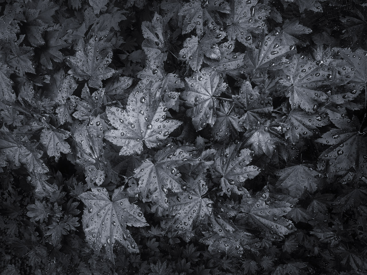
In pursuit of improving my black and white abilities, I decided to play around with some fall "color." I'd love your thoughts/suggestions on the result!

(Click the image to view the larger version; it is closer to what I was chasing.)

Nikon D7100
Nikon 12.0-24.0 mm f/4.0 at 12 mm (18mm equiv.)
1/90 sec. at f/16 and ISO 800

Comments

7 comments
Comment posted by Philip Hodgkins on October 23, 2017 at 7:09 PM
John, this has that nice oily feeling of good b/w, and the slight vignetting really pulls the eye to the center. I have no thoughts on improvement, but I have a suggestion you could pursue. Have you tried NIK SilverEfex Pro? It is still available as a free download from Google here. It does a wonderful job with b/w.
Registered on July 24, 2006, 2741 Posts, 12349 Comments
Comment posted by Michael Lowe on October 24, 2017 at 4:28 PM
Wow, John. That's really all I can say.devildevildevildevil
Registered on February 11, 2004, 777 Posts, 5252 Comments
Comment posted by Kathy Barnhart on October 24, 2017 at 9:05 PM
A beautiful black and white image, with over the top texture and interest. There is one leaf lighter than the others, which helps bring the eye to rest on something, then the eyes go around to the other leaves. I like the vignetting here also, which increases a mysterious mood.
Registered on November 11, 2011, 404 Posts, 1639 Comments
Comment posted by John Williams on October 24, 2017 at 11:54 PM
Thanks all!

Phil, I haven't checked out NIK yet; I need to do that. Thanks! I got to thinking about the adjective "oily," and decided you are correct. I was shooting more for gun metal or silver, so here's a brightened version to compare.

(It looks a bit better if clicked for the larger view.)
Registered on September 6, 2007, 221 Posts, 5985 Comments
Comment posted by Philip Hodgkins on October 25, 2017 at 8:53 AM
Much better! You have added to the tonal range. In hindsight, it was needed.
Registered on July 24, 2006, 2741 Posts, 12349 Comments
Comment posted by Nathan Buck on October 25, 2017 at 2:19 PM
The original, small photo did not work for me, John.  It was just too dark and did not have much contrast.  For me, the repost gets it where it needs to be.  Very nicely done!

Nathan
Registered on November 1, 2003, 1101 Posts, 13589 Comments
Comment posted by Ian Wolfenden on November 7, 2017 at 11:57 AM
John : an excellent conversion, with the vignetting bringing out the tones all the better.  I personally prefer the original to the repost, as being more subtle in tone, but both are good.  Nice work !!
Registered on May 18, 2007, 1108 Posts, 7647 Comments