Nature Photographers Network
This is the preserved archive of the original Nature Photographers Network. The community continues at naturephotographers.network.
Sierra Night
‹ PreviousPhoto Art GalleryNext ›

Sierra Night

by Kathy Barnhart

Gallery: Photo ArtPosted November 16, 20173,576 views3 comments
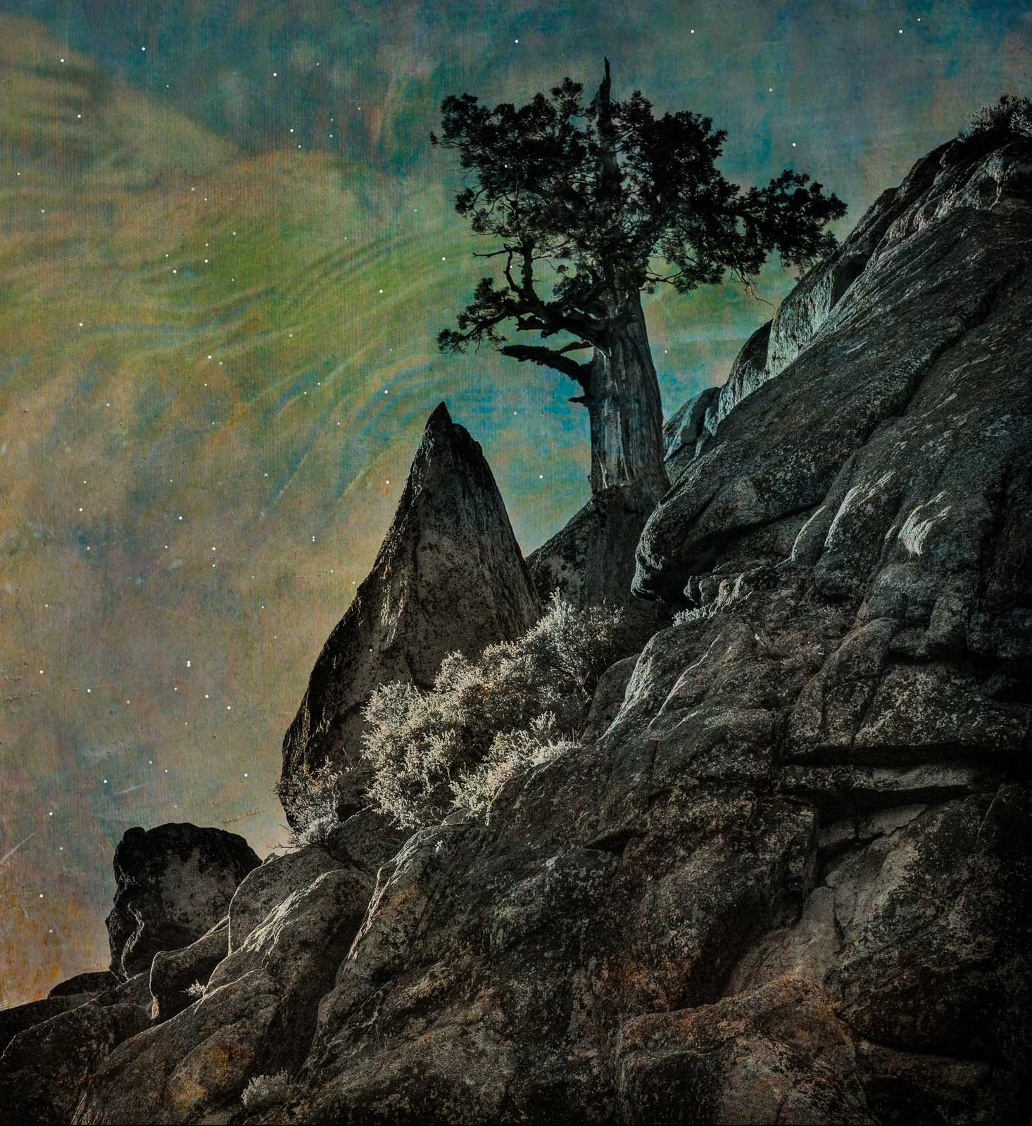
This is a wild idea of compositing a photo of a steep hillside with juniper at dusk, then adding a creative texture for sky, then adding stars. Just wondering if it works or not and would love feedback. When I tried to print it recently it came out very dark and so I am wondering if it looks too dark to others.

 

Comments

3 comments
Comment posted by Allen Brooks on November 17, 2017 at 2:00 AM
Well, this one grabbed my attention from the thumbnail.  Very dramatic.  There's a lot going on here and it's fun to explore the photo.  I like the detail and texture in the rocks.  The sky has an artistic/mystical feel to it.  The stars are a nice touch.  I don't think it is too dark for the computer screen.  I have noticed in my own photos the need to sometimes add brightness for the print to properly come out.  My only negative comment would be the bluish color in the tree.  Great job.
Registered on July 27, 2011, 262 Posts, 2597 Comments
Comment posted by Kathy Snead on November 19, 2017 at 12:24 PM
Hi Kathy
I like this.  Its very creative and I love what you have done with the sky.  I would though play with the black and shadows in the earth part of the photo.  They are very dark on my screen and some lack detail.  I also see a bluish/aqua tint in the rocks.  You could say its a reflection of the sky but without playing with it hard to know if it would look better without that tint.  Van Goghs "Starry Night" though had an overall bluish tone and it worked, but his blue in the landscape (and the sky) was much more saturated.  As a creative piece you really dont have to be realistic so maybe the rocks should stay blue and even more emphasized.

Fun idea!
Registered on April 6, 2017, 104 Posts, 397 Comments
Comment posted by SandyRichardsBrown on November 24, 2017 at 2:52 PM
Love it! Not too dark from here, but I'd remove the dark frame and add a thin line of light gray - about the colour of the bushes.
This is very dramatic  and artistic, with a lot of neat elements to explore.
A little CW rotation to straighten the tree would be good.
Sandy
Registered on November 24, 2003, 3937 Posts, 12909 Comments