Gallery: LandscapePosted December 1, 2017387 views12 comments
Comments
12 comments
Comment posted by gary phillips on December 1, 2017 at 11:23 PM
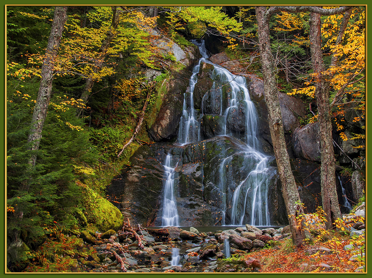
The fall colors in this image are just insane, Sandy. I'm wondering if the green of the frame isn't hurting this a little. It's like color, color, everywhere. I think I would reduce the blue in the falls a bit, and (as much as I hate to say it) back off the overall saturation just a smidge. I also might entertain a crop to just below the horizontal limb top right. Killer image.
Registered on October 24, 2013, 185 Posts, 4136 Comments
Comment posted by Lon Overacker on December 2, 2017 at 12:37 PM
Sandy,
This is a stunning autumn scene; beautifully framed and composed.
I would agree Gary that the saturation is a little strong but not over the top.
Lon
Registered on November 24, 2006, 521 Posts, 19147 Comments
Comment posted by Igor Doncov on December 2, 2017 at 1:07 PM
A great composition. I like the addition of scattered leaves on the waterfall. For me this is oversaturated, particularly the blue water.
Registered on November 22, 2014, 189 Posts, 2733 Comments
Comment posted by Dave Dillemuth on December 2, 2017 at 8:49 PM
Beautiful composed but a bit too saturated for my tastes. imo, pull back on the saturation and this image is a winner.
Registered on December 10, 2015, 104 Posts, 1112 Comments
Comment posted by SandyRichardsBrown on December 2, 2017 at 10:56 PM
Ok, thanks for the feedback.
Let's try again:
Registered on November 24, 2003, 3937 Posts, 12909 Comments
Comment posted by Richard Teller on December 3, 2017 at 7:51 AM
I really like this image. Great composition. The second image is much more natural. I think it looks right on with great color.
Registered on August 23, 2010, 1162 Posts, 6692 Comments
Comment posted by Ed McGuirk on December 3, 2017 at 9:53 AM
Sandy,
Really nice autumn waterfall here, and the repost certainly improves the saturation a lot, the repost looks much more natural. My only nitpick would be to burn down the lower right hand corner a bit because it is so much brighter than the rest of the foreground. I think this would place even more emphasis on the falls. I might even consider a slight burning down of the yellow/green rock in the lower left corner as well.
Registered on November 29, 2017, 19 Posts, 260 Comments
Comment posted by Lon Overacker on December 3, 2017 at 4:44 PM
Great job on the repost Sandy. I agree with Ed about burning down the LRC, but that's pretty minor and personal choice.
Thanks for taking the time to repost.
Registered on November 24, 2006, 521 Posts, 19147 Comments
Comment posted by Igor Doncov on December 3, 2017 at 8:38 PM
The repost looks a lot better to me. It's interesting how the trees on either side are like gates that have opened to display the treasure. It's almost like a stage with curtains on either side. Wonderful composition.
Registered on November 22, 2014, 189 Posts, 2733 Comments
Comment posted by Craig Moreau on December 4, 2017 at 4:35 PM
Moss Glen? A beautiful frame of autumn color and falling water, and they work very well together. There are a lot of great, opposing diagonals in this that create a lovely composition. The repost looks more natural to my eye. It's a small detail, but I really like that small bit of waterfall off to the right.
It looks like you cloned across the bottom to make the image taller? I find it noticeable because there are a lot of patterns that repeat very close to each other, particularly the leaves on moss in the LLC, fallen log to the left of the outflow stream, and the rocks in the LRC. The two bits of water in the outflow stream look unnatural in that jumble of rocks, because they're falling straight down, but that part of the stream is coming straight at the viewer.
Registered on April 21, 2015, 64 Posts, 584 Comments
Comment posted by Lucy VanSwearingen on December 6, 2017 at 6:30 AM
Wow. Textbook killer shot love everything about it. Great comp, color and plenty of interest with multiple falls and scattered leaves throughout!
Registered on May 23, 2009, 800 Posts, 2042 Comments
Comment posted by Doug Koepsel on December 7, 2017 at 1:19 PM
Sandy, I like your framing of the falls with the trees. Also liked are your changes to saturation and water color.
Registered on April 1, 2010, 196 Posts, 1592 Comments

Comments
12 commentsThis is a stunning autumn scene; beautifully framed and composed.
I would agree Gary that the saturation is a little strong but not over the top.
Lon
Let's try again:
Really nice autumn waterfall here, and the repost certainly improves the saturation a lot, the repost looks much more natural. My only nitpick would be to burn down the lower right hand corner a bit because it is so much brighter than the rest of the foreground. I think this would place even more emphasis on the falls. I might even consider a slight burning down of the yellow/green rock in the lower left corner as well.
Thanks for taking the time to repost.
It looks like you cloned across the bottom to make the image taller? I find it noticeable because there are a lot of patterns that repeat very close to each other, particularly the leaves on moss in the LLC, fallen log to the left of the outflow stream, and the rocks in the LRC. The two bits of water in the outflow stream look unnatural in that jumble of rocks, because they're falling straight down, but that part of the stream is coming straight at the viewer.