Gallery: LandscapePosted December 2, 20179,666 views8 comments
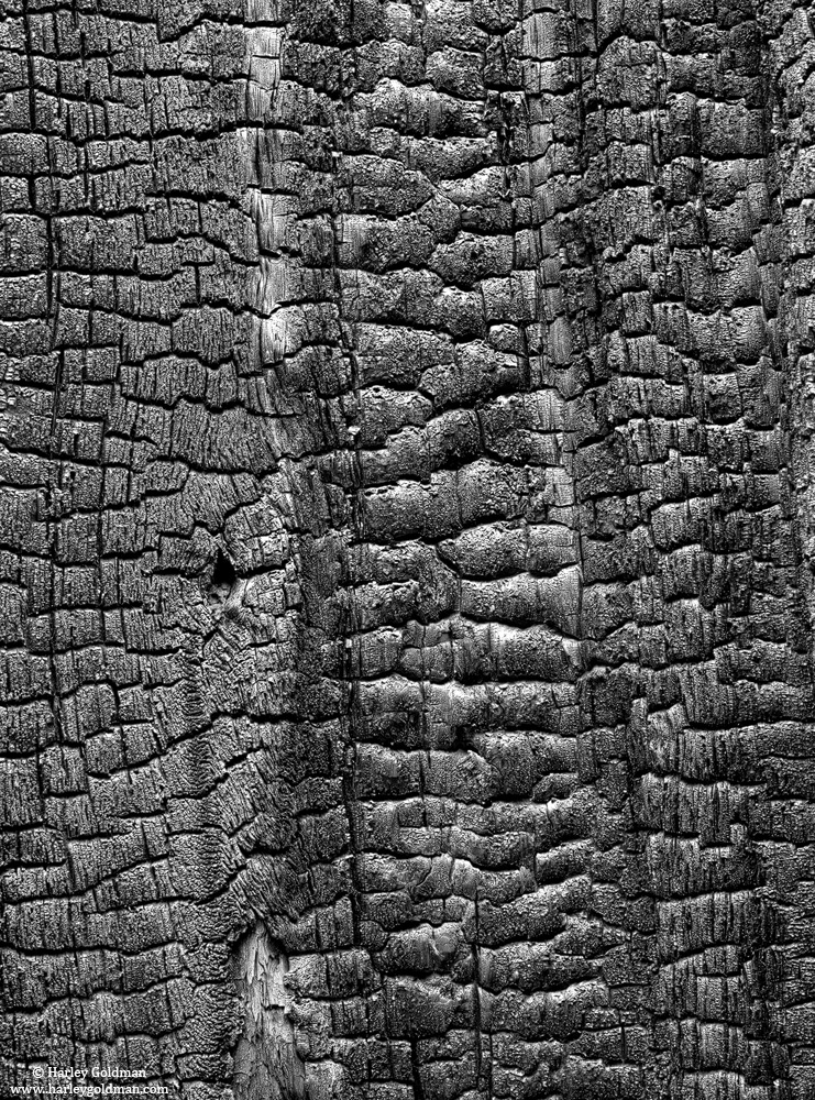
This is a charred tree from one of the many controlled burns conducted by NPS in Yosemite valley.
D810, 70-200mm
Comments
8 comments
Comment posted by Lon Overacker on December 2, 2017 at 1:10 PM
Harley,
Ah, been waiting for some char! What appeals to me here are the 3 different, but distinct vertical sections. Sure, it's all little blocks of char, but the patterns vary left to right and I like the vertical channel on the left where the knot and breakup of the patters are - creates a focal area for the eye. The large view displays beautifully; great detail, texture and contrast.
No nits and my only suggestion is just an alternate crop. This is based on feedback on some of my and other images of tree bark, is that the detail is so great and interesting, that some times we don't chose smaller sections. As an alternate, I might crop down from the top and some from the right to reduce the lighter UR edge. But we're talking personal choice in deciding what to present, and all that. So you can take this with a grain of sea salt. ;-)
Lon
Registered on November 24, 2006, 521 Posts, 19147 Comments
Comment posted by Igor Doncov on December 2, 2017 at 2:58 PM
I'm in agreement with Lon's crop proposal. It would be a slightly better composition and it would feature the lower left quadrant, which is different, a bit more strongly. You could go a bit darker with this image but it's just a preference.
Registered on November 22, 2014, 189 Posts, 2733 Comments
Comment posted by Harry Lichtman on December 2, 2017 at 5:08 PM
Beautiful textures that are brought ou in this image. I'm wondering if a slight rotation then crop making the vertical lines that separate the 3 sections a little more angular to create a little more dynamic presentation?
As an aside, I notice that your images on your web site appear much smoother in fine details than displayed here, even though the images area bout the same size here. Any idea why that might be?
Registered on September 17, 2010, 304 Posts, 3507 Comments
Comment posted by Dave Dillemuth on December 2, 2017 at 8:35 PM
Very graphic abstract. To me the three distinct sections are what makes the image work and brings order from what would be otherwise chaotic. I like Harry's thought on experimenting with a rotation to place these lines on a diagonal.
Registered on December 10, 2015, 104 Posts, 1112 Comments
Comment posted by gary phillips on December 2, 2017 at 10:35 PM
I like this as is Harley. I'm amazed at how the char pattern is as varied as wood grain would be. This could also work horizontally. I had as epiphany as I took a close look at this. I won't bore you with the details. I'll just go out and look for visual evidence.
Registered on October 24, 2013, 185 Posts, 4136 Comments
Comment posted by Ed McGuirk on December 3, 2017 at 10:17 AM
Harley,
I like this pattern a lot, the slight difference in tonality of the left third gives your eye a place to rest. The image as presented is great, but what is amazing is that there are so many good alternate compositions here available for cropping. You have received a number of suggestions that would all work, so I hope you have some fun experimenting with alternate crops.
Registered on November 29, 2017, 19 Posts, 260 Comments
Comment posted by Alberto Patiño on December 3, 2017 at 4:01 PM
The finely detailed texture is truly eye-catching.
Registered on December 2, 2014, 278 Posts, 1736 Comments
Comment posted by Preston Birdwell on December 3, 2017 at 6:40 PM
The detail in this is wonderful. It does look a tiny bit crunchy to me. One thought I have is to bring down the left and right thirds so that the central area with the smooth bits of char are more prominent. I can see alternative crops, too. It would be fun to play with. Nicely done, sir!
--P
Registered on November 1, 2003, 471 Posts, 5188 Comments

Comments
8 commentsAh, been waiting for some char! What appeals to me here are the 3 different, but distinct vertical sections. Sure, it's all little blocks of char, but the patterns vary left to right and I like the vertical channel on the left where the knot and breakup of the patters are - creates a focal area for the eye. The large view displays beautifully; great detail, texture and contrast.
No nits and my only suggestion is just an alternate crop. This is based on feedback on some of my and other images of tree bark, is that the detail is so great and interesting, that some times we don't chose smaller sections. As an alternate, I might crop down from the top and some from the right to reduce the lighter UR edge. But we're talking personal choice in deciding what to present, and all that. So you can take this with a grain of sea salt. ;-)
Lon
As an aside, I notice that your images on your web site appear much smoother in fine details than displayed here, even though the images area bout the same size here. Any idea why that might be?
I like this pattern a lot, the slight difference in tonality of the left third gives your eye a place to rest. The image as presented is great, but what is amazing is that there are so many good alternate compositions here available for cropping. You have received a number of suggestions that would all work, so I hope you have some fun experimenting with alternate crops.
--P