Nature Photographers Network
This is the preserved archive of the original Nature Photographers Network. The community continues at naturephotographers.network.
Bridal Veil Rocks +bw
‹ PreviousLandscape GalleryNext ›

Bridal Veil Rocks +bw

by Lon Overacker

Gallery: LandscapePosted December 2, 201710,234 views14 comments
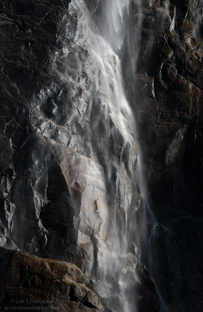
Ok, holidays over, busy work week and now back to posting.  Thank you so much for your comments on my previous image.  Moving in order, we then moved on the check out Bridal Veil Falls, as we usually do.  This is a popular spot for the tourists and it's our one stop on the loop where we have to grin and bear it.  It's a short walk up to a small viewing area near the base of Bridal Veil falls.  In the spring, you get drenched.  In November, not so much, but we were fortunate that some rain had rolled thru the day before which kick-started some of the falls in the valley.  Not much water, but enough to get the rocks wet.

In between chatting with tourists, taking their family pics for them, answering the question, "are you a professional photographer?" I managed to fire off some shots of the face of the falls.  This is a situation where I wanted the water to freeze a bit more, rather than let it fall with a longer exposure.  This was at iso 560, f/11 at 1/800th.

I liked the subtle earth colors so I'm posting the color version first. But then I also experimented with b&w.  I'm really not sure about this one, but don't know why.  Your comments, critiques and suggestions of course always appreciated.

Lon

Comments

14 comments
Comment posted by Lon Overacker on December 2, 2017 at 1:19 PM
B&W version
Registered on November 24, 2006, 521 Posts, 19147 Comments
Comment posted by Harley Goldman on December 2, 2017 at 4:34 PM
The two have such different moods and looks that I feel like I am looking at two different images (and I don't have to pick a favorite). I like both. I might boost the highs a bit in the B&W, but otherwise have no suggestions. They work nicely. 

I have almost the same exact composition in extremely different light and with a much slower shutter.  I will get around to posting it in the next week or two. It will be interesting to compare and contrast. 
Registered on November 19, 2003, 586 Posts, 11271 Comments
Comment posted by Harry Lichtman on December 2, 2017 at 6:36 PM
I think I am liking the color version more.  Seems that there may be more water detail visible in the upper portions.  Maybe just prefer the earth tones in this.  The lower portion of the image appears bright, maybe because there wasn't enough flow to create streams of water there - more like a mist.  The lighting / processing makes this very dramatic. Another well done intimate image.
Registered on September 17, 2010, 304 Posts, 3507 Comments
Comment posted by Dave Dillemuth on December 2, 2017 at 8:31 PM
Excellent, Lon. Put me down for the color version. For me the subtle colors add more depth and visual interest. The sidelighting really makes this image work beautifully. Processing looks good on my monitor.
Registered on December 10, 2015, 104 Posts, 1112 Comments
Comment posted by gary phillips on December 2, 2017 at 10:46 PM
Although the color version is very cool, as you might suspect, I prefer the B/W.  It has that mysterious vibe that I love.  I think the conversion looks good.  One thing I do like are the tonal transitions of the color version.  The B/W is harsher, which I find is often the case.  I might look at trying to massage some more tonal separation in the darks.  It's a minor thing, but might be worth a look.  I love it as is, of course. 
Registered on October 24, 2013, 185 Posts, 4136 Comments
Comment posted by Richard Teller on December 3, 2017 at 7:57 AM
This is a very artistic image. I like the play between light and dark, the textures and all the angles. I tend to like the first image better. The hint of color adds another dimension to the image for me. 
Registered on August 23, 2010, 1162 Posts, 6692 Comments
Comment posted by Ed McGuirk on December 3, 2017 at 10:29 AM
Lon,

This image has a lot of impact, with the textures, strong contrast, and interesting shapes in the rocks. I also prefer the color image because the brown tones are a really nice element in the scene. The color image appears very luminous and almost metallic. Usually a B&W treatment of scene provides that more luminous feeling, but in this case for some reason the color version does a better job of that IMO. I also think the lower water flow level does a great job of helping to emphasize the wonderful textures and shapes in the rocks. Don't get me wrong, the B&W is very nice too, but the subtle colors of the first one appeal to me.
Registered on November 29, 2017, 19 Posts, 260 Comments
Comment posted by Igor Doncov on December 3, 2017 at 12:30 PM
I prefer the color version as well. The treatment of the rock wall is such that it looks like obsidian or other crystalline material. I don't suppose there is such a thing as brown obsidian? That being the case would it look better as more of an abstract without the large boulder llc? I'm toying with that idea but not sure. I suspect you've considered that already. Nice image.
Registered on November 22, 2014, 189 Posts, 2733 Comments
Comment posted by Lon Overacker on December 3, 2017 at 2:36 PM
Thanks everyone for your comments and suggestions.  I know some will always lean b&w, but I'm with most in liking the color version a bit better. Honestly, the b&w conversion was a last minute choice to include.  I still struggle with the artistic side of converting - I mean  it's not hard to "pick" a selection from Nik's Silver Efex Pro plug-in... sure one can tweak... but still..

Igor, I like your crop idea and think it's a valid alternate.

Harley, look forward to seeing your version if you decide to post.

Thanks!
 
Registered on November 24, 2006, 521 Posts, 19147 Comments
Comment posted by Igor Doncov on December 3, 2017 at 3:24 PM
Lon. One of the reasons I chose the color over b&w was the stone in llc. It stands out in the color version due to color but has a smaller impact in b&w. 
Registered on November 22, 2014, 189 Posts, 2733 Comments
Comment posted by Preston Birdwell on December 3, 2017 at 6:34 PM
Well, darn. You did make it hard to choose between the color or monochrome. After carefully considering the whole situation, and my back is against the wall, I will go with the color version. The subtle color in the rock works well.

While I like the B&W, I agree with Gary's suggestion.

I prefer the framing as presented.
--P
Registered on November 1, 2003, 471 Posts, 5188 Comments
Comment posted by Craig Moreau on December 4, 2017 at 6:22 PM
Lon, put me down for the B&W. I don't love the extreme bright parts in the rock, and I find them less harsh in that one. In either case, I could see trying to bring up the detail in the dark LRC.

I really like the tall pano crop and how it emphasizes the falls, an that bit of heavier water flow up top is really nice. Just the right amount, IMO.
Registered on April 21, 2015, 64 Posts, 584 Comments
Comment posted by Mattia Oliviero on December 5, 2017 at 3:42 AM
Almost miss this one, Lon. I really like the b&w version and the composition works really well. The effect of the water and light on the rock is really stunning.
Registered on August 24, 2016, 43 Posts, 254 Comments
Comment posted by Doug Koepsel on December 7, 2017 at 12:31 PM
Lon, my preference is for the first version with the slight hints of color.  In the B&W version, the rock in the LLC seems to get lost/blend in too much.
Registered on April 1, 2010, 196 Posts, 1592 Comments