Nature Photographers Network
This is the preserved archive of the original Nature Photographers Network. The community continues at naturephotographers.network.
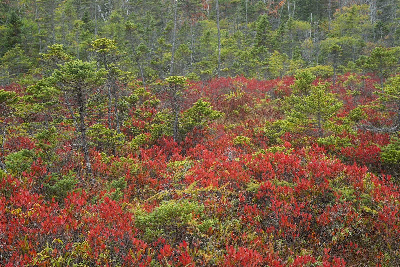
Wonderland # 2 + repost
‹ PreviousLandscape GalleryNext ›

Wonderland # 2 + repost

by Ed Lowe

Gallery: LandscapePosted December 11, 20176,998 views12 comments
Nikon D800
Nikon 35-70 @ 70 mm
f 20 @ 1/50 sec.
ISO 800
cable release & tripod
Acadia NP, ME

Another image from Wonderland. I lowered the color temp on this one to 5000 k; up a little from the repost of my prior image where I lowered it to 4500 k.

As always thanks for taking a look and leaving a comment or suggestion.

Ed

Comments

12 comments
Comment posted by Harley Goldman on December 11, 2017 at 2:16 PM
Sweet colors. Love the red against the green. I could see trimming a little off the top, but works nicely as presented. 
Registered on November 19, 2003, 586 Posts, 11271 Comments
Comment posted by Igor Doncov on December 11, 2017 at 2:33 PM
This looks significantly better than the previous one of same subject. 
Registered on November 22, 2014, 189 Posts, 2733 Comments
Comment posted by Preston Birdwell on December 11, 2017 at 3:08 PM
great color, and nice sense of warmth without going overboard. I agree with Harley's crop suggestion.The soft light is really nice, Ed.
--P
Registered on November 1, 2003, 471 Posts, 5188 Comments
Comment posted by Lon Overacker on December 11, 2017 at 4:16 PM
Ed,

Definitely like the comp here better and the processing is better as well - although my personal tasted might be to pop the reds a little more.  One thing I sometimes do and I think I learned this from Preston, is add a Levels or Curves layer to your stack in PS and change the blending mode to "soft light."  You don't make any adjustments, other than dropping the opacity way down like to 10% (to taste of course.)  Just one of a gazillion ways to add pop and contrast to an image.

Anyway, back to your image.  Before reading the comments I also was going to suggest a slight crop off the top - mainly to exclude the browns and also the white bare branches left of top center.  Minor suggestion.

Otherwise, I'm really enjoying the arrangement and mix of reds with the greens - and this view doesn't have that intruding element at the bottom.

Wonderful image.

Lon
Registered on November 24, 2006, 521 Posts, 19147 Comments
Comment posted by Nick Bristol on December 11, 2017 at 4:27 PM
Ed, I prefer this one over the last as well. Very nice. Nick
Registered on February 1, 2004, 752 Posts, 14140 Comments
Comment posted by Dave Dillemuth on December 11, 2017 at 8:43 PM
Superb, Ed. Those rich reds are set-off beautifully by the evergreens. Processing looks spot-on and framing works well as-is but I could also see experimenting with taking a small slice off the top.
Registered on December 10, 2015, 104 Posts, 1112 Comments
Comment posted by Ed Lowe on December 11, 2017 at 9:44 PM
Here is a repost with a little crop from the top as suggested by a few folks. Thanks for your input everyone.

Ed
Registered on February 7, 2004, 414 Posts, 7115 Comments
Comment posted by Harley Goldman on December 11, 2017 at 10:18 PM
The repost is a subtle but good look to my eye. I find it tightens up the comp nicely. 
Registered on November 19, 2003, 586 Posts, 11271 Comments
Comment posted by Michael Lowe on December 12, 2017 at 10:37 AM
This is outstanding.devilComparing this to your previous post, I like this one better. The comp seems much more balanced to my eye. The other seemed a little left heavy on second viewing.
Registered on February 11, 2004, 777 Posts, 5252 Comments
Comment posted by Ed McGuirk on December 13, 2017 at 5:11 AM
Ed, I like this version much better than the first one. I think you found a good white balance for processing these Wonderland images. I also think the prior image was not as strong  because you had a dark black tree trunk serving as a frame on the left side of the image, and it drew attention away from the rest of the scene.

That's not the case here, your composition has a very pleasing arrangement of pines within the scene, and it works very well, it's nicely balanced. Good job here....
Registered on November 29, 2017, 19 Posts, 260 Comments
Comment posted by Mark Seaver on December 13, 2017 at 9:18 AM
Red and Green, must be getting close to Christmas...enlightened  The colors and especially the touch of glow in the greens look great here, Ed.  It's a great mix of real and abstract.  Fascinating how the crop off the top seems to emphasize the greens even as the amount of green in the image is reduced.  I do think the crop is a nice improvement on an already fine image.
Registered on January 23, 2011, 1103 Posts, 17270 Comments
Comment posted by Ken Henke on December 20, 2017 at 12:38 PM
Ed, Nice composition that for sure!  I might suggest a tab bit of curves or levels in the luminosity mode. I say that because the reds are popping quite nice and any additional levels or curves work in normal mode may oversaturate the reds. 
Cheers!
Registered on February 20, 2012, 117 Posts, 285 Comments