Nature Photographers Network
This is the preserved archive of the original Nature Photographers Network. The community continues at naturephotographers.network.
Red Berries w/redo
‹ PreviousLandscape GalleryNext ›

Red Berries w/redo

by Barbara Graham

Gallery: LandscapePosted December 13, 20171,462 views9 comments
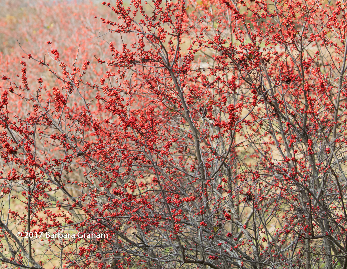
I wasn't sure where to post this, but in my head it was a mini-landscape, so that's why I put it here.  If it needs to be in Flora please feel free to move it. 

When I saw all of these bushes full of red berries this is the image I envisioned, one bush in focus in the front and then all the rest forming an OOF background.  I like the way this came out except for the dead leaves in the in-focus bush.  This is in Glenlake Park in Decatur, Georgia.

12/1/2017, 1:54:07 PM
Canon EOS 7D Mark II EF100-400mm f/4.5-5.6L IS II USM +1.4x III @140mm
f/8, 1/640, ISO 800
Aperture priority, Evaluative metering
Imported into LR Classic 7, processed in CC PS 2018.

Except for the dead leaves, for some reason this image makes me feel good.  Any feedback would be greatly appreciated.  Please see the larger view, if possible.  Thank you!

Comments

9 comments
Comment posted by Harry Lichtman on December 14, 2017 at 7:55 AM
Thee shallow depth of field works great here, isolating the berries as a subject.  We often try to get everything sharp with landscapes, but in this instance you made the right call.  Holiday feel to it.  The dead leaves not a problem for me.
Registered on September 17, 2010, 304 Posts, 3507 Comments
Comment posted by Michael Lowe on December 14, 2017 at 12:08 PM
Works for me. It is a feel good image as you say. I don't mind the leaves but they could be easily removed in PP.
Registered on February 11, 2004, 777 Posts, 5252 Comments
Comment posted by Lon Overacker on December 14, 2017 at 1:17 PM
Barbara,

I love your vision with this!  And to take that vision and actually craft that to a photographic image is even more impressive.  This of course is pure chaos, but you have clearly achieved your goal of separating the fore and background utilizing depth of field and I think this is a great success.

Could this be improved on? I'm not sure because I think this works wonderfully as presented.  For me, I'm mostly drawn to the left 2/3's or so.  I think this could be a little more abstract if you cropped from the right and perhaps a bit from the bottom to remove the larger branch center bottom edge.  Minor suggestion and of course personal choice and vision.

Lon

 
Registered on November 24, 2006, 521 Posts, 19147 Comments
Comment posted by Paul Breitkreuz on December 14, 2017 at 7:02 PM
Barbara, I like this as is. I thought I wanted to try some crops for a different look, but both my thoughts changed after viewing the image for a couple minutes.
I think one of the key points that backed me off the crop ideas was the diagonal view or flow of the scene I see here. With that said I think the subject as framed works best overall......nice work with a simple subject.
Registered on February 25, 2006, 525 Posts, 8448 Comments
Comment posted by Doug Koepsel on December 15, 2017 at 8:21 AM
Barbara, I like the red berries against the blurred yellowish background.  I sould see trying a tighter crops removintg the bottom 20% ad rigth 30%, or maybe just the bottom.  It is the UL that is eespecially nice.  Colors and contrasts look good.
Registered on April 1, 2010, 196 Posts, 1592 Comments
Comment posted by Kathy Barnhart on December 16, 2017 at 2:20 PM
This is so festive and seasonal...would go well on a holiday card, if you are so inclined. I love the left half with the oof berries in the background. Wonderful scene!
Registered on November 11, 2011, 404 Posts, 1639 Comments
Comment posted by Ed Williams on December 17, 2017 at 11:10 PM
I really love this one Barbara. Simple yet bright and festive without overdoing it. Great shot.
Registered on December 28, 2010, 636 Posts, 3499 Comments
Comment posted by Barbara Graham on December 18, 2017 at 3:06 PM
Thanks, everyone.  I think I do like the image as posted the best, but I have cropped it with your various suggestions in mind, and this is the result.  I have tried to keep the diagonal flow, but there is that thin branch that goes straight up on the left-hand side.  If anyone sees this, please let me know what you think.  Thanks!
Registered on July 27, 2010, 1310 Posts, 5035 Comments
Comment posted by Igor Doncov on December 19, 2017 at 1:48 PM
I think the redo is an improvement, Barbara. The dominant branch here gives a bit more structure to the composition. 
Registered on November 22, 2014, 189 Posts, 2733 Comments