Nature Photographers Network
This is the preserved archive of the original Nature Photographers Network. The community continues at naturephotographers.network.
Sycamore Patterns +rp
‹ PreviousLandscape GalleryNext ›

Sycamore Patterns +rp

by Preston Birdwell

Gallery: LandscapePosted December 17, 20178,748 views10 comments
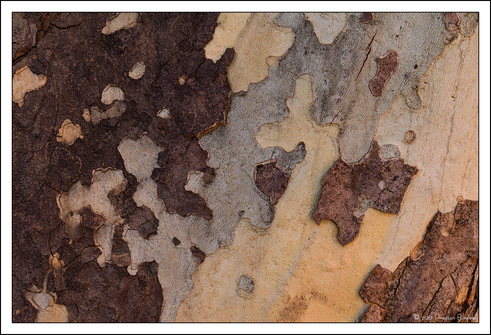
There are a few Sycamore trees around Columbia whose bark patterns have always intrigued me. Mostly I wanted to show the lovely patterns and tonal and color variations in this tree but also to test a new lens.

This is a 3-image stack for depth of field.

Nikon D-7100
Nikkor 70-200mm @ 135mm
Each image: f-8 @ 1/15, ISO 100
TK's masks
Full frame.

Please see the large version. Thanks.

Thanks also for your comments on my previous image, and for your comments on this one.
--P

Comments

10 comments
Comment posted by Jim Zablotny on December 17, 2017 at 3:42 PM
Hi Preston,

Your comp looks pretty good. Can you bump up midtone contrast slightly to bring out those blue gray tones?  Just a thought--otherwise a very nice abstract pattern on the sycamore bark..............................Jim
Registered on January 17, 2004, 705 Posts, 3594 Comments
Comment posted by Kah Kit Yoong on December 17, 2017 at 7:02 PM
I really dig the colour palette and patterns here. Query about the technique which I notice a lot lately : when you have a fairly flat subject, what advantages are there to focus stacking instead of closing the aperture a bit more?
Registered on September 27, 2006, 636 Posts, 10682 Comments
Comment posted by Dan Kearl on December 17, 2017 at 7:40 PM
I don't comment generally on abstracts but I like this one a lot because it looks like an aerial photograph of some strange landscape.
 Well seen.
Registered on September 2, 2013, 209 Posts, 1514 Comments
Comment posted by Harry Lichtman on December 17, 2017 at 8:10 PM
Like the warm light hitting the right side.  Might crop off the left just beyond the bright section to keep a relatively dark left boarder.  Interesting tree, nice find.
Registered on September 17, 2010, 304 Posts, 3507 Comments
Comment posted by gary phillips on December 17, 2017 at 9:56 PM
I'd say the new lens is working very well, Preston.  Sycamore's are interesting trees.  I once made a cabinet from curly sycamore that was wonderful wood to work with.  The bark abstract looks great, lovely detail.
Registered on October 24, 2013, 185 Posts, 4136 Comments
Comment posted by Preston Birdwell on December 18, 2017 at 10:20 PM
Thank you for your comments on this image, everyone.

Thanks for the suggestion, Jim. It was a great idea, that I have incorporated here. Let me know what yuo think.

Kah Kit, that's a great question! I did the focus stack due to the curvature of the tree trunk. I looked at exposing at f-16 but the left and right sides were a little soft. The exposures for the stack were made moving the focus point from left to right.
--P

 
Registered on November 1, 2003, 471 Posts, 5188 Comments
Comment posted by Michael Lowe on December 19, 2017 at 3:18 PM
Great eye to find this. I like the bumped up contrast of the repost. Do you use LR, PS or a another program for your stacking? I need to try this in the future. Small apertures really soften things IMO.
Registered on February 11, 2004, 777 Posts, 5252 Comments
Comment posted by Kah Kit Yoong on December 21, 2017 at 6:01 AM
Oh I see, it looked very flat with the curvature not apparent. 
Registered on September 27, 2006, 636 Posts, 10682 Comments
Comment posted by Jim Zablotny on December 21, 2017 at 10:44 AM
Your original post is excellent but your repost is most excellent!  The deeper grays make those colors pop.......................Jim
Registered on January 17, 2004, 705 Posts, 3594 Comments
Comment posted by Lon Overacker on December 21, 2017 at 2:04 PM
Hey Preston,

Sorry, a bit behind and finally able to comment today.

Great design here - I too love the bark of a sycamore.  Thanks for the repost, I think the contrast is better and it pops just a bit more. The original was slightly flat for me.

For me, I see a crop off the right. While I really like the patterns and design, as we've sometimes said and heard with closeups of bark in particular, we often show too much?  Before the repost I thought the brighter patch on the right took things out of balance a little. Perhaps cropping some or most of the brighter bark on the right might work as an alternative.  There is still a nice variety of tone and color left.  Still, as presented this is a cool bark image.

I also think the use of focus stacking on curved surfaces is great for getting edge to edge sharpness.  Great job!

Lon
Registered on November 24, 2006, 521 Posts, 19147 Comments