Nature Photographers Network
This is the preserved archive of the original Nature Photographers Network. The community continues at naturephotographers.network.
Gates of the Arctic +2rps
‹ PreviousLandscape GalleryNext ›

Gates of the Arctic +2rps

by Igor Doncov

Gallery: LandscapePosted December 24, 201712,753 views18 comments
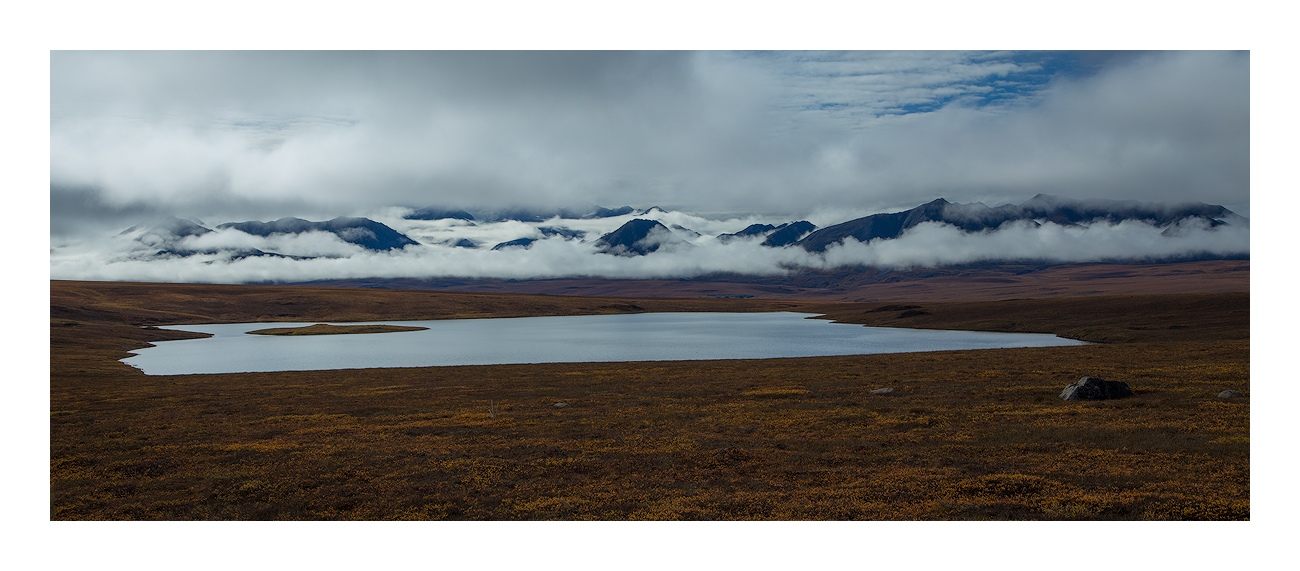
This is facing Gates of the Arctic in the Brooks Range shot from just off the Dalton Highway. This image was made in late August on the way back to Anchorage. The temperatures had started to drop around freezing with highs in the low 40's so we decided that we'd had enough. Island Lake. I had wanted to shoot this scene several times and then when the weather got bad the filming got good. It's a long panorama that was shot with one image so the top and bottom were cropped substantially. Please look at large version.

Thank you for your comments on the last one. I'm looking forward to reading your thoughts on this one. Shot with Canon 6D.

Comments

18 comments
Comment posted by Harley Goldman on December 24, 2017 at 1:42 PM
Great mood with the clouds and fog. The foreground/tundra looks on the muddy side. Maybe raise the midtones there with a little more contrast? Sweet view!
Registered on November 19, 2003, 586 Posts, 11271 Comments
Comment posted by Igor Doncov on December 24, 2017 at 2:09 PM
Here is a repost addressing Harley's suggestion. Best seen as a large version.
Registered on November 22, 2014, 189 Posts, 2733 Comments
Comment posted by Preston Birdwell on December 24, 2017 at 3:35 PM
The repost looks great, Igor. You nailed the processing. There is an illusion that the lake is really huge and the mountains are small, so there must be quite a distance between the lake and the range. I like the color, and the mood a lot.
--P
Registered on November 1, 2003, 471 Posts, 5188 Comments
Comment posted by Harry Lichtman on December 24, 2017 at 4:35 PM
Like the repost much better.  Think you could go even farther in this direction by selecting some of the brighter ground cover, then increasing the brightness more.  Using this as a layer, you could back off it looked too much.  Think it would add more dimension to the FG/MG areas.  Might consider brightening the right clouds a little to be more in line with the left side, to again add some depth in that area.  Image gives the expansiveness that the place exudes.

After looking again, feels like the image is tilting to the left.  Maybe the clouds, especially the lower ones too cyan?
Registered on September 17, 2010, 304 Posts, 3507 Comments
Comment posted by Harley Goldman on December 24, 2017 at 4:48 PM
I like the repost, but I agree with Harry that you could take it further. I was also thinking about the clouds being too blue/cyan, but kept my yap shut due to my anti-blue reputation. sad
Registered on November 19, 2003, 586 Posts, 11271 Comments
Comment posted by Igor Doncov on December 24, 2017 at 5:52 PM
For Harry and Harley. I like the blue overall tint but I'm always interested in how others feel. I added a touch of clarity to make the fg pop just a tad more but I don't want to go overboard because it's not that kind of image. I'm not after awesomeness but rather a desolate, cold, nordic place. The light was not the same on the clouds. That was part of the attraction. I don't want to make the clouds on the right have the same lighting as the left because the sky was not even. As I recall the clouds were breaking up as I raced over the ridge trying to get it in time.  
Registered on November 22, 2014, 189 Posts, 2733 Comments
Comment posted by Harley Goldman on December 24, 2017 at 6:16 PM
It keeps getting better! Looks great to my eye on the second RP. 
Registered on November 19, 2003, 586 Posts, 11271 Comments
Comment posted by Preston Birdwell on December 25, 2017 at 11:33 AM
The second re-post looks great to me. Perhaps the blue could be about mid way between the original and the 2nd re-post? At least to me, the blue adds to the mood. The foreground looks great.

Thanks for taking the time on the re-works, Igor.
--P
Registered on November 1, 2003, 471 Posts, 5188 Comments
Comment posted by Nick Bristol on December 25, 2017 at 6:15 PM
Igor, I'm really enjoying this image. You did a great job of capturing this landscape and the mood it gave you. I'm glad you made subtle changes in the repost images keeping the realistic look and maintaining the desolate lonely mood of this place on that day. The last repost does work! 

Nick Bristol
Lone Rock, WI.
Registered on February 1, 2004, 752 Posts, 14140 Comments
Comment posted by Lon Overacker on December 25, 2017 at 8:37 PM
Igor,

This really speaks the Alaska landscape for me.  While I've only been once and clearly haven't had much seat time there, this landscape still speaks volumes (and quite literally too.)    The Brooks range is a bit obscured by the low hanging clouds - but then the mountains in AK can create their own weather.

The last repost is the ticket for me.  This is a great example image of how even the smallest and most subtle changes in an image can make a difference.  Your changes were subtle and I you were quite successful in making those changes without, IMHO, changing the mood or what you wanted to convey to the viewer.

Lon
Registered on November 24, 2006, 521 Posts, 19147 Comments
Comment posted by John Tobias on December 25, 2017 at 11:30 PM
I like all 3 versions, each become just a bit better than the previous one.  It is the type of image I could easily put on the wall and enjoy for a long time!  Well done.  Thanks for sharing.
Registered on September 12, 2009, 2120 Posts, 6455 Comments
Comment posted by Craig Moreau on December 26, 2017 at 11:14 AM
Igor, this is a very nice pano. I like the second repost best for the greater texture in the foreground tundra. The low clouds obscuring the mountains add a nice sense of mystery to the image. I also like the silvery, metallic look to the lake.

I could maybe see a small crop off the right to just inside the small rock, but this is lovely as presented.
Registered on April 21, 2015, 64 Posts, 584 Comments
Comment posted by Mark Seaver on December 26, 2017 at 12:44 PM
Igor, the weather indeed has added a lot to this view, with the mix of low clouds in the mountains being a great addition.  The shape of the lake is also very nice.  It feels like there's too much tundra in the foreground, although Harley's suggestion should help that part of the view.  The reposts are both nice improvements.
Registered on January 23, 2011, 1103 Posts, 17270 Comments
Comment posted by Paul Breitkreuz on December 27, 2017 at 11:23 PM
Igor, I like the second reposted image overall. The pano choice fits nicely for the scene. Hard to really get the impact without having the larger version on the repost. But even at the standard size the change(s) are somewhat noticeable.

Been 50 years since I was there......did I really admit to that drastic lapse in time?......UGH!
Registered on February 25, 2006, 525 Posts, 8448 Comments
Comment posted by Genny K. on January 1, 2018 at 3:58 PM
Lovely image, Igor.  I like the reposts, but I feel the original image is most true to what it actually is like.  I say that because if the mountains really were that overcast and dark, and there was not any sunshine obviously shining in the FG, then all that tundra in the FG would be a bit dark.  I know it doesn't make for the best image, but for me, it's important to keep the real feel to the image, too.  I worked up there for many years, although I've only traveled the highway a couple times.
It does really have that expansive view that has so much impact; it is the same feeling you get in some places in the Great Plains. It doesn't appear to have any excess cyan/blue, but I am on an office laptop, so I cannot really say anything about color.

I am trying to figure out where this is; do you by any chance remember what milepost this was near? 
Registered on June 5, 2006, 132 Posts, 2001 Comments
Comment posted by Igor Doncov on January 1, 2018 at 4:40 PM
Mile 278. 
https://static1.squarespace.com/static/5388cf21e4b0a83ac5f971b1/t/5786ac9dd2b8572d0472488b/1468443858859/Dalton+Highway+Callout+Markers.pdf

This is the stretch of Dalton Hwy. There are five Highway 11 signs. Between lowest sign to next is the large Galbraith Lake. Between the 2nd and 3rd sign is this lake, 'Island Lake'. At the bend in the highway between 3rd and 4th sign is Toolkit Lake. It's supposed to have big grayling but we got skunked,

 
Registered on November 22, 2014, 189 Posts, 2733 Comments
Comment posted by Genny K. on January 2, 2018 at 1:02 PM
Thanks for the info. I don't think the weather was ever good enough to see that far when we went through that part. I distinctly remember driving north through that section in pouring rain. There was road construction, and we were stopped, and in front of us were a couple guys on BMW motorcycles. The road was gray-brown soupy mud, and those guys on the motorcycles were covered in it.
I hope to go back through there and have enough time to slow down and really look around. Thx again.
Registered on June 5, 2006, 132 Posts, 2001 Comments
Comment posted by Igor Doncov on January 2, 2018 at 2:00 PM
Your trip sounds a lot like ours, Genny. We had intermittent rain almost the entire month. It was rare for it to rain the entire day but on those days the road was soft mud. Cooking outdoors in the rain was no fun but there was no choice. A burger in Coldfoot went for $15. If it was a light drizzle I would shoot intimate landscapes. Overall the lighting was excellent. I would go back.
Registered on November 22, 2014, 189 Posts, 2733 Comments