Nature Photographers Network
This is the preserved archive of the original Nature Photographers Network. The community continues at naturephotographers.network.
Marble Monsters 2
‹ PreviousLandscape GalleryNext ›

Marble Monsters 2

by Preston Birdwell

Gallery: LandscapePosted December 25, 20179,697 views8 comments
Thank you for your comments on my previous post.

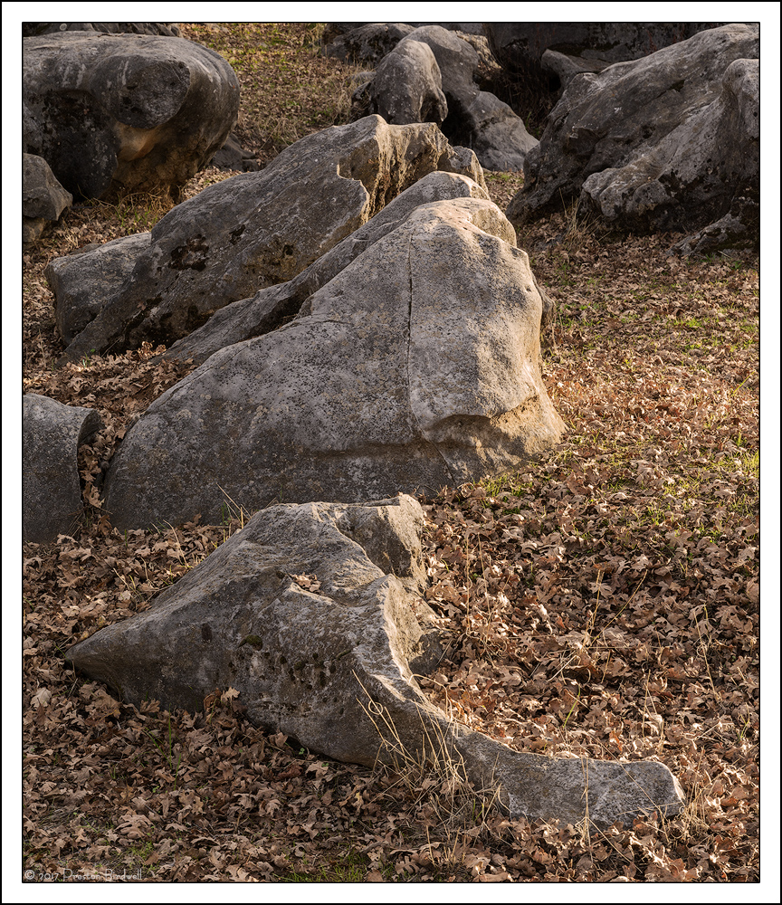
Based upon a suggestion regarding my previous effort at this location, I went back and framed the rocks a bit wider so that the near rock was not cut off. I timed this one for approximately the same time of day because I liked the late afternoon light.

Nikon D-7100
Nikkor DX 18-140  16-85 @ 52mm
4-Image stack for depth of field
F-10 @ 1/30, ISO 160
TK's masks.
Cropped some from the bottom.

Please see the large version. Thanks!

Your thoughts are always appreciated. cool
--P


Comments

8 comments
Comment posted by Harley Goldman on December 25, 2017 at 2:28 PM
Nicer light and nicer composition. Fine improvements on this, PB. Very minor suggestion, maybe use a gradient mask and burn the top area of the image? Minor as said.  I thought you sold the 18-140? 
Registered on November 19, 2003, 586 Posts, 11271 Comments
Comment posted by Preston Birdwell on December 25, 2017 at 3:11 PM
Thanks for your comment, Harley! I'll consider the grad. You're right, I did sell the 18-140. This was made with my 16-85. Good catch.
--P
Registered on November 1, 2003, 471 Posts, 5188 Comments
Comment posted by Harry Lichtman on December 25, 2017 at 5:14 PM
I like this one better than the previous from this site.  Might consider a slight crop off the top just below the bright top of the rock in the upper left. The rock edges up top seem to take away from the main point of interest, the larger rocks below.  The colors are a bit muted, wonder if a BW conversion with added contrast might be something to try.  A rocky still life.
Registered on September 17, 2010, 304 Posts, 3507 Comments
Comment posted by Igor Doncov on December 25, 2017 at 9:13 PM
I pretty much agree with Harry's remarks. This is better than the previous one but seems crowded up top. Cropping seems like a poor solution because then the sunnier ones below start to look crowded. I think you did the best you could given the subject. I personally like the rocks but feel less enthusiastic about the leaves. The rocks are beautifully illuminated with that gentle light. One of them looks like a harbor seal.
Registered on November 22, 2014, 189 Posts, 2733 Comments
Comment posted by Mark Seaver on December 26, 2017 at 12:39 PM
Preston, how nice to be able to go back easily for a redo.  I like seeing the leading edge of the first rock, especially the nicely curving sweep.  I also think you've done a good job at putting the attention on the main trio.  It's subtle, but a bit more dodging along the top, especially in the leafy area, would reduce the attention it gets even further.  The subtle crop suggestion also adds more emphasis to the main trio.
Registered on January 23, 2011, 1103 Posts, 17270 Comments
Comment posted by gary phillips on December 26, 2017 at 2:05 PM
I like the afternoon light on main subjects and I think I would add a vignette and burn the top edge even more.  I like the idea of a mono rock study.
Registered on October 24, 2013, 185 Posts, 4136 Comments
Comment posted by Paul Breitkreuz on December 27, 2017 at 5:55 PM
Preston, excellent work here with the much warmer yellow light over the previous version. I really like it as is........laugh
Registered on February 25, 2006, 525 Posts, 8448 Comments
Comment posted by Lon Overacker on December 28, 2017 at 12:54 PM
Hey Preston,

Sorry, a little tardy on this one.  Holidays and all.... ;-)

I like this one very much, although I might give a slight edge to your previous version.  I do like that you included the entire stone at the bottom, with sufficient room.  I do think that the top is busier and was going to recommend a crop similar to Harry's.  The light on the main rock is real nice - just the right amount of warmth and not too bright on the rock.

I would say the previous version was more about the rock, marble. This one is more about the place - if that makes sense.

Processing excellent.

Lon
Registered on November 24, 2006, 521 Posts, 19147 Comments