Nature Photographers Network
This is the preserved archive of the original Nature Photographers Network. The community continues at naturephotographers.network.
Painted BW + Reposts
‹ PreviousLandscape GalleryNext ›

Painted BW + Reposts

by Marylynne Diggs

Gallery: LandscapePosted January 4, 20182,096 views11 comments
Hi Folks,
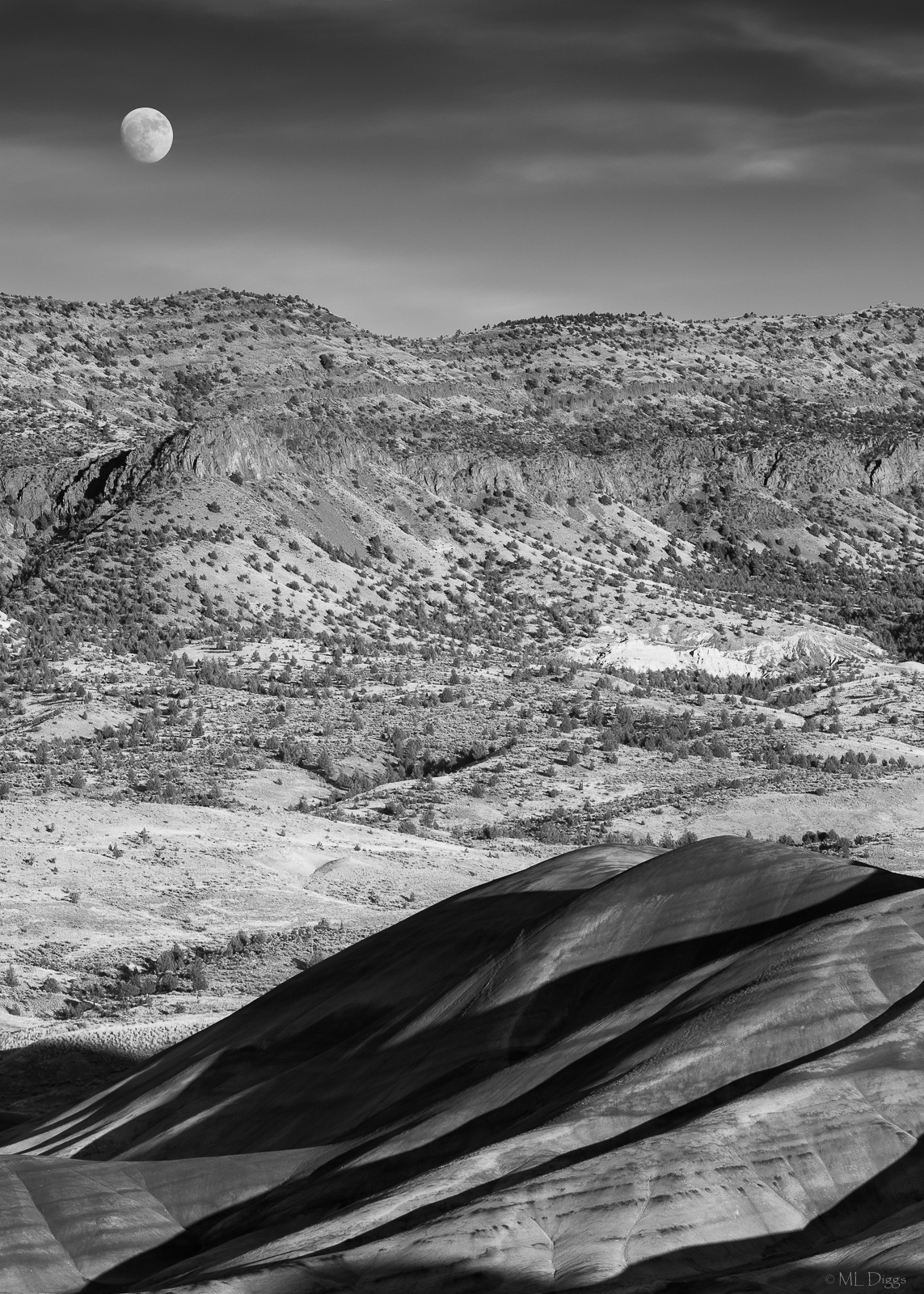
I spent some time in the Painted Hills last week, a few days before the Supermoon, alas, but we had some nice gauzy clouds and a waxing moon setting as we were wrapping up.  I'm interested on your thoughts on whether this works.  I can share color as well, for comparison, but color seems to be leaving me cold lately, so b/w is my default.

 

Comments

11 comments
Comment posted by Dan Kearl on January 4, 2018 at 10:11 PM
The odd shaped moon really works with odd foreground. The sky is really silky and well done.
Since this is the Painted Hills, I would like to see a color version...
Registered on September 2, 2013, 209 Posts, 1514 Comments
Comment posted by Ed McGuirk on January 5, 2018 at 8:13 AM
Marylynne, I really like this image as a B&W. The textures and tonalities in the landscape create some wonderful contrasts that translate very well to B&W. From a composition standpoint, I love the strong diagonal flow you have created between the moon and the powerful formations in the LRC. But you also have a nice transition zone between those elements too, which holds the image together.

I would consider slightly burning the bright triangular wedge that is above and to the left of the formations in the LRC. And this is just my personal taste, but I also feel like the moon is a little tight to the left edge and top of the of the frame, i just wish the moon had a little more breathing room, especially to the left.

This image is very good as presented, but there is also another good B&W image contained in the bottom half of this shot, crop it a bit above that bright wedge, and you have a shot that emphasizes the light and shadow in the foreground fomrations.
Registered on November 29, 2017, 19 Posts, 260 Comments
Comment posted by Lon Overacker on January 5, 2018 at 3:03 PM
Marylynne,

I'm really enjoying the contrast and juxtaposition between the light, shadows and curves of the foreground painted hills against the textured, rugged hills in the back. This is a viewpoint unlike we've seen from here.  Great job crafting this one.

I'm torn about the presence of the moon.  I think it works as presented and it's a beautiful capture of the moon, but for me it seems out of place, or at least not in balance with the juxtaposing geologic features, light, shadow play, etc.   With or without the moon, I could see a slight increase in contrast in the sky, or slightly darkening; in effect kind of sandwiching the lighter hills between some dark areas top/bottom.

The only real nit those is the harsh, almost washed out exposed rock just right of the center line.  I think if you could magically tone that down while somehow getting some texture in there, that would help. As is, it's a bit of an eye magnet for me.

Lon
Registered on November 24, 2006, 521 Posts, 19147 Comments
Comment posted by Daniel Rappaport on January 5, 2018 at 9:10 PM
Definitely a different approach to the Painted Hills!  Love the alternating textures.  I wonder if a lower key version might add some more moodiness to the image. 
Registered on September 9, 2009, 294 Posts, 2006 Comments
Comment posted by Marylynne Diggs on January 5, 2018 at 11:41 PM
Thanks, folks, for the feedback. I’ll tinker this weekend and share a redo.
ML
Registered on December 14, 2010, 122 Posts, 1034 Comments
Comment posted by Mark Seaver on January 6, 2018 at 3:17 PM
Marylynne, the textures in the land look great.  The high contrast in the foreground gives it a commanding presence that is offset well by the silky clouds in the sky.  I think that some additional contrast in the distant ridges would look good.
Registered on January 23, 2011, 1103 Posts, 17270 Comments
Comment posted by Harley Goldman on January 7, 2018 at 2:12 PM
I am really loving the look of the landscape and the moon works for me. B&W works well with it.  However, for some reason, I am wanting to see this in landscape orientation. It feels somehow cut off to me.  Not sure why, but ??
Registered on November 19, 2003, 586 Posts, 11271 Comments
Comment posted by Harry Lichtman on January 7, 2018 at 6:42 PM
Love the FG shadows and features and the moon and sky portion.  The mid areas looks a bit flat when compared the other areas.  I realize you needed it to keep the moon and sky.  But if you're into Photo Art and some tinkering, I could see that it might not be too difficult to cut the sky/moon and top portion of the ridge and paste it just above the brighter wedge on the left to create an image that has the hills and the moon /sky.  Some careful blending might work.
Registered on September 17, 2010, 304 Posts, 3507 Comments
Comment posted by Marylynne Diggs on January 7, 2018 at 7:21 PM
Hi Dan,
Here is the color version. 

All,
Black and white redo coming soon.
ML
Registered on December 14, 2010, 122 Posts, 1034 Comments
Comment posted by Marylynne Diggs on January 7, 2018 at 7:47 PM
Here is a re-post of the black and white version.  I did the following:
1. darkened and creatively healed the bright outcropping
2. darkened sky and slightly increased contrast there
3. darkened the scrubby hills a tish, but increased contrast there

A few other thoughts:
Harry: I'm not philosophically opposed to creative blending that you suggested, just photoshop challenged in that respect.  I do almost all of my processing in LR.  The challenge with PH National Monument is that you can't get down lower (no allowed to) to shoot up at the hills, and that darn hillside behind is very vexing (though my geologist friend enjoyed that "lava flow").  I often do abstracts here in part because those standard central oregon scrub hills are not particularly interesting.    I think that's also why many shots of this area shoot to the right of this spot (where the painted hills are taller and block more of the scrub) and go wider to minimize the impact of the scrub and maximize foreground and sky.

Harley: Your curiosity is spot on.  I went vertical to get the moon and long to get the moon big.  I do have another frame taken slightly wider with more of the breadth. 

Ed: I also have a more abstract shot of just the near hills, which you are emboldening me to work on and share in another thread.

As always, I couldn't do this without you all.  Thanks for the suggestions, encouragement, and general sense of community.  If you see more that I could do to improve this one, don't hesitate to let me know.  I could clone the moon to the right a bit if folks think that would help.

ML
Registered on December 14, 2010, 122 Posts, 1034 Comments
Comment posted by Marylynne Diggs on January 7, 2018 at 9:09 PM
And for Harley, here is a wider (though not horizontal) view.  I had more issues with some of the foreground shadows and the sky in this one (it was taken just a few minutes earlier, but the shadows had patches of light and the clouds were more stringy at this time, and then thinned and spread a bit more).

Nonetheless, if this one looks better than the redo of the first, please don't hesitate to say so. 
ML
 
Registered on December 14, 2010, 122 Posts, 1034 Comments