Nature Photographers Network
This is the preserved archive of the original Nature Photographers Network. The community continues at naturephotographers.network.
Exposed +RP
‹ PreviousLandscape GalleryNext ›

Exposed +RP

by Lon Overacker

Gallery: LandscapePosted January 16, 20188,955 views16 comments
Thanks for your comments on my previous image and all the images from this trip.  I've skipped over a few and I have but a few left to post; the next few all b&w.

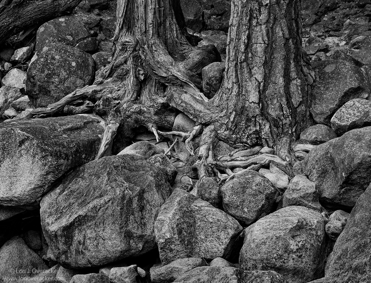
We're nearing the end of the second day of this quick trip to the Yosemite Valley,(that I've been milking for two months now!)  After brief recent rain, there was some trickle of water in Yosemite Falls and so we took the short walk to the base.  Nothing jumped out at us in terms of water flow or any graphics on granite walls, but I became interested in this static flow of granite boulders. In the spring and normal water flow, these are buried under a torrent of millions of gallons of water... but in the late fall, all this rock - and even surviving pines and roots are exposed.

B&W was the vision here. I'd love to hear your thoughts, critiques and suggestions here.  This is a slight crop from full frame, Nik's Silver Efex Pro 2 for the b&w processing and a few layers in PS. Single frame.

Thanks!

Comments

16 comments
Comment posted by Silvia Richter on January 16, 2018 at 6:10 PM
There is a most interesting interplay of textures and shapes in your image for me, Lon. The rocks do not only anchor the trees in this scene, they likewise anchor the composition firmly. I am sure a fine art print would reveal some more subtle shades than the web version is able to.

Silvia
Registered on February 27, 2011, 18 Posts, 167 Comments
Comment posted by Igor Doncov on January 16, 2018 at 7:06 PM
I'm a sucker for these type of images. The roots are so expressive, as are the rocks, and the b&w medium is perfect for letting your emotions go. On the other hand it feels a bit busy to me. I thought of simplifying the composition but I think it's the contrast that's doing it. The roots need good contrast but the rocks not so much. It's a tricky thing because the contrast brings out the emotions which is what this is all about for me. Either way this is an excellent subject and enjoyable to look at.
Registered on November 22, 2014, 189 Posts, 2733 Comments
Comment posted by Harley Goldman on January 16, 2018 at 7:08 PM
Your crop helped on this one. I might boost the highs just a little to get a touch more contrast and pop, but otherwise nice tones and shapes. For some reason, I was thinking this was along the Merced. Wrong set of roots. 
Registered on November 19, 2003, 586 Posts, 11271 Comments
Comment posted by Marylynne Diggs on January 16, 2018 at 7:17 PM
I like this a lot, Lon.  I see Igor's point about busy-ness.  It could be that more highlights in the trees and roots in particular would give it more unity, or perhaps cropping the smaller rocks off the bottom, though they do give us a sense of the trees being cradled. I think the top edge of the frame is perfect, but there might be just enough diversity along the bottom edge to pull our eyes there.  Either way, this is a wonderful image. 
ML 
Registered on December 14, 2010, 122 Posts, 1034 Comments
Comment posted by Paul Breitkreuz on January 16, 2018 at 8:14 PM
Lon, this is one where the standard image just does not work. But thankfully the uploads of the larger images really save the day on fine scenes as this one. For me it's about the survival of the trees among these rocks. Always amazes me how they can fight their way into whatever soil they can find to keep going.
B&W was a good choice for this image too.  
Registered on February 25, 2006, 525 Posts, 8448 Comments
Comment posted by Lon Overacker on January 17, 2018 at 11:54 AM
Thank you so much for the excellent feedback!

... it's the contrast that's doing it. The roots need good contrast but the rocks not so much.

Igor - thank you so much, this comment, along with others, really opened my eyes to this image and how I was approaching it.  I'm a novice when it comes to b&w and as I've mentioned in the past I think there's little skill in selecting a template and tweaking it.  My initial approach was global in the sense of overall contrast, textures, luminosity, etc. etc.  But to use contrast selectively is something that hadn't crossed my mind - at all.  Sure, I've dodged and burned and selectively used color, saturation,etc., but again not contrast and certainly not for this image.  My goal with the rework was to try and separate the trees/roots from the rock.

Here is a repost with that thought process in mind.  I'm sure this isn't the final and I'm not even convinced it's better, I may have gone too far.  But in reworking I tried to retain the contrast and even lightened the trunks and roots a bit, while decreasing the contrast in the surrounding rock.  I also did some additional burning and dodging so the rock didn't go completely flat.

thanks for any additional comments or feedback.  I do wish the roots were more expressive and extensive, but the scene was what it was and I think there's enough there for good nature story.

Thanks again!

Lon

Edit: The rock does look pretty flat in the repost here.  I'm wondering though, if there was no original for reference, and you saw this one for the first time, would you notice that?  Hard to say for me.
Registered on November 24, 2006, 521 Posts, 19147 Comments
Comment posted by Harley Goldman on January 17, 2018 at 12:57 PM
I definitely prefer the repost, but I could see taking it even further. 
Registered on November 19, 2003, 586 Posts, 11271 Comments
Comment posted by Nick Bristol on January 17, 2018 at 1:07 PM
Lon, I like the repost as well and it works fine for me as you have it now. I really like the textures this has in the larger view of the repost.

Nick Bristol
Lone Rock, WI.
Registered on February 1, 2004, 752 Posts, 14140 Comments
Comment posted by Marylynne Diggs on January 17, 2018 at 6:00 PM
Repost works for me and eliminates my query about the bottom-most layer of rock.

Nice work!
ML
Registered on December 14, 2010, 122 Posts, 1034 Comments
Comment posted by Ed Lowe on January 17, 2018 at 6:18 PM
Repost looks great and is the winner for me, Lon. Lightening the trees and the roots has given them a nice tonal separation from the surrounding boulder field. The details and textures really shine when opening the large version. Beautifully done IMO.

Ed
Registered on February 7, 2004, 414 Posts, 7115 Comments
Comment posted by Silvia Richter on January 18, 2018 at 3:33 AM
Lon, in your repost the contrast for the roots works perfectly for me and I think the rocks might also benefit from some increase of the contrast.

And yes, I think I would have noticed the difference.

Silvia
Registered on February 27, 2011, 18 Posts, 167 Comments
Comment posted by Ed McGuirk on January 18, 2018 at 7:53 AM
Lon, I'm coming in late on this one, and I actually skipped down to see the repost first, so at first I wasn't influenced by the original. I prefer the reduction in contrast of the rocks from the repost, and the higher contrast in the trees. After going back and looking at the original too, what strikes me is that in the original it's the very strong shadows that take some attention away from the trees. You have addressed that in the repost, partly by reducing contrast in the rocks, and partly by adjusting the trees. However, I think the repost would benefit from additional dodging of the lighter areas of the three foreground rocks, especially the two on the left  (the one right one may be okay). It's always amazing to me how such subtle local adjustments create such major changes in the impact of the image. Kudos to Igor for sending you off on the right track.
Registered on November 29, 2017, 19 Posts, 260 Comments
Comment posted by Dave Dillemuth on January 18, 2018 at 11:49 AM
Excellent, Lon Apologies for being a bit late to comment. As usual very well seen and crafted image. I love the way the rocks appear to ring the trees. Repost looks great. Those tree trunks/roots really pop. I could see maybe lightly dodging the prominent rocks in the foreground as they look a tad too dark. 
Registered on December 10, 2015, 104 Posts, 1112 Comments
Comment posted by Chris Chamberlain on January 18, 2018 at 9:13 PM
Everything is working here! From the lines to the shapes and textures and tones, there's a lot of interesting things to look at. The sharpening looks crazy good to me as well!  
Registered on March 13, 2007, 500 Posts, 8365 Comments
Comment posted by Preston Birdwell on January 19, 2018 at 11:05 AM
I really like the composition, Lon. It tells a great story.

The reworked image really pops, although I agree the foreground rocks would benefit from additional tweaking. It's real close.

Thanks for taking the time to rework this.
--P
Registered on November 1, 2003, 471 Posts, 5188 Comments
Comment posted by Mark Seaver on January 20, 2018 at 1:43 PM
Lon, the small version has a decided "grunge" look.  The larger version loses that with the "grunge" turning into sharp, high contrast details.  It's a fascinating collection of rocks, roots and trunks that does a good job of showing off how resilient trees can be.  I think the reduced contrast in the repost is a good improvement....no more grunge look...
Registered on January 23, 2011, 1103 Posts, 17270 Comments