Nature Photographers Network
This is the preserved archive of the original Nature Photographers Network. The community continues at naturephotographers.network.
Winter Oak + 3 BW
‹ PreviousLandscape GalleryNext ›

Winter Oak + 3 BW

by Preston Birdwell

Gallery: LandscapePosted January 25, 20189,270 views17 comments
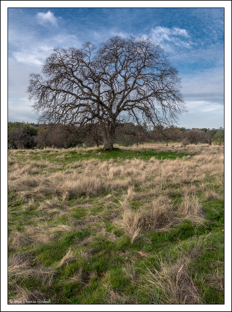
I returned to this location a couple of days after I made the California Winter Oak image I posted a few days ago.  I like the light in this image, and decided to include more of the foreground grasses. It always amazes how conditions can vary greatly from day to day.

Nikon D-7100
Nikkor 16-85 @ 18mm
TK's masks and a Saturation Painting action.
Cropped very slightly from the top.

Please see the large version. Thanks!

Your thoughts are always appreciated. cool
--P

Comments

17 comments
Comment posted by Harry Lichtman on January 25, 2018 at 2:05 PM
Lots of nice texture in those grasses.  Wondering if you can move lower and shoot up to help separate the bottom tree branches from the background.  the tree reminds me of a brain.
Registered on September 17, 2010, 304 Posts, 3507 Comments
Comment posted by Harley Goldman on January 25, 2018 at 2:07 PM
The perspective works quite nicely. I like the extended foreground. A fine portrait of this stately oak. I think this would also work quite well (and maybe even better) as a B&W, pulling in the black and the white points to really pop the tree against the sky. Can't go wrong either way. 
Registered on November 19, 2003, 586 Posts, 11271 Comments
Comment posted by Igor Doncov on January 25, 2018 at 2:43 PM
The tree carries this image due to that incredible canopy. However, I feel this is a weaker image due to a foreground that I feeel neutral about. I don’t think it complements the tree very well. Still, the half/half comp is a good idea. 
Registered on November 22, 2014, 189 Posts, 2733 Comments
Comment posted by Preston Birdwell on January 25, 2018 at 6:10 PM
Thanks for your comments, gents.

Wondering if you can move lower and shoot up to help separate the bottom tree branches from the background.


That's a great idea, but I would have to climb over a rickety barbed wire fence onto private property. That's not something I want to do, although I would really like to do.

I think this would also work quite well (and maybe even better) as a B&W...

 
 Good idea. How's this?
--P
Registered on November 1, 2003, 471 Posts, 5188 Comments
Comment posted by Igor Doncov on January 25, 2018 at 6:44 PM
This is really good, Preston. There's an out-of-this-world look to that tree now. Almost sinister. I like it. Great job.
Registered on November 22, 2014, 189 Posts, 2733 Comments
Comment posted by Wayne Jones on January 25, 2018 at 11:04 PM
I really enjoy this portrait of an oak, partly because a solitary tree (other than in a man-made pasture or farm field) is so rare where I live.  i.e., I can't see the tree for the forest.  I agree that the distant background sort of obscures the bottom of the tree's profile, but somehow, I don't notice this as much in the B&W version.  Unfortunately, the TOP of the oak's outline kind of get's lost in the dark sky in the B&W version.  For that reason, I prefer the color one, foreground and all.
Registered on April 18, 2007, 953 Posts, 6435 Comments
Comment posted by Preston Birdwell on January 26, 2018 at 12:15 PM
Thanks for your comments, everyone! Harley gave me a nice tweak off line that I thought I would post. I did use his 20% cloning technique to fix a couple of hot spots in the brightest clouds to the left and right of the tree. 

One of the cool things about B&W is the ability to create images that give a totally different mood.
--P
Registered on November 1, 2003, 471 Posts, 5188 Comments
Comment posted by Igor Doncov on January 26, 2018 at 1:21 PM
The first b&w is considerably better than the 2nd for the following reasons.

1. It's a 2 tone image with the foreground having a yellowish cast. I felt it added an artistic outlook on the subject.

2. The abnormally dark sky in the first image provided a mood and mystery that is now gone. 

The 2nd image has less emotion for me, a closer representation of objective reality, with all the tone values accurately depicting what was there. 

The 2nd b&w has an improved fg over the color version but the sky is weaker than the color version. The fact that the tree doesn't stand out well against the sky in the 1st b&w does not matter. It's about emotion - not zone system. IMO the color and 2nd b&w are about equal in quality. The first b&w has vision.
Registered on November 22, 2014, 189 Posts, 2733 Comments
Comment posted by scott lanz on January 26, 2018 at 1:29 PM
That tree is a great subject, Preston. Wonderful form. I like the reposted B&W, though I also liked the original color. While I think the is nothing wrong with the comp, zooming in on that tree would also work well I think.  
Registered on November 14, 2003, 840 Posts, 12902 Comments
Comment posted by Dave Dillemuth on January 26, 2018 at 1:32 PM
I prefer the B&W versions to color as I don't find the light compelling enough in the color version. I went back and forth on the two B&W renderings and I think I prefer the top half from the first (darker sky) and the toning of the bottom half in the second.
Registered on December 10, 2015, 104 Posts, 1112 Comments
Comment posted by Lon Overacker on January 26, 2018 at 1:40 PM
Preston,

I very much like this original color version.  As Harley described it, the "extended" foreground works wonderfully and makes this much more than just another great oak image; it's also about the environment that the oaks live - even managing to avoid fences and cows... angel cool

I think the b&w is a good idea, but the first repost, the grasses have lost their effect. In fact, there seems to be a color tint? The grasses don't quite look completely b&w. maybe it's just me.

For me, I like the treatment of the grass in the 2nd repost, but now the sky/clouds on either side look a little washed out. Not sure what or why you were trying to adjust.  I actually prefer the sky in the 1st b&w and the grass in the second. 

I still prefer the color over either of the reposts.

Lon
Registered on November 24, 2006, 521 Posts, 19147 Comments
Comment posted by Harley Goldman on January 26, 2018 at 1:58 PM
I prefer the second B&W of all the choices (no great surprise there). While the sky is more dramatic in the first B&W, I find the tree kind of disappears into it and I think the tree is the star of the show here.  To my eye, the second B&W of the three does the best job of showcasing the grand tree. It is great to behold how we all have different visions of the landscape and luckily we have to tools to pursue those varying visions. 
Registered on November 19, 2003, 586 Posts, 11271 Comments
Comment posted by Preston Birdwell on January 26, 2018 at 3:30 PM
Thanks for your additional comments, everyone. It is interesting and educational to see the differences in opinion. 

In fact, there seems to be a color tint? The grasses don't quite look completely b&w. maybe it's just me.

No, it is not just you. I figured out where that cast in the grass came from. When I originally worked up the master file in Adobe RGB, I used a warming Photo Filter on the foreground only. When I did the conversion to the first B&W, that layer was still active, and I did not notice it. When I did the tweaks on the second BW, I deleted that layer. Voila!

If you use the Black and White adjustment layer in PS to convert an image that already has adjustment layers, and you have used a Photo Filter layer, be sure to either disable the layer, or delete it so that its effect will not carry over.
--P
Registered on November 1, 2003, 471 Posts, 5188 Comments
Comment posted by Preston Birdwell on January 26, 2018 at 6:22 PM
OK, decided I wanted a happy medium between the two Black & White images for the contrast in the sky, so I adjusted the blue using a B&W adjustment layer. Next, I did some selective burn/dodge in the clouds. Third, I cropped some of the foreground. Lastly, I used a TK Mid Tones-1 mask with the blending mode set to 'soft light', which increased the contrast ever so slightly.

Any other thoughts on this one?
--P
Registered on November 1, 2003, 471 Posts, 5188 Comments
Comment posted by Igor Doncov on January 26, 2018 at 8:16 PM
#4 is better than #3 imo. My ranking order of preference:

#2 > #4 > (#1=#3)
Registered on November 22, 2014, 189 Posts, 2733 Comments
Comment posted by Lon Overacker on January 26, 2018 at 10:09 PM
Preston,

#4 is the best b&w IMHO.  Great job and compromise with the sky where the tree still gets good separation.

My favorite is still the color version, simply because of the blue and green colors where I think the oak canopy stands out best against the sky.  Interesting, and I just thought of this.  I think the tree stands out better because it's against blue - it's color that allows the dark gray branches to separate more.  Where as with b&w, tonality is what is relied on to separate and there just isn't a great of tonal separation as there is color separation.  

That's my story and I'm sticking to it.  Thanks for you time and work on this one.

Lon
Registered on November 24, 2006, 521 Posts, 19147 Comments
Comment posted by Nick Bristol on January 28, 2018 at 5:42 PM
Preston, I just love that first b&w version. The tones and mood are wonderful. Very cool processing on that! cool

Nick Bristol
Lone Rock, WI.
Registered on February 1, 2004, 752 Posts, 14140 Comments