Nature Photographers Network
This is the preserved archive of the original Nature Photographers Network. The community continues at naturephotographers.network.
Eucalyptus abstract
‹ PreviousLandscape GalleryNext ›

Eucalyptus abstract

by David Schoen

Gallery: LandscapePosted January 30, 2018512 views10 comments
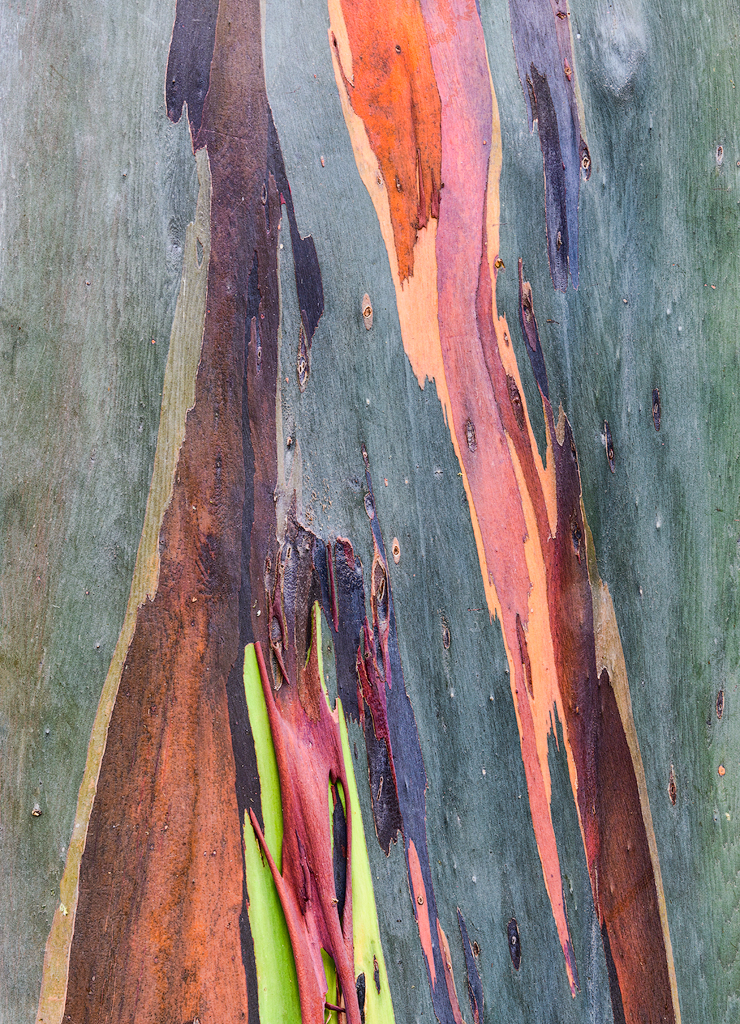
This is Eucalyptus bark close-up.  There is another version of this image in the weekly challenge gallery.  These are some of the first landscape images I'm taking with my Nikon D 850.  I'm not sure whether this one is too saturated or not.  I think it is pretty realistic from what I remember when I took it a week ago.  One of the things I am finding with the Nikon D 850 is it seems to have a tendency to over saturate colors.  My monitor is calibrated as of two days ago.  Still having the learning curve with this new camera other than avian shots.  

Iso-100, 24-120 at 62 mm, F-14, 0.4 second, tripod, D 850, partially overcast and in the shade, 95% full frame, ACR 10, Topaz Adjust, TK sharpening action at 40%



Comments

10 comments
Comment posted by Nick Bristol on January 30, 2018 at 3:09 PM
David, This bark is so amazing to see. It is hard to imagine that it is bark with these colors but yet I know it does look like this. The larger detail version shows the wood grain up really well. Very interesting seeing this and I think excellent work on your part. I'm sure you will enjoy that new camera! I have a friend waiting for his. 

Nick Bristol
Lone Rock, WI.
Registered on February 1, 2004, 752 Posts, 14140 Comments
Comment posted by Igor Doncov on January 30, 2018 at 4:31 PM
I enjoyed your bark image in the WC gallery and this is even better. I find the lime green colors at the bottom to clash with the color scheme of this image. If I crop off all of the lime green part of image the upper half of image is a stronger composition in terms of color. The overall composition of image is as is very good. I would mask that color and convert to something more harmonious.
Registered on November 22, 2014, 189 Posts, 2733 Comments
Comment posted by Eva McDermott on January 31, 2018 at 6:01 PM
I love this David.  Looks like brush strokes on a canvas.
Registered on January 4, 2009, 1015 Posts, 13229 Comments
Comment posted by John Williams on January 31, 2018 at 10:03 PM
That's really pretty David. I enjoy rich color, but with that disclaimer this looks great to me.
Registered on September 6, 2007, 221 Posts, 5985 Comments
Comment posted by Harry Lichtman on February 2, 2018 at 8:04 AM
Wonderful colors and patterns.  SOme huge prints possible with your new camera, I'm envious!  The top portion seems a little bright compared to the bottom so I might suggest a gradual darkening of the top to midway down.  Slight increase in midtone contrast might make the colors pop a little more without adjusting sat., though looks very good as is.
Registered on September 17, 2010, 304 Posts, 3507 Comments
Comment posted by Kathy Barnhart on February 2, 2018 at 1:54 PM
Wonderful pyramid lines and colors. I agree that the lime green color stands out, but I like it and find that this little section of the bark shows off the rainbow aspect of this bark. It is called Rainbow Eucalyptus for a good reason!
Registered on November 11, 2011, 404 Posts, 1639 Comments
Comment posted by Anil Rao on February 2, 2018 at 10:24 PM
Very nice ... very different ... totally enjoyable. You have made my day David.

Thanks!
Registered on November 15, 2003, 234 Posts, 4923 Comments
Comment posted by Lon Overacker on February 3, 2018 at 12:49 PM
David,

The bark of the Eucalyptus has always been fascinating and beautiful to me.  Hard to speak of the accuracy and intensity of the color and saturation without having stood there to observe.  Regardless, we have the artistic license... ;-)  for me, the purple and the yellow/green are slightly strong, but again, for art and design this works quite beautifully.

I would agree with the comment about being somewhat bright up to.  Very minor, but some burning up top might be a subtle improvement.

Lon
Registered on November 24, 2006, 521 Posts, 19147 Comments
Comment posted by Preston Birdwell on February 3, 2018 at 2:43 PM
This is real nice, David. The texture and detail is excellent. I do agree with Lon about the saturation of the yellow/green and the purples. Regarding the top being a tad bright, you could use a soft gradient fill to balance things out. I have had to do that on several of my bark detail images.

The lines are striking, and the composition works quite well. Nice job on this one.
--P
Registered on November 1, 2003, 471 Posts, 5188 Comments
Comment posted by Kah Kit Yoong on February 8, 2018 at 6:43 PM
The patterns and colour certainly make a lovely abstract landscape. My only slight note is the glare in the top half, maybe a polarizer could have helped, in any case easily enough dealt with in processing if you wanted.
Registered on September 27, 2006, 636 Posts, 10682 Comments