Gallery: Weekly ChallengePosted February 4, 2018219 views6 comments
Sony A77
Sony 70-400G @ 280mm, CPL
ISO 100, 1/640 @ f8
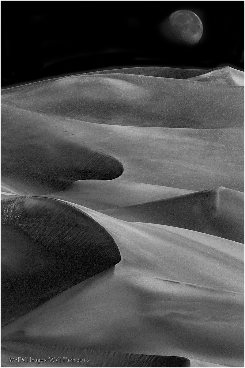
This is a rework of the original Parting Shot (http://www.naturephotographers.net/imagecritique/ic.cgi?a=vp&pr=224011&CGISESSID=b29e64597e56ee2ea3f885aac4a9e9d3&u=343&title_action=#top) from Great Sand Dunes NP in December 2014.incorporating some of the suggestions in that post. The original RAW file is in the first post. This is a single capture converted in Lightroom Classic and enhanced in Photoshop. The trick to getting a black sky was to pretty much remove the blue channel. All comments welcome. >=))>
Comments
6 comments
Comment posted by Jim DeWitt on February 4, 2018 at 10:06 PM
Beautiful, Bill. The layering the shot is just outstanding.
Registered on August 28, 2006, 1240 Posts, 8506 Comments
Comment posted by scott lanz on February 5, 2018 at 9:54 AM
I really like the other-worldly look of this BW rendition, Bill. A fine shot to begin with, then excellent processing to achieve this result.
Registered on November 14, 2003, 840 Posts, 12902 Comments
Comment posted by Paula LeVay on February 5, 2018 at 1:56 PM
Bill, my first thought after seeing your entry in the WC was should I even bother to submit anything? Amazing curves and texture along with an orientation that works for this shot. Otherworldly and awesome!
Registered on July 29, 2016, 66 Posts, 270 Comments
Comment posted by Mark Seaver on February 6, 2018 at 10:14 AM
Bill, the leading sweep of the dunes up to the almost full moon looks great. This is a beauty that really shows off how b&w enhances textures and shapes.
Registered on January 23, 2011, 1103 Posts, 17270 Comments
Comment posted by David Schoen on February 6, 2018 at 1:42 PM
Excellent image. Wonderful shadows, shapes, and textures. Beautifully composed. I think this works far better in black-and-white than it does in color. There's so much more drama in the black-and-white image.
Registered on November 6, 2006, 1213 Posts, 4587 Comments
Comment posted by Doug Koepsel on February 6, 2018 at 5:43 PM
Bill, I think the B&W here works better than the color version. The black sky in nice. I could see brightening the moon some.
Registered on April 1, 2010, 196 Posts, 1592 Comments

Comments
6 comments