Nature Photographers Network
This is the preserved archive of the original Nature Photographers Network. The community continues at naturephotographers.network.
Autumn Twilight
‹ PreviousLandscape GalleryNext ›

Autumn Twilight

by Brian Schrayer

Gallery: LandscapePosted March 10, 20182,860 views8 comments
Please View Large

Hi Y'all!  I am trying to get back in the saddle with photography.  This is the first image that I have processed since early November.  I'm coming out of a season where I just sort of lost interest in photography for a while due to a combination of factors. 

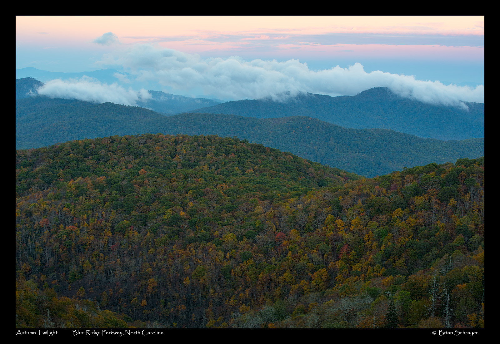
This is an image that I captured last fall along the Blue Ridge Parkway.  I find that more and more I am drawn to the kind of soft light in this image.  I really like the subtle tones and color in this image from the pastel blues and pinks in the sky to the patchwork of color in the foliage. 

I have noticed that I seem to have a tendency toward processing images too dark - this has become especially apparent as I have tried to print some of my images.  I would appreciate any feedback that you have as to whether this is too dark.  As always all comments and critiques are welcome! 

Capture Info:
85 mm
f/11 @ 1/10 sec.
ISO 100

Processing Info:
Levels adjustment to set black and white point; TK's luminosity masks to lighten darks, adjust contrast in the midtones and lights; TK's vibrance masks, and color balance adjustment. 

Comments

8 comments
Comment posted by Dave Dillemuth on March 10, 2018 at 6:47 PM
Beautiful layering and mix of colors. Composition looks well balanced to my eye. I might reduce the cyan cast in the clouds and distant ridges.
Registered on December 10, 2015, 104 Posts, 1112 Comments
Comment posted by Bill Leggett on March 10, 2018 at 10:32 PM
Brian, this is a sweet scene. From the thumbnail I knew it was in the Smokies or nearby. I think you made a good choice down-framing to emphasize the nice fall colors. Overall I like it very much. As an option I'm wondering if you could benefit from bringing up the levels in the fall foliage a bit, but quite nice as is.
Registered on July 21, 2004, 706 Posts, 3233 Comments
Comment posted by Harley Goldman on March 11, 2018 at 7:23 AM
Great layering and sweet scene. The processing looks good in the large version, except I would agree with Dave about scaling back in the cyan. Nice one to get you back in the saddle. 
Registered on November 19, 2003, 586 Posts, 11271 Comments
Comment posted by Preston Birdwell on March 11, 2018 at 12:24 PM
Nicely composed, Bryan. To me, the foreground Autumn color is the star of the show, so you might consider tweaking it some. I also agree with the suggestions to dial back the cyan. The sunrise sky looks real nice, and I like the clouds hovering on the ridges. Nice to see you back!
--P.
Registered on November 1, 2003, 471 Posts, 5188 Comments
Comment posted by Ed Lowe on March 11, 2018 at 2:33 PM
You put together some great layering in this classic Smokies scene, Brian. The large version is a must see to really enjoy all the details in the trees along with the clouds in the sky. I too would bring down the cyan just a little bit and tweak the fall foliage a little to give it just a little more pop.

Great to see you back.

Ed
Registered on February 7, 2004, 414 Posts, 7115 Comments
Comment posted by Ed McGuirk on March 11, 2018 at 5:39 PM
Brian, I do not think the processing here is too dark. This is after all a twilight shot, and you don't want to the foreground too bright or it would look unnatural. In the large version there is plenty of detail in the foreground.

I like the image as presented, but I think another effective composition would be to go panoramic and crop away the nearest foreground ridges at the bottom of the frame.
 
Registered on November 29, 2017, 19 Posts, 260 Comments
Comment posted by Nick Bristol on March 16, 2018 at 7:59 PM
Brian, This is really a nice image! The large version has wonderful detail and is a pleasure to view. I like this composition not only for the great view but the layers go on and on right through the clouds which is very nice. I too agree about reducing the cyan a little and I might try bring out the fall colors a bit more. It is not to dark for me viewing it here (large version) but I know if I were printing it I would probably have to brighten it some to get the same look as I'm seeing on my monitor. Looks like a nice way to get back at your photography again. Enjoy it and have fun with it! 

Nick Bristol
Lone Rock, WI.
Registered on February 1, 2004, 752 Posts, 14140 Comments
Comment posted by Brian Schrayer on May 12, 2018 at 8:09 PM
Here is an updated version with added midtone contrast, a boost in vibrance and a color balance adjustment to add a slight warmth to the image. 
Registered on May 28, 2004, 114 Posts, 2890 Comments