Nature Photographers Network
This is the preserved archive of the original Nature Photographers Network. The community continues at naturephotographers.network.
Light & Shadow #4 +1
‹ PreviousLandscape GalleryNext ›

Light & Shadow #4 +1

by Brian Schrayer

Gallery: LandscapePosted April 18, 20183,958 views8 comments
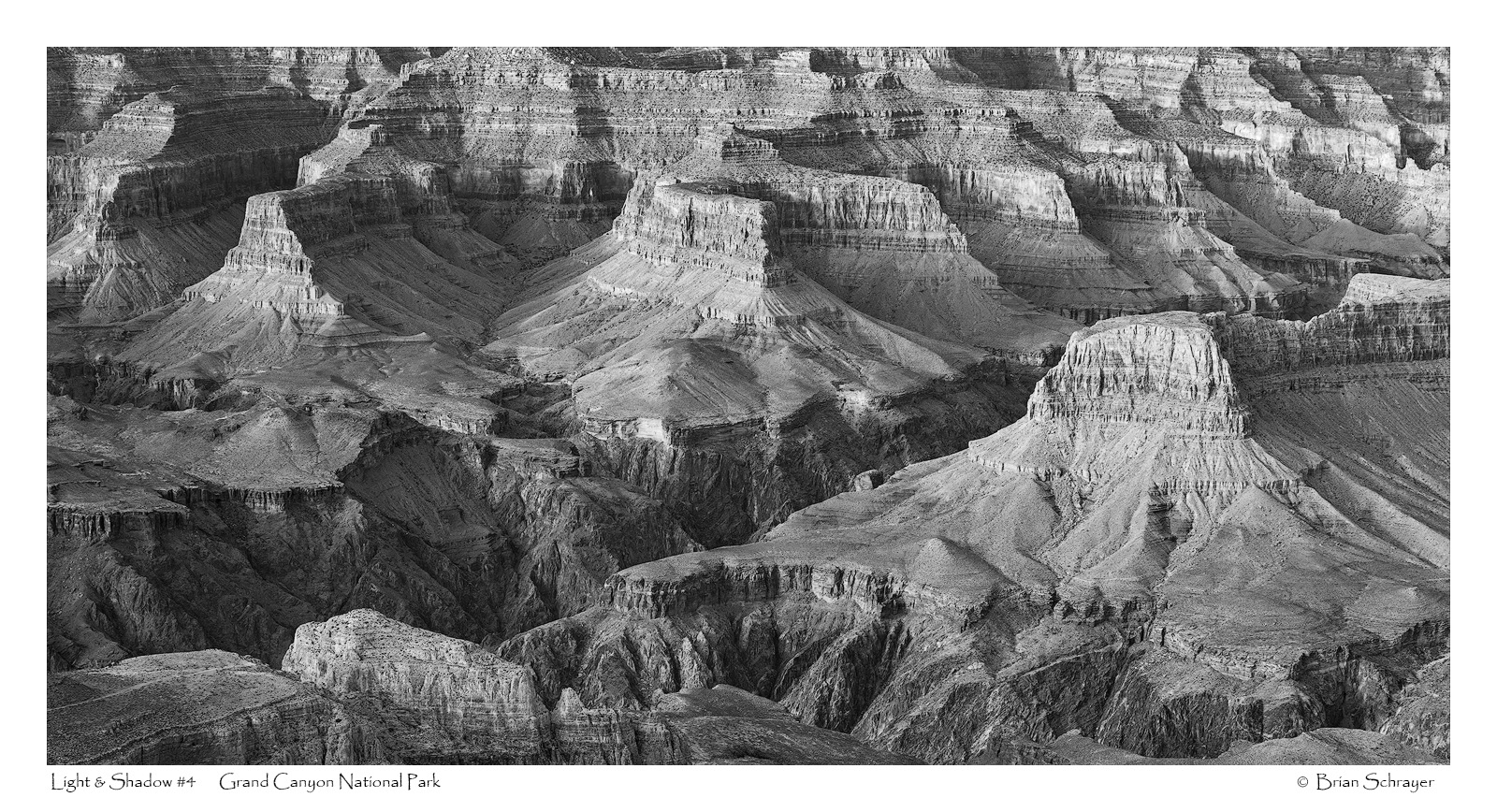
Here is a photo that I took from my trip to the Grand Canyon in December 2016.  I really enjoyed looking for more intimate views of the canyon. 

As always all comments and critiques are welcome!  crying

Capture Info: 
70 mm
f/11 @ 1/10 sec
ISO 100

Processing Info:
Levels Adjustment to Set Black & White Point
Black & White Layer in PS with adjustments to color channels to bring out contrasts
TK's Luminosity masks
Cropped to panoramic format

 

Comments

8 comments
Comment posted by Brian Schrayer on April 18, 2018 at 11:49 PM
Here's a color version as well.  I'm interested to know if you have a preference. 
Registered on May 28, 2004, 114 Posts, 2890 Comments
Comment posted by Doug Koepsel on April 19, 2018 at 12:55 PM
Hello Brian.  For the B&W, my tastes would be to add some more midtone contrast and general contrast (or move the black point and midpoint) to give the image darker shadows and some more depth.
Registered on April 1, 2010, 196 Posts, 1592 Comments
Comment posted by Jim Gavin on April 19, 2018 at 3:59 PM
I second Doug's comments. With those changes, I am sure I would prefer the b/w although the color is wonderful.
Registered on August 14, 2008, 293 Posts, 1250 Comments
Comment posted by Igor Doncov on April 19, 2018 at 6:46 PM
I prefer the b&w considerably more. Good composition. Adding contrast may improve it but I like it as is also.
Registered on November 22, 2014, 189 Posts, 2733 Comments
Comment posted by Neale Dyster on April 19, 2018 at 8:03 PM
Brian,
I'm pretty much in line with the previous comments, as they are now, I perhaps slightly prefer the colour version, but with some added contrast , I think I'd prefer the B&W. 
Great image though, well chosen frame. I've never been there, but from what I've seen, I'm sure it must be difficult to decide where to point the lens !
Registered on February 19, 2008, 94 Posts, 738 Comments
Comment posted by Ken Henke on April 21, 2018 at 11:49 AM
Yea, I agree with what has been mentioned. B&W with some localized contrast/darkening to accentuate the light.
Cheers
Registered on February 20, 2012, 117 Posts, 285 Comments
Comment posted by Brian Schrayer on April 22, 2018 at 3:26 PM
Here is a version with added mid-tone contrast.  I generated a levels adjustment layer using a luminosity mask selection for the mid-tone channel and brought in both the shadows and highlights to enhance contrast.

Thank you everyone for your comments and suggestions.  I always appreciate the great feedback here on NPN. 
Registered on May 28, 2004, 114 Posts, 2890 Comments
Comment posted by Harley Goldman on April 24, 2018 at 8:54 AM
Nice take on the big ditch. I like the repost and I might even play with bringing in the black point a bit and see how it looks. 
Registered on November 19, 2003, 586 Posts, 11271 Comments