Nature Photographers Network
This is the preserved archive of the original Nature Photographers Network. The community continues at naturephotographers.network.
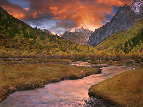
Mystic Waters of Shangri La (RePost)
‹ PreviousLandscape GalleryNext ›

Mystic Waters of Shangri La (RePost)

by Michael Anderson

Gallery: LandscapePosted December 12, 20064,822 views39 comments
Yes, this is the same image I posted last week. I got some great constructive commentary from the NPN community and decided to rework the image by blending several exposures in RAW to hold detail in the shadows and the water. The biggest problem I had shooting there was the tremendous exposure latitudes between the high altitude brightly lit snow faces towering 8,000 feet above and the extreme shadows in these deep valleys. I tried to shoot reflected water to help even exposures, and I was also trying very hard to keep accurate mid tones to showcase the autumn larches. The middle tones tended to suffer a bit with grad lines. I haven't been able to completely remove the grad effect, but I hope this comes close to reality.

This is one of my favorite shots, so I'm really trying to get it right. Sorry to post this twice but I'm wondering what you guys think of this version?

Thanks in advance.

Mike Anderson
www.lightscapephoto.com
Golden, CO

Comments

39 comments
Comment posted by Michael Anderson on December 12, 2006 at 12:05 AM
Here's last week's version for comparison...
Registered on January 31, 2006, 228 Posts, 3072 Comments
Comment posted by Paul Breitkreuz on December 12, 2006 at 12:07 AM
I liked the first one and commented on it, the re-post is even better. Nice job overall Mike.
Registered on February 25, 2006, 525 Posts, 8448 Comments
Comment posted by Joseph Kayne on December 12, 2006 at 12:35 AM
Yep, the second one is thee one.

Good photography.

Joe.
Registered on November 1, 2003, 573 Posts, 2619 Comments
Comment posted by Rick Lundh on December 12, 2006 at 12:36 AM
WOW! I can really see why it is one of your favs. :toast:
Registered on April 28, 2004, 774 Posts, 4351 Comments
Comment posted by Mike Dawson on December 12, 2006 at 12:56 AM
I liked the first but the rewaork is even better
Registered on February 4, 2006, 364 Posts, 8872 Comments
Comment posted by Zack Schnepf on December 12, 2006 at 1:10 AM
Yep rework is even more stunning, killer image!
Registered on November 1, 2003, 403 Posts, 2528 Comments
Comment posted by Richard Wong on December 12, 2006 at 1:35 AM
The ground seems lighter than the sky which looks a bit weird, but I do like that's it's not muddy looking like hte first one. Whatever it is, I'd be glad to have this image in my own collection.
Registered on February 2, 2006, 79 Posts, 2629 Comments
Comment posted by DARRENK on December 12, 2006 at 1:38 AM
It's a very strong image, but your rework has gone to the other extreme. This has a distinct black ridgeline all the way across with a light halo on the other side. There is also a halo on the lower foreground ridgeline from center on to the right edge. To me, it looks like another HDR gone bad type shot and my eyes get stuck on this pronounced flaw. Also, either the land should be darker, or the sky lighter on this one. You've got all the pieces there, which is the main thing, but more work is in order.
Registered on November 13, 2003, 8 Posts, 256 Comments
Comment posted by Patrik Larsson on December 12, 2006 at 7:08 AM
I like the first one better. The second look a bit to mutch. Mayby somtthing in betven? It´s a great image both of them!
Registered on July 10, 2004, 5 Posts, 23 Comments
Comment posted by Prashant Khapane on December 12, 2006 at 7:58 AM
I might prefer something inbetween. New one looks more like funky hdr image :toast:
Registered on November 1, 2003, 492 Posts, 4580 Comments
Comment posted by Guy Tal on December 12, 2006 at 8:35 AM
Still a spectacular image although personally I like the previous version a bit better. The open shadows on the front side of the right hand mountain look a little unnatural in the new one. Perhaps something in between might be the ideal setting.

Guy
Registered on November 1, 2003, 566 Posts, 15507 Comments
Comment posted by Josh Anderson on December 12, 2006 at 8:44 AM
The rework does not look natural. I would stick with the original!
Registered on June 2, 2005, 493 Posts, 2996 Comments
Comment posted by Jesse Mechling on December 12, 2006 at 8:47 AM
Mike,

Hi. The composition is incredible and the light is fabulous. It would be a favorite of mine as well. I agree with some of the other comments that the second shot goes a little extreme. It doesn't feel right, meaning the light in the foreground is too light and the mountain on the right seems very bright. Somewhere in between would be good, however, the first image is stunning.

Jesse
Registered on February 8, 2006, 24 Posts, 13 Comments
Comment posted by Dan Baumbach on December 12, 2006 at 9:54 AM
I too think something in between is the best. I love the way the trees look in this one but the lighting looks a bit too artificial. Maybe just darkening the middle of the image a bit will be enough.

- Dan.
Registered on November 1, 2003, 473 Posts, 7980 Comments
Comment posted by Marc Adamus on December 12, 2006 at 10:39 AM
I would prefer the cliff face at right to be slightly darker, but still lighter than it appears in the first version. The forest at left looks fine now except the dark halo at top. I'm definitely somewhere in between the two versions.
Registered on September 17, 2005, 780 Posts, 8091 Comments
Comment posted by Bernie Kasper on December 12, 2006 at 10:40 AM
They are both beautiful Michael, but if I had too choose it would probably be the first one, but everything aside it is still a beathtaking scene that must have been incredible to witness. :toast: :toast:
Registered on June 5, 2005, 251 Posts, 3734 Comments
Comment posted by Michael Handley on December 12, 2006 at 10:48 AM
Wow, what a stunning image. I didn't get to see this last week. I'm glad to have the second chance to see it now. I like what you did with the second one.

Michael
Registered on April 1, 2004, 38 Posts, 1301 Comments
Comment posted by Jody Grigg on December 12, 2006 at 11:15 AM
Nice image but I find the dark ridge lines on the mountains to the left and right to distracting for my tastes.
Registered on February 7, 2004, 165 Posts, 1227 Comments
Comment posted by John Lehmkuhl on December 12, 2006 at 11:17 AM
The dark line along the top of the Left on the rework is unnatural to me. The Right mountains also are a bit too light now. Layer the 2 and set the top (newer) version at 50/50 :smile:
Registered on May 22, 2005, 165 Posts, 2008 Comments
Comment posted by Roger Rouch on December 12, 2006 at 11:45 AM
Hopefully I commented on how much I like the original version. It's a great photo deserving of some attention. I'd probably go with the group thinking the right version is somewhere in between. The clouds and sky in the revised version don't seem quite right.to me.
Registered on November 1, 2003, 159 Posts, 1014 Comments
Comment posted by Nathan Buck on December 12, 2006 at 11:50 AM
I like the original shot.

Nathan
Registered on November 1, 2003, 1101 Posts, 13589 Comments
Comment posted by Mike Moats on December 12, 2006 at 2:33 PM
Really dramatic look. Well done Mike. :toast:
Registered on October 20, 2004, 892 Posts, 6324 Comments
Comment posted by Kirk Greene on December 12, 2006 at 2:44 PM
This is a spectacular image that is definitely worth the effort you are putting in to get it right. I personally prefer the first, more natural, looking version to the repost. I will put in another vote that the final version should fall somewhere between the two versions you have posted thus far. A little more work and you will have a true masterpiece.
Registered on May 12, 2004, 191 Posts, 1578 Comments
Comment posted by Jeff Wiebe on December 12, 2006 at 2:48 PM
Both shots are great Mark! The sky is just awesome.
Registered on July 24, 2006, 102 Posts, 772 Comments
Comment posted by Gary Crabbe on December 12, 2006 at 2:58 PM
I way prefer the original. Can't stand the heavy HDR feel in the distant peak and haloed edges. I'd work from the original scan, and dodge / burn as needed vs. look fake.

My 2 cents.
Registered on November 1, 2003, 182 Posts, 1840 Comments
Comment posted by Youssef Ismail on December 12, 2006 at 7:10 PM
Mike,

I think it has potential, but I don't think you are there yet. The current reworked version is better but I can tell that it has been reworked. The sky is starting to not look right due to the dark ridge line itself and the halo above it. And with the current brightness of the FG and hills, the sky seems to dark or vice versa. Mike its a wonderful image and well worth the effort to get it just right.
Registered on November 1, 2003, 474 Posts, 5555 Comments
Comment posted by Lori Kincaid on December 12, 2006 at 7:29 PM
I'd go somewhere in between, more toward the original. It's a gorgeous scene.

Lori
Registered on November 15, 2003, 90 Posts, 2033 Comments
Comment posted by Craig Sullivan on December 12, 2006 at 7:43 PM
A beautiful shot. To accomplish an "in between" version like many are suggesting, you might combine both images on separate layers in Photoshop and adjust the opacity of the top layer to the desired result.
Registered on May 2, 2006, 55 Posts, 137 Comments
Comment posted by Doug Dolde on December 12, 2006 at 9:25 PM
Nice rework...this is a fantastic image.
Registered on November 1, 2003, 305 Posts, 3900 Comments
Comment posted by Harley Goldman on December 12, 2006 at 9:26 PM
The second one is even better! Great stuff.
Registered on November 19, 2003, 586 Posts, 11271 Comments
Comment posted by Bill Chambers on December 12, 2006 at 11:11 PM
Whoa, big difference Mike. Nice rework!
Registered on April 10, 2005, 753 Posts, 21216 Comments
Comment posted by Michael Anderson on December 14, 2006 at 9:05 PM
Man, that's a lot of input! Thanks you guys! I'll keep working on getting the final version to look like something in between these two versions. Here's where I'm at so far, and thanks again for all of your time and commentary.

Mike Anderson
www.lightscapephoto.com
Registered on January 31, 2006, 228 Posts, 3072 Comments
Comment posted by Bill Chambers on December 18, 2006 at 8:35 AM
Congrats on the EP Mike. Very well deserved.
Registered on April 10, 2005, 753 Posts, 21216 Comments
Comment posted by SandyRichardsBrown on December 18, 2006 at 1:26 PM
wonderful image! The diagonal stream and reflections , the offset mountains, and the spectacular sky color all compliment each other perfectly. Congrats on EP ! :toast:
Sandy
Registered on November 24, 2003, 3937 Posts, 12909 Comments
Comment posted by Barry R. Byrd on December 19, 2006 at 10:24 AM
stunning, congrats on the EP, I like the last version best :jump: :jump:
Registered on December 20, 2005, 136 Posts, 970 Comments
Comment posted by Richard Olsen on December 20, 2006 at 2:12 PM
This is an awsome photograph! Congrats on the EP!
:toast:
Registered on October 19, 2006, 306 Posts, 1571 Comments
Comment posted by Doug Benner on December 29, 2006 at 6:04 AM
Magical light in all the versions. Congratulations.
Registered on December 8, 2003, 482 Posts, 1868 Comments
Comment posted by Michael Anderson on July 17, 2008 at 4:06 AM
Here is the completely reworked version.
Registered on January 31, 2006, 228 Posts, 3072 Comments
Comment posted by Jose Suro on July 17, 2008 at 10:32 AM
Gorgeous image. Congrats!!

Jose
Registered on June 24, 2006, 267 Posts, 2273 Comments