Nature Photographers Network
This is the preserved archive of the original Nature Photographers Network. The community continues at naturephotographers.network.
ESS
‹ PreviousLandscape GalleryNext ›

ESS

by Verena & Georg Pop

Gallery: LandscapePosted January 2, 20072,458 views29 comments
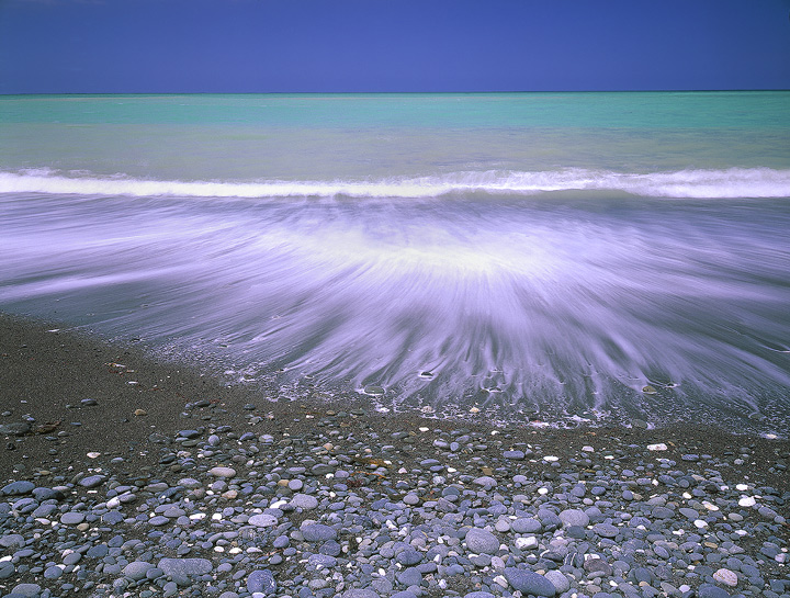
the light didn't ask for more to include. (but then, it's plenty, isnt it?)
(Location: East Coast New Zealand, near Kaikoura)

Verena

Toyo Field 45 AII, 75mm, 0,6 ND-Grad, Velvia 50 (which, btw, just made a comeback on the market!!!)

Comments

29 comments
Comment posted by Jerry Greer on January 2, 2007 at 1:25 PM
The sky may be just a tade dark due to the grad but I love the clean feel to this image. Very nice Verena! :toast:
Registered on November 1, 2003, 404 Posts, 1977 Comments
Comment posted by Verena & Georg Pop on January 2, 2007 at 1:45 PM
Jerry, yes but it was dark, as there was a little stormfront coming in. I used the nd-grad not for darkening the sky (sure, it would have worked withouit it, technically seen) but to help keep the drama alive. sometimes those dark clouds turn out too "harmless".
verena
Registered on July 5, 2006, 272 Posts, 2823 Comments
Comment posted by Alice Scoggins on January 2, 2007 at 2:00 PM
Really interesting shot! I like all the elements in the different layers. I especially like the water treatment, it looks very delicate. :toast:
Registered on February 21, 2005, 430 Posts, 5959 Comments
Comment posted by Paul Breitkreuz on January 2, 2007 at 2:15 PM
Extremely relaxing feel to this one Verena. Although the sky is dark, it gives a feeling of a tropical storm brewing.
Registered on February 25, 2006, 525 Posts, 8448 Comments
Comment posted by Leann Greene on January 2, 2007 at 2:18 PM
Vibrant colours and fascinating wave patterns-like fingers or wings reaching fro the stones. Very eye catching and lovely.
Registered on January 25, 2006, 223 Posts, 3566 Comments
Comment posted by Guy Tal on January 2, 2007 at 4:27 PM
Beautiful combination of layers and a great array of blues. The sweep in the retreating wave is a very dynamic element and fits perfectly into the composition. Definitely up to your usual standard of excellence.

Guy
Registered on November 1, 2003, 566 Posts, 15507 Comments
Comment posted by Bill Chambers on January 2, 2007 at 5:16 PM
Beautiful Verena - I love the layers of colors and the motion of the water.
Registered on April 10, 2005, 753 Posts, 21216 Comments
Comment posted by Anil Rao on January 2, 2007 at 6:07 PM
Hi Verena,

I love the overall design of this image. Its very striking! However, that sky is killing it for me. This is just my opinion (and as such can be easily disregarded) but I feel that if you eliminate it completely, the image becomes much stronger.
Registered on November 15, 2003, 234 Posts, 4923 Comments
Comment posted by Mike Dawson on January 2, 2007 at 6:40 PM
I like the image, although I think I like it better without the sky, has the distinct feel of A goddess of the deep letting her hair down on the beach
Registered on February 4, 2006, 364 Posts, 8872 Comments
Comment posted by Marc Adamus on January 2, 2007 at 6:50 PM
I think the sky and infinite expanse beyond not only gives context to the crashing surf but provides depth, which I like. Great capture of the wave action - especially with 4x5 sheets being so expensive. The whites are feeling a little too hot for me, but stilll a very nice image.
Registered on September 17, 2005, 780 Posts, 8091 Comments
Comment posted by Josh Anderson on January 2, 2007 at 7:30 PM
The whites are pretty hot. Other than that, I love it.
Registered on June 2, 2005, 493 Posts, 2996 Comments
Comment posted by Kah Kit Yoong on January 2, 2007 at 8:23 PM
I think the sky is an important static backdrop for the action here. The water motion is beautifully captured.
Registered on September 27, 2006, 636 Posts, 10682 Comments
Comment posted by Doug Dolde on January 2, 2007 at 9:33 PM
This is an ultra cool composition but I'm bugged by the blown highlights and apparent color cast. A drum scan might rescue it.
Registered on November 1, 2003, 305 Posts, 3900 Comments
Comment posted by Dan Baumbach on January 2, 2007 at 10:32 PM
Another beauty from you two. Always a pleasure to see them.

- Dan.
Registered on November 1, 2003, 473 Posts, 7980 Comments
Comment posted by beth summer on January 2, 2007 at 10:54 PM
I think the sky is essential in this image to show depth of scale and an overall sense of grandeur. I like the "pulling" effect of the waves but yes, a tad hot on the waves. Still, I'd be happy with this in my portfolio, Verena. Nicely done.
Registered on November 1, 2003, 437 Posts, 5220 Comments
Comment posted by Bill Fach on January 2, 2007 at 11:20 PM
Verena: I really like the distinct zones of this comp. Lots to look at and like. >=))>
Registered on November 1, 2003, 1805 Posts, 26981 Comments
Comment posted by Gary Gulash on January 3, 2007 at 12:17 AM
Beautiful image, criticisms have been pretty well aired out, but I will add that it could use a little bit of a horizon correction with some ccw rotation. Very nice!!! :toast:
Registered on January 28, 2005, 879 Posts, 12098 Comments
Comment posted by Jack Brauer on January 3, 2007 at 2:22 AM
I really like the 2-dimensional composition, and the way that the rocks at the bottom give way to increasing abstraction. Really cool.
Registered on September 12, 2005, 40 Posts, 627 Comments
Comment posted by Verena & Georg Pop on January 3, 2007 at 7:12 AM
thanks for the comments. yes, the highlights are a little burned out here, luckily however not in the original file. this is a flatbed scan (VF 750 pro), which is fine unless there are problems in shadows or highlights (or both)....
other than some suggested there is NO color cast and I just very slightly used the saturation-feature to get the jpg file to look as the original Velvia 50 slide. this is not the color of a cloudless sky but JUST featureless clouds. to me the image without sky loses depth and gets a little too simple, but I very much appreciate the input and critique, as it is always interesting how different viewers react. I especially like Mike' s comment of "the goddess of the deep, letting her hair down on the beach" - great, I never thought of it that way.

verena
Registered on July 5, 2006, 272 Posts, 2823 Comments
Comment posted by Patrik Larsson on January 3, 2007 at 7:21 AM
Lovely colors and great wave action!
Registered on July 10, 2004, 5 Posts, 23 Comments
Comment posted by Michael Handley on January 3, 2007 at 11:38 AM
What a strange color palette. But it works. Nice image.

Michael
Registered on April 1, 2004, 38 Posts, 1301 Comments
Comment posted by Wendy Blanchard on January 3, 2007 at 7:29 PM
I dont know what ESS means but for me its Extra Special Splendor. I miss the ocean haven't been in awhile. Very nice shot!! You have captured the love of my life perfectly. :toast:
Registered on June 11, 2006, 58 Posts, 647 Comments
Comment posted by Harley Goldman on January 3, 2007 at 7:59 PM
Very cool shot! Great colors!

I just gave up on the new Velvia 100. It is doing too much weird stuff to reds. The old 50 version was better, but not sure I can live with shooting at 40 anymore. Might give Provia a go.
Registered on November 19, 2003, 586 Posts, 11271 Comments
Comment posted by Michael Anderson on January 3, 2007 at 8:27 PM
Verena,

I really like the composition, the beautiful water movement and the I prefer a darker sky. The green translucent water often appears brighter than the sky in reality and I prefer the color tone separation you have captured. It's rare to see an image of these spectacular waters that actually focuses on the water and doesn't include a palm tree somewhere. Very well done.
Registered on January 31, 2006, 228 Posts, 3072 Comments
Comment posted by Rick Lundh on January 4, 2007 at 12:09 AM
Verena,
The colors are very pleasing in a tropical way. I might prefer to pull back the highlight in the wave action a little, and a tad bit o crop off the bottom. Overall, really nice image.
Registered on April 28, 2004, 774 Posts, 4351 Comments
Comment posted by Bill Chambers on January 8, 2007 at 10:22 AM
Congrats on the EP! Very well deserved.
Registered on April 10, 2005, 753 Posts, 21216 Comments
Comment posted by Doug Benner on January 8, 2007 at 2:53 PM
beautiful and creative composition. congrats.
Registered on December 8, 2003, 482 Posts, 1868 Comments
Comment posted by Jose Suro on January 9, 2007 at 9:07 AM
Outstanding image with perfect light and color. Congrats on the EP!

Best,

Jose
Registered on June 24, 2006, 267 Posts, 2273 Comments
Comment posted by Mark Metternich on November 10, 2009 at 3:39 PM
Nice!
Registered on June 19, 2009, 276 Posts, 6240 Comments