Nature Photographers Network
This is the preserved archive of the original Nature Photographers Network. The community continues at naturephotographers.network.
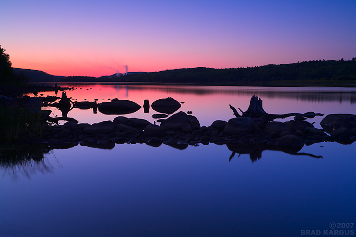
Stumps (2 views)
‹ PreviousMan & Nature GalleryNext ›

Stumps (2 views)

by Brad Kargus

Gallery: Man & NaturePosted August 15, 20071,967 views9 comments
Stumps dot the shoreline along this stretch of the Ottawa River while steam rises from the stacks of a pulp and paper mill in the distance.

5D, 17-40@40, f/16, 15sec, ISO100, 3HS GND, tripod, lots of not-so-helpful assistants (mosquitoes)

Comments

9 comments
Comment posted by Brad Kargus on August 15, 2007 at 2:19 AM
Same settings except at 24mm.
Registered on January 19, 2007, 47 Posts, 1051 Comments
Comment posted by Mike Dawson on August 15, 2007 at 2:25 AM
I like the first version best, wonderfully graphic and colorful image
Registered on February 4, 2006, 364 Posts, 8872 Comments
Comment posted by Mia McPherson on August 15, 2007 at 5:17 AM
I also like the first version best. Love the colors!
Registered on June 25, 2007, 491 Posts, 12566 Comments
Comment posted by Gabi Lach on August 15, 2007 at 10:36 AM
Lovely colors, Brad! I like the first version better. It feels very calm with great mood. Nice work. :smile:
Registered on May 1, 2007, 101 Posts, 3187 Comments
Comment posted by Kah Kit Yoong on August 15, 2007 at 11:23 PM
The first version seems much better balanced, sky to water wise. Great colours & nicely exposed.
Registered on September 27, 2006, 636 Posts, 10682 Comments
Comment posted by Eric Good on August 16, 2007 at 12:26 AM
This is actually a hard choice for me between the two. The first is definitely more conventional and appealing in it's own right, but the second's blue water gradient with just a hint of the three small stones really feels sweet as well. I might actually lean towards the second version, but they're both quite nice.
Registered on March 17, 2007, 116 Posts, 4764 Comments
Comment posted by Mark Pelton on August 16, 2007 at 1:01 PM
Very cool color gradient. I like the starkness of the near silhouette comp.
Registered on November 25, 2003, 380 Posts, 4647 Comments
Comment posted by Gary Minish on August 18, 2007 at 2:21 PM
Love the silhouettes and colors, Brad. I think I would crop the darker blue off the bottom of the first one and turn it into a panorama....but then I have a passion for panoramas :rolleyes:
Registered on February 4, 2006, 625 Posts, 3583 Comments
Comment posted by INGOMA on August 20, 2007 at 8:12 AM
Congrats on the editor's choice, Brad! Great colors and I love the mood.
Registered on July 2, 2004, 231 Posts, 3110 Comments