Gallery: WildlifePosted November 14, 200999 views7 comments
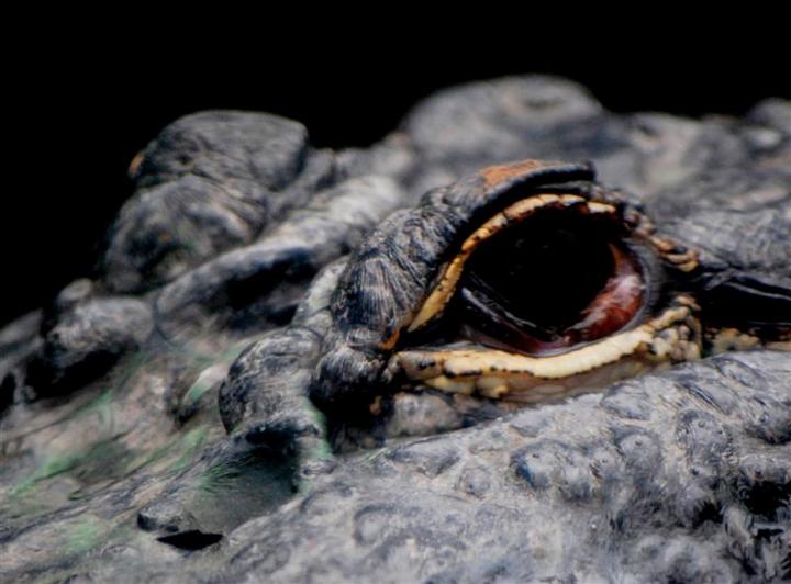
Took this alligator portrait at North Carolina Aquarium using a Nikon D40x set at Iso 800, F5.6 at 1/40 . I debated additional cropping?
Comments
7 comments
Comment posted by Sam Rua on November 14, 2009 at 12:19 PM
An interesting comp, Bob. Unfortunately, the eye looks starkly lifeless. Some fill flash to get some catch light would have really helped here. You may want to try some post processing to see if bumping the brightness, levels, or shadows helps.
Registered on September 9, 2006, 130 Posts, 2281 Comments
Comment posted by Mike Bonar on November 14, 2009 at 1:38 PM
I always enjoy close-up wildlife eye shots. I agree with Sam, some catch light in the eye would have really made this shot pop! But considering the potential disposition of this subject, it is a good shot!
Registered on November 11, 2009, 25 Posts, 50 Comments
Comment posted by Sally King on November 14, 2009 at 3:36 PM
I like the interesting perspective. Those are some protected eyes. I agree with the others that a catchlight would be helpful. A flash may not have worked in an aquarium setting and the lighting in those places can be extremely difficult for photography. Looks just a bit on the soft side too.
Registered on December 2, 2008, 416 Posts, 4450 Comments
Comment posted by Rick Gomez on November 14, 2009 at 11:22 PM
Crop looks pretty good to me! I wish there was a bit more catchlight in the eye, yet at the same time, I guess it adds to the gator's mysterious ways.
Great shot!
Registered on March 3, 2007, 206 Posts, 1853 Comments
Comment posted by Bob Grassi on November 15, 2009 at 4:20 AM
Thanks for your comments. I went back to my orignal file which is presented, and agree that lighting
definitely is a plus.BobG
Registered on July 12, 2009, 43 Posts, 41 Comments
Comment posted by Vincent Grafhorst on November 15, 2009 at 12:34 PM
Hi Bob, the detail you managed to retrieve in the repost is certainly helping the image as a whole. However, now it looks a bit too flat/washed out. Bump up the mid tone contrast and maybe saturation and you will have a very appealing image.
Registered on February 24, 2006, 504 Posts, 7203 Comments
Comment posted by John Tobias on November 15, 2009 at 8:20 PM
The second version is better, but does seem to lack contrast. I do like the original crop better than the repost.
Registered on September 12, 2009, 2120 Posts, 6455 Comments

Comments
7 commentsGreat shot!
definitely is a plus.BobG