Nature Photographers Network
This is the preserved archive of the original Nature Photographers Network. The community continues at naturephotographers.network.
Island in the Sky
‹ PreviousLandscape GalleryNext ›

Island in the Sky

by Stan Rose

Gallery: LandscapePosted January 14, 2010356 views48 comments
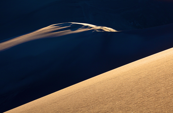
I had a couple plans in mind for my latest excursion to the Sand Dunes. With perfectly clear skies, i figued that would work best for some large scale abstracts and for some new night shots (more of that later). This was shortly before sunset yesterday from an area that has probably rarely been photographed. It was a magical scene--i keep thinking i'll run out of subjects at the Sand Dunes, but they keep providing me with new material. See B&W below.
5Dmkii; 100mm, /60s at f/16
C&C welcome!

Comments

48 comments
Comment posted by Stan Rose on January 14, 2010 at 3:09 AM
Heres the B&W.
Registered on September 15, 2005, 836 Posts, 17099 Comments
Comment posted by Joseph Campisi on January 14, 2010 at 3:20 AM
Otherworldly is the only way I can describe this Stan...love it.
The B&W is cool, but the color version has more depth, IMO. Well seen! :toast:
Registered on November 24, 2008, 304 Posts, 3211 Comments
Comment posted by John&Patty Benway on January 14, 2010 at 5:22 AM
Really nice Stan, and very well composed, and I especially like the little section of dunes surrounded in darkness. Color version most definitely. Beautiful work.
John
Registered on May 12, 2006, 626 Posts, 8700 Comments
Comment posted by Hamed Musharbak on January 14, 2010 at 6:12 AM
Hi Stan

this is just great

i like the contrast here btw the light & shadow

mmm i think something wrong with my screen because the shadow areas seems to be pixelated & colorized :confused:

Hamed
Registered on June 1, 2009, 372 Posts, 2282 Comments
Comment posted by Giovanni Allievi on January 14, 2010 at 7:36 AM
Lovely composition Stan.

I like the blue hint in the shadows.

Giovanni
Registered on March 26, 2008, 87 Posts, 379 Comments
Comment posted by Nick Moore on January 14, 2010 at 8:30 AM
This is very unique Stan, I really like the diagonals and the "floating" island, excellent stuff!.
Registered on May 23, 2006, 93 Posts, 2228 Comments
Comment posted by Robert Dayton on January 14, 2010 at 9:11 AM
Your previsualizing of abstracts certainly worked here. This is so well done it
almost has a three dimensional effect. There both worthy, but I prefer the B &
W.
Registered on November 11, 2008, 281 Posts, 3958 Comments
Comment posted by Barry Vangrov on January 14, 2010 at 9:12 AM
I prefer the B&W with the strong contrast and diagonal comp. The shadows in the color version have a blue cast on my monitor. Is there any way to bring out a little more detail in the shadows without losing the great contrast? I'm straining to see whats in there. :smile:
Registered on September 1, 2009, 148 Posts, 749 Comments
Comment posted by Stan Rose on January 14, 2010 at 9:34 AM
The cast would have been a lot more blue if i hadnt have used a custom white balance, Barry. This was one shoot where i can confidently say that the colors are nearly identical to what i saw, because i checked them on site, its somethng ive been trying to do more of lately. I could easily bring up the shadows here, but that would destroy the whole idea of the shot, at least how i saw it (hence the title). I processed it with a little extra contrast so that there is just a hint of detail--its all in deep shadows anyways, so i didnt see any reason to show things (like the patches of old snow in the upper right side) that i could barely see in person. Thanks for your comment!
Registered on September 15, 2005, 836 Posts, 17099 Comments
Comment posted by Rafael Rojas on January 14, 2010 at 9:37 AM
As soon as I saw this I knew it was signed Stan :)
Gorgeous, the only think I would have liked more than this is the background dune just lit at the tip, leaving the whole thing floating amidst the blank black background. I guess you too, but I dont think you are able to move mountains of sand at will (not yet, at least :)) That does not mean the image as it is lacks impact or interest. I like it Stan,
Registered on March 1, 2009, 56 Posts, 623 Comments
Comment posted by Stan Rose on January 14, 2010 at 9:52 AM
Rafael--thanks, if you stand a couple feet away and squint you can get the effect you're looking for :biggrin: :wink:
Registered on September 15, 2005, 836 Posts, 17099 Comments
Comment posted by Paul Wegemann on January 14, 2010 at 10:10 AM
This is fabulous, Stan! The color version appeals to me a lot more than the B&W. At first I kept thinking the bright foreground was overwhelming the background, but the more I've looked at this, the more I've come to appreciate the balance between the two. I do think Rafael has a good point for an alternative comp, so you'll just have to go back. :smile:
Registered on December 14, 2006, 58 Posts, 1888 Comments
Comment posted by Harley Goldman on January 14, 2010 at 10:24 AM
Very, very cool image, Stan!!! Definitely other-worldly. I really like both, but I think the B&W has more impact and sense of mystery. Great work!
Registered on November 19, 2003, 586 Posts, 11271 Comments
Comment posted by Laurent Baig on January 14, 2010 at 10:25 AM
Sweet!
Registered on January 12, 2005, 206 Posts, 6784 Comments
Comment posted by Mike Bohlander on January 14, 2010 at 11:19 AM
I'm partial to the B&W version myself, but the color is no slouch either. Very nice layering.
Registered on August 22, 2008, 14 Posts, 125 Comments
Comment posted by Nicolas Belokurov on January 14, 2010 at 11:27 AM
Top notch work Stan, i really prefer the color version- it has more subtle tonalities imho.
Registered on July 22, 2009, 41 Posts, 533 Comments
Comment posted by Ricardo La Piettra on January 14, 2010 at 11:34 AM
Color version for me Stan, stunning image, abstract for sure.
Registered on July 22, 2009, 62 Posts, 730 Comments
Comment posted by Ron Richins on January 14, 2010 at 11:52 AM
Love the color version. The thing that makes this image for me is the light hitting the distant dune. So definitely keep the deep shadows.
Registered on March 6, 2008, 113 Posts, 1009 Comments
Comment posted by Kirk Greene on January 14, 2010 at 11:57 AM
I like the graphic nature & simplicity of this image. I wish the shadows were actually a bit darker. I am surprised to say this but I prefer the color version. I usually prefer B&W with this type of image.
Registered on May 12, 2004, 191 Posts, 1578 Comments
Comment posted by Kevin Trinkner on January 14, 2010 at 11:58 AM
Killer shot Stan, you keep coming back with some outstanding work from here. Love that Island and the sense of space you've created. Great capture. I'm torn, but I think I prefer the color..
Registered on June 30, 2008, 203 Posts, 2641 Comments
Comment posted by Gabi Lach on January 14, 2010 at 11:58 AM
Crisp, clean and beautiful. Well done, Stan. Both versions.
Registered on May 1, 2007, 101 Posts, 3187 Comments
Comment posted by Eva McDermott on January 14, 2010 at 12:18 PM
Very ethereal Stan. I like the color version a little better. When I first saw the thumbnail, 2001 A Space Odyssey came to mind. Excellent work.
Registered on January 4, 2009, 1015 Posts, 13229 Comments
Comment posted by Bruce Palla on January 14, 2010 at 1:09 PM
Awesome shot and effect! B/W version for my 2 cents.
Registered on December 19, 2007, 25 Posts, 328 Comments
Comment posted by Abdullaziz Bin Ali on January 14, 2010 at 2:39 PM
Beautiful work Stan, I love this blue shadow. The contrast between these two colors are magnificent
The best thing here I really like is the proper exposure where we I can see details every where

Great work Stan :wink:


Waiting for the next awesome work :wavey:
Registered on May 31, 2009, 112 Posts, 1590 Comments
Comment posted by Rajeev Thomas on January 14, 2010 at 4:15 PM
Love this one Stan!!! :toast: I love the color version...
Registered on February 20, 2008, 0 Posts, 291 Comments
Comment posted by Todd Liotine on January 14, 2010 at 6:45 PM
Very nice, the color version is best for my taste. This a great example of composing with light
Registered on July 1, 2008, 131 Posts, 671 Comments
Comment posted by Youssef Ismail on January 14, 2010 at 6:51 PM
Very nice. I think I will call you Sand Rose from now on. :biggrin: I like how the dune in the background just appears out of nowhere. Color is my preference.
Registered on November 1, 2003, 474 Posts, 5555 Comments
Comment posted by Marc Ward on January 14, 2010 at 10:01 PM
Stan,
I love this... The floating dune really pulls one into the image and makes you study the image. I find the color image more pleasing. There is some wonderfully subtle things going on in the blue areas of the image. You make me want to travel out to the dunes... :wavey:
Registered on February 26, 2009, 304 Posts, 1365 Comments
Comment posted by Daniel Ewert on January 14, 2010 at 10:09 PM
This is great, Stan. I like the color version much more. The play of light is just awesome.
Registered on June 2, 2009, 103 Posts, 1500 Comments
Comment posted by Anthony Vincent on January 14, 2010 at 10:38 PM
Really sweet Stan, you outdid yourself again. I am enjoying both version, the b+w in particular. There is a certain mysterious quality about it. Now the color is great on it's own as well. I am wondering if the blues where toned way down how it would look. Spectacular shots btw.
Thanks for sharing
Registered on February 5, 2009, 199 Posts, 2775 Comments
Comment posted by Albert Darmo on January 14, 2010 at 10:54 PM
Hi Stan :wavey: I wish i could comment on all your fine work, But my weak eyes need rest sometimes :rolleyes: But i could not pass this one up. :smile: I really love this fine composition and awesome light. i'll take the color version :eek: Both are superb.
Albert Darmo Canada
Registered on November 25, 2008, 1386 Posts, 11978 Comments
Comment posted by Chris Chamberlain on January 14, 2010 at 11:19 PM
This is very edgy. It seems like there is a lot of tension in the angles, and light/shadow. This makes the entire image very dynamic IMO. I'd like to see this in a print, in order to see all the little grainy details in the foreground.

Chris
Registered on March 13, 2007, 500 Posts, 8365 Comments
Comment posted by Stuart Williams on January 15, 2010 at 1:18 AM
excellent stan - this is where the compositional aspects of the photo are most important and yours works well. love both renditions.
Registered on December 7, 2007, 247 Posts, 4792 Comments
Comment posted by John Williams on January 15, 2010 at 1:36 AM
That's fantastic Stan, otherwordly is exactly the word that came to my mind too! Color for me.
Registered on September 6, 2007, 221 Posts, 5985 Comments
Comment posted by Lon Overacker on January 15, 2010 at 1:36 AM
Stan,

i keep thinking i'll run out of subjects at the Sand Dunes,

I keep thinking you'll run out of subjects...... and you keep turning out winners! This is wonderful - I would say other-wordly. In fact, this could easily pass as an image of space; you know, the one where the space craft has a view of some distant planet's surface with a view back to earth - or vice versa? Well this has that look to me; and image from space with the surface of some planet in the foreground with the surface or some other galaxy feature in the background. The color or b&w version both do the same thing....

Outstanding imagery Stan. Ok, this is repetitive, but others haven't heard it... when is the book coming out???

Lon
Registered on November 24, 2006, 521 Posts, 19147 Comments
Comment posted by Kent Mearig on January 15, 2010 at 1:39 AM
It's easier for me to pick of those subtleties of tone in the shadows in the black and white version, which I very much like. On the other hand, the colors are not at all distracting, and they are a pleasing combination. It would be really hard for me to choose one or the other, but I lean B&W in this case.

I know what it's like to have a subject around with limitless potential. What a blessing.
Registered on September 4, 2006, 237 Posts, 4748 Comments
Comment posted by Stan Rose on January 15, 2010 at 2:50 AM
Thanks for all the kind remarks, folks!
Lon, im glad this connected with you in the way it did--Eva mentioned 2001, which happens to be my all time fav movie, i love spacy things and thats probably the main reason i love shooting the dunes. As for the book--discussions are underway, i may wait til Spring to get a few more shots of the mountain lakes that are part of the park. :wavey:
Registered on September 15, 2005, 836 Posts, 17099 Comments
Comment posted by Anil Rao on January 15, 2010 at 3:05 AM
This is very very creative, Stan. The play of light and shadow has been done to excellence. I'd be really proud to have made an image such as this.
Registered on November 15, 2003, 234 Posts, 4923 Comments
Comment posted by Lajos Horvath on January 15, 2010 at 9:51 AM
Amazing, Stan!
I prefer the colour version. If I were in the space, above a planet!
It could be very good, without foreground, just the "island", too.
Congrats.
Registered on January 3, 2010, 30 Posts, 92 Comments
Comment posted by Ryan Shain on January 15, 2010 at 1:07 PM
Sweet capture Stan,

I love the detail and illumination in the immediate foreground, and of course the diagonals, comp and contrast rock!!!!
Registered on February 20, 2007, 226 Posts, 4571 Comments
Comment posted by Vance Gese on January 15, 2010 at 2:33 PM
Phenomenal image Stan. Color image wins hands down in my book; the light glows. Love it.
Registered on November 13, 2008, 298 Posts, 6629 Comments
Comment posted by Mark Metternich on January 15, 2010 at 4:36 PM
Stan, you da man! Love it.

Mark
Registered on June 19, 2009, 276 Posts, 6240 Comments
Comment posted by Nick Holland on January 15, 2010 at 5:29 PM
Reminds of the view the first astronauts had looking back at the earth.
Beautiful and "other worldly"
Registered on August 18, 2007, 19 Posts, 38 Comments
Comment posted by Tony Kuyper on January 15, 2010 at 7:19 PM
I really like this, Stan. Wonderful concept for a sand dune. Technically, I would prefer a little burning at the top right of the foreground dune. The brightness in this area feels like it's strayed a bit too far from that of the rest of the dune.
Registered on November 1, 2003, 364 Posts, 22328 Comments
Comment posted by Reno DiTullio on January 15, 2010 at 7:53 PM
The BW really makes it look like something oozing out of the primordial muck, the eyes and back just breaking the surface, very cool :toast:
Registered on November 14, 2003, 130 Posts, 1644 Comments
Comment posted by Morris McClung on January 15, 2010 at 9:00 PM
A seriously excellent photo. Color for me.
Registered on May 7, 2007, 670 Posts, 19650 Comments
Comment posted by Chip Phillips on January 16, 2010 at 2:18 AM
Very cool Stan. I love the color version. A very 3 dimensional image. Very well composed.
Registered on November 26, 2007, 128 Posts, 1436 Comments
Comment posted by Stan Rose on January 16, 2010 at 2:32 AM
Thanks for all the comments, folks! :toast:
Registered on September 15, 2005, 836 Posts, 17099 Comments