Gallery: LandscapePosted January 21, 2010436 views31 comments
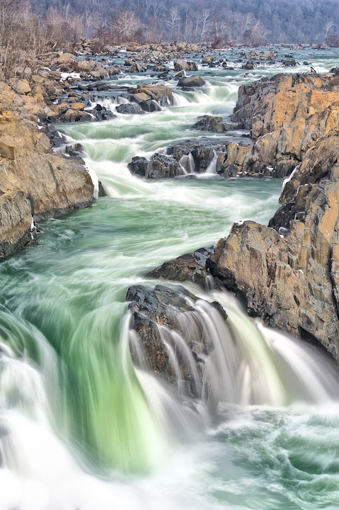
A shot from last weekend at Great Falls Park, VA. In post processing, I found that heavy sharpening gave a look to the water that I really liked but what do you think? Is it totally overboard or passable?
Comments
31 comments
Comment posted by Eva McDermott on January 22, 2010 at 12:25 AM
I like the greens and zig-zags of the water and interspersing of rocks Mike.
Registered on January 4, 2009, 1015 Posts, 13229 Comments
Comment posted by Abdullaziz Bin Ali on January 22, 2010 at 2:42 AM
Almost drawing :)
I love the motion of the water and the composition is stunning
Lovely work
Registered on May 31, 2009, 112 Posts, 1590 Comments
Comment posted by Ken Smith on January 22, 2010 at 3:15 AM
The oversharpening works for me. I like the effect...seems as if the sharpening added contrast to the whites against the greens making both more attractive. Well done.
Registered on September 5, 2008, 449 Posts, 2444 Comments
Comment posted by Michael E. Gordon on January 22, 2010 at 3:27 AM
Great composition, with neat colors and a ruggedly cool location. From a print perspective, I think it would greatly benefit from edge burning.
Registered on November 1, 2003, 90 Posts, 2482 Comments
Comment posted by Mike Walker on January 22, 2010 at 6:55 AM
Thanks Michael for the link to edge burning. I'll give that a try for printing.
Registered on December 12, 2009, 11 Posts, 14 Comments
Comment posted by Jay Nielsen on January 22, 2010 at 7:31 AM
Wow the colors at the bottom of the frame are totally mezmorizing. I could look at this for a long time, have been actually! I also like it scrolling down to crop the trees off the top of the frame, just an option to consider.
Registered on October 6, 2008, 137 Posts, 720 Comments
Comment posted by Guy Tal on January 22, 2010 at 7:38 AM
Great composition and I love the soft palette and emerald green waters. What a beautiful place.
Guy
Registered on November 1, 2003, 566 Posts, 15507 Comments
Comment posted by Bill Chambers on January 22, 2010 at 8:08 AM
Excellent image Mike, and a very well thought out composition.
Registered on April 10, 2005, 753 Posts, 21216 Comments
Comment posted by Morris McClung on January 22, 2010 at 9:45 AM
Excellent comp and depth in this one. I also like the effect it has on the water and the rocks.
Registered on May 7, 2007, 670 Posts, 19650 Comments
Comment posted by Kenn Leonhardt on January 22, 2010 at 10:37 AM
Cool waterfall and composition. The sharpening suits the scene.
Appears a bit over-exposed and bright overall, thus causing the water to appear a bit blown out in a few places (bottom left corner most notably). Perhaps if you go back to the raw file you can bring out some more detail in those highlights, and also make the darker tones a bit richer.
Registered on March 29, 2008, 27 Posts, 1710 Comments
Comment posted by Dietrich Gloger on January 22, 2010 at 11:47 AM
Wow, amazing shot Mike! Love the high key pastel look. Wonderful water treatment too.
Registered on January 26, 2007, 360 Posts, 9876 Comments
Comment posted by Rick Gomez on January 22, 2010 at 12:04 PM
Looks awesome! An eye catcher for sure!
Registered on March 3, 2007, 206 Posts, 1853 Comments
Comment posted by Daniel Rappaport on January 22, 2010 at 12:44 PM
I appreciate that you may have purposefully been going for the high key look that I see on my monitor, but wonder if you might try moving things a bit darker, less blown out highlights and some true black. I love the composition and the green is beautiful.
Registered on September 9, 2009, 294 Posts, 2006 Comments
Comment posted by Bob&Charly Nelson on January 22, 2010 at 1:03 PM
I like the work you put into this Mike, and really well composed.
Bob
Registered on October 27, 2005, 289 Posts, 4202 Comments
Comment posted by István Molnár on January 22, 2010 at 1:46 PM
Wonderful composition. I like the long exposition, the river is nice and it has very interesting colors.
Congrats: István
István Molnár
Beled
Hungary
Registered on January 7, 2010, 114 Posts, 704 Comments
Comment posted by Nick Holland on January 22, 2010 at 6:18 PM
Love it! How would it look with trees in the distance cropped out?
Registered on August 18, 2007, 19 Posts, 38 Comments
Comment posted by Mark Capurso on January 22, 2010 at 6:52 PM
Totally Passable! Great shot!
Mark Capurso
Phx AZ
Registered on January 4, 2008, 47 Posts, 321 Comments
Comment posted by Reed Bowman on January 22, 2010 at 8:59 PM
oh man, I'm a bit torn. I love the effect on the water and I love the composition, but the bg rocks seemed washed out. Maybe just boosting the contrast a bit would help? Also, some of the highlights in the fg water seem blown, so maybe some buring there?
Registered on March 2, 2009, 166 Posts, 1058 Comments
Comment posted by Mike Walker on January 22, 2010 at 9:21 PM
Wow, I really appreciate everyone's feedback. This is a great forum, I like to think that I've been able to improve each image I have posted here based on the feedback I've received. So I wanted to post another version of this image where I have tried to recover some detail in the water and add some contrast to the rocks while bringing down the overall brightness of the scene. I haven't cropped the trees out, as some folks have suggested, because I just prefer having the trees in the background. I would appreciate any comments on whether you think this new version is an improvement over the original.
Registered on December 12, 2009, 11 Posts, 14 Comments
Comment posted by Albert Darmo on January 22, 2010 at 11:08 PM
Hi Mike I like everything about this scene. The motion of the water, And the detail, and colors.
Albert Darmo Canada
Registered on November 25, 2008, 1386 Posts, 11978 Comments
Comment posted by Tony Kuyper on January 22, 2010 at 11:24 PM
The sharpening looks fine. I like the soft light and the lack of any real shadows. It's an interesting way to present a nature photo.
Registered on November 1, 2003, 364 Posts, 22328 Comments
Comment posted by Stuart Williams on January 22, 2010 at 11:36 PM
mike, i like this - the result is very painterly. whichever part of your processing has somewhat flatterned the image as it has eradicated any haze that may have been there. the composition is however excellent and i love those greens.
Registered on December 7, 2007, 247 Posts, 4792 Comments
Comment posted by Kenn Leonhardt on January 23, 2010 at 1:39 AM
Both have their pros and cons, but I prefer your repost, mainly due to the added detail of the water. However, I think that overall something roughly between the two versions would be ideal. Keep up the good work.
Registered on March 29, 2008, 27 Posts, 1710 Comments
Comment posted by Verena & Georg Pop on January 23, 2010 at 6:49 AM
well, I really like the look from the 1st version better and I think edge burning is great too but the rest of the scene should be kept like it is in the 1st. it looks unusual in its soft and pastel rendering. the style of the 2nd is too "classic"...
georg
Registered on July 5, 2006, 272 Posts, 2823 Comments
Comment posted by Jimmy Gekas on January 23, 2010 at 1:09 PM
This is a wonderful scene! I prefer the first version, for it has a softer, more artistic feel to the overall image.
Registered on July 26, 2007, 244 Posts, 2807 Comments
Comment posted by Neven Dries on January 23, 2010 at 1:14 PM
I think both vesions are great! The greens of the water are really eye catching. My only suggestion wold be a slight crop to drop the trees off the top. Just seeing all the rocks and water really makes it flow.
Registered on February 24, 2006, 52 Posts, 160 Comments
Comment posted by Stephen Weaver on January 23, 2010 at 1:53 PM
I actually prefer the first version. There is a certain luminosity to it that gives an almost pastel look.
Registered on November 1, 2003, 226 Posts, 623 Comments
Comment posted by Helio Cristovao on January 23, 2010 at 6:25 PM
Mike, this is great! 1st version, works really better for my taste, looks like a painting. Beautiful scene overall.
Registered on September 15, 2009, 83 Posts, 434 Comments
Comment posted by Joseph Rossbach on January 23, 2010 at 7:48 PM
Great image Mike!!
I agree with what a few of the others have already said, I love the water in the original and the composition is flawless. The rocks seem a bit bright, but the second post is a right on!!
Supremely sweet image man!
Registered on November 25, 2005, 484 Posts, 1377 Comments
Comment posted by Dan Baumbach on January 24, 2010 at 3:04 PM
Wonderful composition and color. Great image.
- Dan.
Registered on November 1, 2003, 473 Posts, 7980 Comments
Comment posted by Dean Sauskojus on January 24, 2010 at 5:11 PM
Mike, I like the trees in the background for the added compositional element. I think I prefer the second image, mainly because in the first the water in the bottom left corner is blown out. The rocks also have a little more natural look to them IMO. The only thing is that you do lose the softer light. I'd love to see it printed. Nice work.
Registered on September 29, 2009, 137 Posts, 2659 Comments

Comments
31 commentsI love the motion of the water and the composition is stunning
Lovely work
Guy
Appears a bit over-exposed and bright overall, thus causing the water to appear a bit blown out in a few places (bottom left corner most notably). Perhaps if you go back to the raw file you can bring out some more detail in those highlights, and also make the darker tones a bit richer.
Bob
Congrats: István
István Molnár
Beled
Hungary
Mark Capurso
Phx AZ
Albert Darmo Canada
georg
I agree with what a few of the others have already said, I love the water in the original and the composition is flawless. The rocks seem a bit bright, but the second post is a right on!!
Supremely sweet image man!
- Dan.