Gallery: LandscapePosted April 21, 2010811 views43 comments
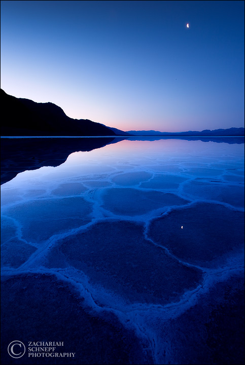
A vertical version shot just before the other one. I'm not sure I like the moon in this, I may take it out. Let me know what you think.
Comments
43 comments
Comment posted by Chris Chamberlain on April 21, 2010 at 3:39 PM
This is equally as awesome as the horizontal! I have never seen anything quite like these from here. It's pretty hard to criticize anythin here. But I guess I could do without the moon. At least the refection. It just looks like something that should be cloned out to me. But maybe at large size, it wouldn't be an issue. I kind of like it in the sky.
Chris
Registered on March 13, 2007, 500 Posts, 8365 Comments
Comment posted by Chris Rice on April 21, 2010 at 3:46 PM
Good lord this is beautiful Zack. Your title is dead on.
The Moon and the reflection makes for that additional mystique to the image. Well done.
Registered on February 2, 2009, 36 Posts, 96 Comments
Comment posted by Bill Chambers on April 21, 2010 at 3:50 PM
This is beautiful Zack - love the soft pastels on the horizon and reflection. I like the moon; it helps balance the shot IMO.
Registered on April 10, 2005, 753 Posts, 21216 Comments
Comment posted by Richard Sogn on April 21, 2010 at 4:06 PM
Registered on January 17, 2007, 68 Posts, 210 Comments
Comment posted by Richard Sogn on April 21, 2010 at 4:07 PM
Zach, this is one of your best. I vote for leaving the moon in.
Registered on January 17, 2007, 68 Posts, 210 Comments
Comment posted by Tyson Fisher on April 21, 2010 at 4:36 PM
Killer shot! I don't mind the moon at all. Good separation between the distant mountains.
Registered on September 17, 2008, 44 Posts, 623 Comments
Comment posted by Ian Cameron on April 21, 2010 at 5:02 PM
That's a belter Zack really excellent shot.
Registered on August 6, 2004, 1125 Posts, 3318 Comments
Comment posted by scott lanz on April 21, 2010 at 5:05 PM
Beautiful image. If it were my image, I'd definately keep the moon both because it was in the photo when the image was taken and eliminating it creates disclosure issues the same as adding a moon if there was none (just my opinion) and because it's a really nice element.
Registered on November 14, 2003, 840 Posts, 12902 Comments
Comment posted by Gary McGhee on April 21, 2010 at 5:09 PM
It's a cracking shot Zack, love the saturation. I dont think the moon has much impact in the shot but it's certainly not a distraction.
Gary.
Registered on April 15, 2010, 142 Posts, 2416 Comments
Comment posted by Zack Schnepf on April 21, 2010 at 5:11 PM
Here is a version without the moon just for reference.
Registered on November 1, 2003, 403 Posts, 2528 Comments
Comment posted by Ken Smith on April 21, 2010 at 5:37 PM
Zach, I like the blues...and clear water which looks like it could be 3 in or 30 ft depth. The still water matches the smooth sky ...nice balance and purity to the scene. Ken S
Registered on September 5, 2008, 449 Posts, 2444 Comments
Comment posted by Mark Pelton on April 21, 2010 at 6:13 PM
Fabulous image, Zack. I agree with Scott .
Registered on November 25, 2003, 380 Posts, 4647 Comments
Comment posted by Harley Goldman on April 21, 2010 at 6:52 PM
Beautiful scene. I prefer it without the moon, especially the reflected moon. Well done with the image.
Registered on November 19, 2003, 586 Posts, 11271 Comments
Comment posted by Rodney Ninow on April 21, 2010 at 7:49 PM
Beautiful shot, leave the moon in! I didn't see the other, where was this shot? Looks like the salt flats in Death Valley?
Registered on January 11, 2009, 7 Posts, 123 Comments
Comment posted by Zack Schnepf on April 21, 2010 at 7:51 PM
Right you are Rodney, this is Bad Water in Death Valley
Registered on November 1, 2003, 403 Posts, 2528 Comments
Comment posted by Kory Lidstrom on April 21, 2010 at 7:52 PM
Beautiful! For me, the moon is essential, otherwise the sky would constitute too much negative space. If anything, I might've shot the moon with a telephoto and cloned it in. Although, getting the reflection right would've been tough.
Registered on November 19, 2008, 49 Posts, 1035 Comments
Comment posted by Daniel Ewert on April 21, 2010 at 7:52 PM
Wonderful image, Zach. I would definitely keep the moon. On a large print it will look great.
Registered on June 2, 2009, 103 Posts, 1500 Comments
Comment posted by David Haynes on April 21, 2010 at 8:04 PM
Zack,
I think I prefer this to the landscape shot. Beautiful. I like the moon but not the reflection. If I had to pick one shot with or without both the moon and the reflection I would pick it without. It's a major distraction at first glance and it immediately draws you in for a closer inspection. When you see it's the moon and it's reflection, you're left to ponder how cool this shot would have been had the moon and it's reflection been bigger and more immediately identifiable. It's just 2 hot white dots in an otherwise clean, clear, and cool pallet. That being said, come on Zack....this is sick. What a find. You swear this planet Earth? Great title for a phenominal shot. I still want to see more from this trip. I can't get enough. Dave
Registered on February 20, 2010, 110 Posts, 1511 Comments
Comment posted by Mike Veltri on April 21, 2010 at 8:21 PM
This is an execllent shot Zack. I like the moon and would keep it, it adds to the image. Love the blues here as well.
Registered on February 3, 2007, 51 Posts, 1077 Comments
Comment posted by Dan Baumbach on April 21, 2010 at 8:23 PM
I like the stark simplicity of this. I don't mind the moon at all.
- Dan
Registered on November 1, 2003, 473 Posts, 7980 Comments
Comment posted by Eva McDermott on April 21, 2010 at 8:49 PM
Fantastic image Zack. I like the one with the moon.
Registered on January 4, 2009, 1015 Posts, 13229 Comments
Comment posted by Tony Kuyper on April 21, 2010 at 10:19 PM
Wonderful comp and light. I'd make the moon bigger.
Registered on November 1, 2003, 364 Posts, 22328 Comments
Comment posted by Dean Sauskojus on April 22, 2010 at 12:10 AM
I think I prefer the horizontal. It shows more of the underwater shapes which is the most important part of the image. If you do remove the moon I would crop the sky some. Excellent work.
Registered on September 29, 2009, 137 Posts, 2659 Comments
Comment posted by Zack Schnepf on April 22, 2010 at 12:47 AM
Thanks for all the great feedback, here is one more version without the moons and cropped from the top.
Registered on November 1, 2003, 403 Posts, 2528 Comments
Comment posted by Kenn Leonhardt on April 22, 2010 at 1:21 AM
I like the moon, but not its reflection. Of the versions you've posted, I think I like the latest the most, but really, they're all great. Looks like a dust spot below and to the left of where the moon is/was.
Registered on March 29, 2008, 27 Posts, 1710 Comments
Comment posted by Jimmy Gekas on April 22, 2010 at 1:56 AM
Killer image, Zack. I prefer the third version.
Registered on July 26, 2007, 244 Posts, 2807 Comments
Comment posted by Rafael Rojas on April 22, 2010 at 3:29 AM
Zack, I really prefer this image to the horizontal one. One of my comments related to the horizontal was that the black wedge expanse to the left, being too much overwhelming in my opinion. With this vertical comp, you limit its expanse to a great proportion, and it gets balanced by the visual weight of the tiny moon. I love also the way the vertical comp "stretches" the nice patterns in the foreground. Lovely image indeed. Nice that you did not get any cloud in the sky, that would have killed the graphical and simple character of this image. Very well crafted...
Registered on March 1, 2009, 56 Posts, 623 Comments
Comment posted by David Edwards on April 22, 2010 at 5:15 AM
Stunning light and color in this image, Zack. I like this vertical version and would definitely leave the moon in. It creates a nice balance to the comp and adds to the mood and wonder. Excellent shot.
Registered on December 6, 2008, 142 Posts, 2623 Comments
Comment posted by Andreas Resch on April 22, 2010 at 5:49 AM
Amazing shot, Zack. The vertical works better for me and amongst them I like the original version with the moon.
Registered on November 14, 2007, 322 Posts, 6101 Comments
Comment posted by Guy Tal on April 22, 2010 at 8:27 AM
Those blues are just luscious and the little moon adds a lot to the composition. What a surreal and beautiful place.
Guy
Registered on November 1, 2003, 566 Posts, 15507 Comments
Comment posted by John Williams on April 22, 2010 at 9:04 AM
I loved the horizontal, but this vertical is even better. I prefer it with the moon, and don't mind the reflection, or your final crop. My only thought is that my mind always expects reflections to line up vertically. That probably comes from photographing birds on water, where it can be very difficult to tell what level is without using that effect of reflected light. These darn wide-angles mess with that principle.
Regardless, this is spectacular and superbly crafted, whichever variation you end up choosing. I've really enjoyed your shots from this trip.
Registered on September 6, 2007, 221 Posts, 5985 Comments
Comment posted by Stuart Williams on April 22, 2010 at 10:23 AM
equally wonderful. happy to live with or without the moon (which could, i guess, be interpreted as saying i don't think it adds that much). the bottom right corner is a little dark to me??
Registered on December 7, 2007, 247 Posts, 4792 Comments
Comment posted by Adam Gibbs on April 22, 2010 at 11:07 AM
Leave the moon in Zack, ti's the cherry on top of the cup cake. Well done! simple and graphic.
Registered on November 1, 2003, 168 Posts, 870 Comments
Comment posted by Alessandro Carboni on April 22, 2010 at 11:59 AM
excellent!!
agree for the moon out
aLe
Registered on January 21, 2010, 20 Posts, 98 Comments
Comment posted by Peter Cross on April 22, 2010 at 12:19 PM
I can't think of any kudos to add beyond what has already been said. A really great image. If there was a tiny bit of a green cast along the horizon, I would swear it was a painting by Maxfield Parrish. Thanks for sharing.
Peter
Registered on April 3, 2010, 271 Posts, 1342 Comments
Comment posted by Luis Argerich on April 22, 2010 at 1:12 PM
The water is so beautiful, what a unique picture. Really stunning
Registered on December 22, 2009, 91 Posts, 1349 Comments
Comment posted by Balakumar Kaushik on April 22, 2010 at 2:36 PM
Beautiful image. Love the stillness in the whole scene. I would certainly keep the moon and its reflection in the image. The image does'nt look as good without it.
Registered on January 4, 2008, 98 Posts, 1403 Comments
Comment posted by Ian Plant on April 22, 2010 at 5:36 PM
"I'm not sure I like the moon in this, I may take it out."
You're talking loco man! The moon makes the shot. Perfect counterpoint to a wonderfully composed image.
Registered on July 7, 2008, 271 Posts, 1657 Comments
Comment posted by Rick Lundh on April 22, 2010 at 6:01 PM
Great image here Zack. Im gonna actually request a 4th version. No moons, and crop just a little above the left hill. You have a little too much sky in there. Less sky directs the eye more to the fg and the fg is the main interest at least for me. Its either that or the 3rd version with a much better moon added in.
Registered on April 28, 2004, 774 Posts, 4351 Comments
Comment posted by mark cillo on April 22, 2010 at 10:30 PM
This is really beautiful! I like the overall blue with a touch of warm color on the horizon. I vote for the original with a slightly larger moon
Registered on July 27, 2008, 143 Posts, 1483 Comments
Comment posted by Vance Gese on April 23, 2010 at 12:53 AM
All your iterations of this are fantastic Zack. Utterly unreal and beautiful. Being a nut about patterns and the abstract though, your third post of this, without the moon and with the slight crop, really distills this down to phenomenal design of light, shadow , and pattern. The image with the moon evokes a 'wow, how cool is that with the moon' response to me, while your third image leaves me silent and in awe. Just my take on this. All though are superb.
Registered on November 13, 2008, 298 Posts, 6629 Comments
Comment posted by Kah Kit Yoong on April 23, 2010 at 6:54 AM
All of them are awesome. I have a slight preference for the cropped version but I do like the moon.
Registered on September 27, 2006, 636 Posts, 10682 Comments
Comment posted by Ian Haskell on April 26, 2010 at 5:05 PM
Elegant, simple, beautiful blue with lovely lines...with a hint of cherry on the horizon!
Ian
Registered on October 30, 2008, 24 Posts, 673 Comments

Comments
43 commentsChris
The Moon and the reflection makes for that additional mystique to the image. Well done.
Gary.
I think I prefer this to the landscape shot. Beautiful. I like the moon but not the reflection. If I had to pick one shot with or without both the moon and the reflection I would pick it without. It's a major distraction at first glance and it immediately draws you in for a closer inspection. When you see it's the moon and it's reflection, you're left to ponder how cool this shot would have been had the moon and it's reflection been bigger and more immediately identifiable. It's just 2 hot white dots in an otherwise clean, clear, and cool pallet. That being said, come on Zack....this is sick. What a find. You swear this planet Earth? Great title for a phenominal shot. I still want to see more from this trip. I can't get enough. Dave
- Dan
Guy
Regardless, this is spectacular and superbly crafted, whichever variation you end up choosing. I've really enjoyed your shots from this trip.
agree for the moon out
aLe
Peter
You're talking loco man! The moon makes the shot. Perfect counterpoint to a wonderfully composed image.
Ian