Nature Photographers Network
This is the preserved archive of the original Nature Photographers Network. The community continues at naturephotographers.network.
Heron Pond
‹ PreviousLandscape GalleryNext ›

Heron Pond

by Matthew Goldsmith

Gallery: LandscapePosted June 30, 2010266 views18 comments
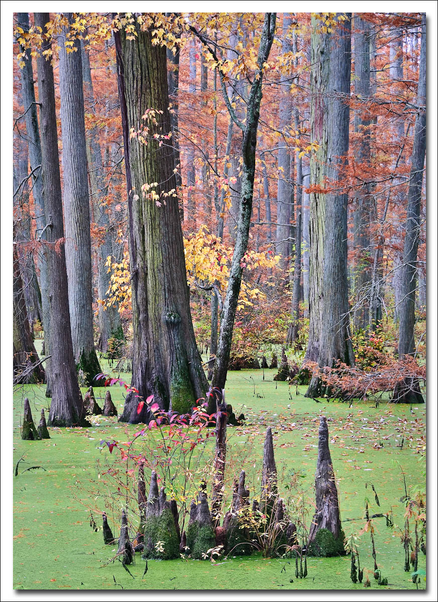
As a new member I thought I would post something local for a first post. This shot was taken at Heron Pond, in southern IL. Heron Pond is part of the Cache River wetlands, the northernmost most cypress and tupelo swamps in the US. This image was taken last fall. Comments and critiques appreciated.
D200, 18-200VR @ 80mm, 1/6 sec @ f/11, CPL, tripod.

Comments

18 comments
Comment posted by Mel Ladewig on June 30, 2010 at 11:35 AM
I always love shots of Cypress swamps and this is no exception. I like the processing choice of the pastel tones over the lush green banner.
Registered on July 24, 2005, 114 Posts, 1205 Comments
Comment posted by Kyle L. Krause on June 30, 2010 at 12:23 PM
Matthew,

Awesome Image. Very nice composition. Cypess Swamps is a place I'd love to shoot someday. Nice work and welcome to NPN.
Registered on June 15, 2010, 29 Posts, 605 Comments
Comment posted by scott lanz on June 30, 2010 at 12:54 PM
Interesting, different image. I particularly like the foreground. Looks like an interesting place to shoot. I would not have guessed Illinois. Good first post.
Registered on November 14, 2003, 840 Posts, 12902 Comments
Comment posted by Marc Adamus on June 30, 2010 at 1:17 PM
Truly wonderful image. Love the details everywhere. Great depth in the composition but not too much clutter - a rare combination in the woods and swamps. Well done!
Registered on September 17, 2005, 780 Posts, 8091 Comments
Comment posted by Floris van Breugel on June 30, 2010 at 2:22 PM
Welcome to NPN Matthew, and fantastic first post! I love the Cypress swamps (haven't been myself, but very much want to!), and this is a great rendition. Great job ordering the chaos, and the green and falls colors contrast beautifully. Looks like a little more web sharpening or less compression would help a little - a helpful little article: web sharpening.
Registered on December 19, 2008, 306 Posts, 4840 Comments
Comment posted by Ron Richins on June 30, 2010 at 2:52 PM
Nice shot. I'm partial to dark images, so I'd perhaps put a vignette around it. Otherwise, it's very interesting.
Registered on March 6, 2008, 113 Posts, 1009 Comments
Comment posted by Steve Sieren on June 30, 2010 at 3:43 PM
The south seems to be the most neglected place for fall color or least one of them. This is evidence of that! I like all the colors harmoniously intertwining themselves there Matthew.
Registered on January 2, 2008, 360 Posts, 5321 Comments
Comment posted by Shane McDermott on June 30, 2010 at 4:24 PM
Welcome Mathew to NPN! Beautiful first post, so many fabulous colors and textures to study in this image. IMO the yellow leaves at the top add a special significance to this comp, that whole thin tree on the oblique angle really brings this whole thing together for me. It seems a little bright however, I would play with underexposing it if it were my image.

Well done,

Shane :toast: :toast:
Registered on November 12, 2007, 49 Posts, 1074 Comments
Comment posted by Lon Overacker on June 30, 2010 at 6:06 PM
Welcome to NPN and the ES&S Gallery Matthew! Great to have you hear and we look forward to your images and participation.

Another thumbs up for a very nicely captured cypress swamp image. I like the vertical comp and the soft and varied color throughout.

No real nitpicks, but would agree with a couple things already mentioned. Take a look at our web sharpening technique. the larger version is pretty good, so there is most likely some compression going on. And if mine, I would drop the overall brightness a hair, less than 1/2 stop. And lastly, no one has mentioned this, but to me some of the trunks look to be a little on the magenta side; very slight and in all fairness, a personal choice/taste thing.

Welcome aboard.

Lon
Registered on November 24, 2006, 521 Posts, 19147 Comments
Comment posted by beth summer on June 30, 2010 at 6:26 PM
I recognized this immediately. Nice, Matthew. I agree with a few of the comments...a bit bright and perhaps more sharpening. I'm wondering about the pastel color. I don't remember Heron Pond as pastel. Perhaps we have just visited at different times of the day. Anyway, welcome to NPN. You'll find this is a great family of photographers with lots of support. Looking forward to seeing more from around Shawnee Forest and the cache river area.
Registered on November 1, 2003, 437 Posts, 5220 Comments
Comment posted by Morris McClung on June 30, 2010 at 7:02 PM
The color makes this one bloody brilliant!
Registered on May 7, 2007, 670 Posts, 19650 Comments
Comment posted by Anthony Vincent on June 30, 2010 at 7:04 PM
Really enjoying the combination of colors and shapes her Matthew. The softer colors work wonders together.
Nice capture.
Registered on February 5, 2009, 199 Posts, 2775 Comments
Comment posted by Mark Pelton on June 30, 2010 at 9:01 PM
very nice image, Matthew. I like the comp and the vertical orientation. I was there a couple of times about 10 years ago. Wonderful place.
Registered on November 25, 2003, 380 Posts, 4647 Comments
Comment posted by Chris Chamberlain on June 30, 2010 at 10:48 PM
This is real nice/beautiful! I don't know if this is all ambient light, but I think you could add a little shadow/midtone adjustment. It's gorgeous as is, so either way. The fall color is sweet.

Oh yeah, what's a tupelo?

Chris
Registered on March 13, 2007, 500 Posts, 8365 Comments
Comment posted by Andreas Resch on July 1, 2010 at 3:03 AM
Welcome here, Matthew. Nice first post with a very well balanced composition. Not a lot of things to criticize - they all have been mentioned before. Enjoy your stay here.
Registered on November 14, 2007, 322 Posts, 6101 Comments
Comment posted by Michael J Greene, on July 1, 2010 at 1:09 PM
Hi Matthew,

Terrific first post and welcome to NPN! This is an otherwordly scene and I enjoy your composition very much. All those pointed little tree stumps reminds me of the medieval times for some reason. I agree with what many of the others have already - and for what it's worth - I find the image slightly oversaturated for my tastes. The green moss growing on the main tree looks a little blue and the trunks are a bit purple looking. If it were mine, I'd try to render them a more natural grey. Again, this is a personal preference and I think this is an awesome shot even as is. Thanks for sharing.

Michael
Registered on June 18, 2009, 86 Posts, 2317 Comments
Comment posted by Rick Goldwasser on July 2, 2010 at 9:18 AM
Welcome to NPN - I like this a lot! The trunks give it some great lines and those shapes in the foreground really give this a unique look.
Registered on May 10, 2009, 127 Posts, 970 Comments
Comment posted by Matthew Goldsmith on July 3, 2010 at 10:57 PM
Thanks so much to everyone for your feedback. I agree that underexposing helps significantly (as does removing the magenta cast). Chris, tupelo's are trees of the genus Nyssa, common to the swamps of the southern US (had to look that up).
Registered on June 29, 2010, 37 Posts, 286 Comments