Nature Photographers Network
This is the preserved archive of the original Nature Photographers Network. The community continues at naturephotographers.network.
DA Skewed
‹ PreviousLandscape GalleryNext ›

DA Skewed

by Angela Classen

Gallery: LandscapePosted July 10, 2010696 views11 comments
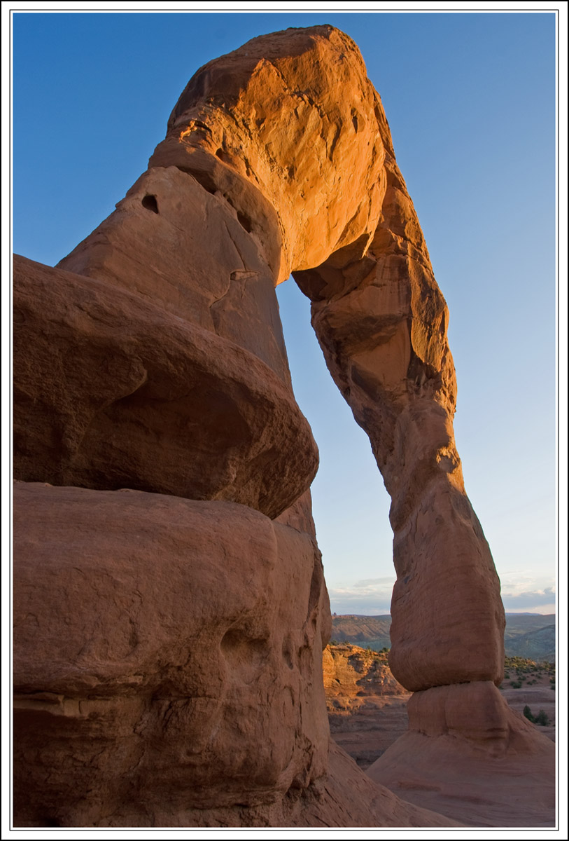
Icon, schmicon... On our recent visit to Arches, I tried to get a few shots that were different, which is difficult to do - but I sure had fun trying. I wished for clouds above the arch, but didn't get them.

Canon Rebel XTI, handheld
10-22 mm lens, no filters
ISO 100, F11 @ 1/15

Comments

11 comments
Comment posted by Vincent Grafhorst on July 10, 2010 at 2:13 PM
Wow, what an amazing arch Angela. I like how your low POV and WA perspective make this arch look so tall. I do wish for a bit more room above it though and maybe a bit more on the right as well to give the arch some room. Good choice of aperture btw for that camera/lens combo.
Registered on February 24, 2006, 504 Posts, 7203 Comments
Comment posted by Eva McDermott on July 10, 2010 at 3:07 PM
I like the perspective too Angela as well as the nice warm light on the top of the arch.
Registered on January 4, 2009, 1015 Posts, 13229 Comments
Comment posted by David Cobb on July 10, 2010 at 3:12 PM
Love the skewed angle you chose here Angela, and it's a good way to get the people out of the shot too!
Registered on December 14, 2007, 312 Posts, 3243 Comments
Comment posted by Mark Metternich on July 10, 2010 at 3:29 PM
'Bout time someone did something way unusual with this schmicon! :toast:
Registered on June 19, 2009, 276 Posts, 6240 Comments
Comment posted by Bruce King on July 10, 2010 at 3:36 PM
Nice image Angela. I definitely like this compoisition better than the wider, straight on comps I've seen of this. I suggest changing the title to Icon, Schmicon. It works. :cool:
Registered on January 14, 2010, 276 Posts, 2212 Comments
Comment posted by Morris McClung on July 10, 2010 at 4:20 PM
A very unique approach to this Schmicon. :biggrin: I would ditto what Vincent said about a touch more room at the top.
Registered on May 7, 2007, 670 Posts, 19650 Comments
Comment posted by Angela Classen on July 10, 2010 at 5:38 PM
I agree it's a little tight at the top, but when I straightened the horizon, it cropped a lot of the top off. Is it possible to add more canvas to the top of the image (add more blue sky)? I have CS4 but haven't been able to figure out if (or how) this can be done.
Registered on June 13, 2007, 434 Posts, 2742 Comments
Comment posted by Tony Kuyper on July 10, 2010 at 6:44 PM
This is a very effective angle for composing this, Angela. Just my thing, but I could see adding a bit more saturation here to increase the color drama between sky and rock.
Registered on November 1, 2003, 364 Posts, 22328 Comments
Comment posted by Lon Overacker on July 10, 2010 at 7:23 PM
Great job with this Angela - especially in pulling of a different view. I suspect it's been done before, but I don't recall seeing this view before. Other than a wish for more room at the top (easily cloned in btw...) I would go along with Tony and say that I think you have some leeway to boost the colors and contrast. Now that's not to say this needs it, because I think you've done very well with it, so that means that if you have the personal taste to do it, I wouldn't mind... :wink:

Lon
Registered on November 24, 2006, 521 Posts, 19147 Comments
Comment posted by Stan Rose on July 11, 2010 at 4:21 AM
I like this angle, Angela--very nice! I agree with the other comments (on the top etc).
Registered on September 15, 2005, 836 Posts, 17099 Comments
Comment posted by Chris Chamberlain on July 11, 2010 at 6:00 PM
Good job finding a perspective and comp of this arch that I've never sen before. The one time I was there, I had to share the arch with 100 or so other folks.

Chris
Registered on March 13, 2007, 500 Posts, 8365 Comments