Nature Photographers Network
This is the preserved archive of the original Nature Photographers Network. The community continues at naturephotographers.network.
Paradise II / With B&W
‹ PreviousLandscape GalleryNext ›

Paradise II / With B&W

by Chris Chamberlain

Gallery: LandscapePosted September 8, 2010478 views22 comments
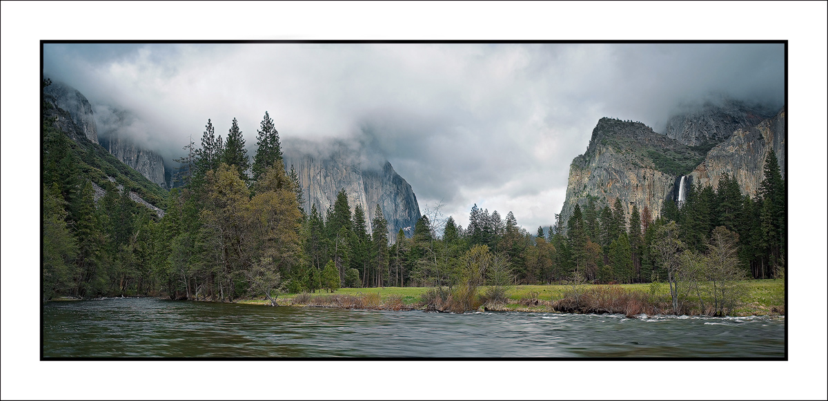
Lon was asking about anymore spectacular images from Yosemite. Well, I don't know if this qualifies as spectacular, but I like it. It was fun trying to capture it, while keeping me and my gear dry. A 4 shot pano from "Gates Of The Valley" Yosemite National Park. The first images captured upon arriving in the park last May for a spring water fest. Thank you so much for all the positive feedback on the last post. I hope you enjoy this one as well. Large version included too!

D200,
18-70mm,
1/4sec, F/10
GND Filter,

Thanks,
Chris

Comments

22 comments
Comment posted by Jim Lou on September 8, 2010 at 9:32 PM
The low hanging cloud provide mystical mood to El Capitan. I don't mind to see little less water.

Jim
Registered on August 3, 2010, 86 Posts, 273 Comments
Comment posted by Paul Duval on September 8, 2010 at 11:02 PM
Chris,

I could look at photo's from Yosemite all day and not be bored, El Cap is hidden but we all know it's there. It's a different feeling taking images in Yosemite. Shutters have been opening briefly at just the right moment in this valley almost since the birth of photography and the clicking of shutters and whir of mirrors flipping echo through time. It's almost a religious experience especially with epic conditions of weather and light. This image might not be spectacular but it's promise certainly is, all you have to do is wait until those clouds break a little and play light all over the valley. It's also the reward after miles of boring trees and forest leading up to this..... Thanks for sharing Chris.

Paul :wavey:
Registered on June 30, 2009, 508 Posts, 1907 Comments
Comment posted by Stan Rose on September 8, 2010 at 11:02 PM
Nice shot, Chris, everything looks nicely composed. I bet in B&W it would look very 'Ansel'-like. :smile:
Registered on September 15, 2005, 836 Posts, 17099 Comments
Comment posted by Aleksandra Miesak on September 8, 2010 at 11:17 PM
Great drama with those clouds! I agree with Stan, conversion could put this over the top.
Registered on March 1, 2009, 15 Posts, 133 Comments
Comment posted by Chris Chamberlain on September 8, 2010 at 11:50 PM
Okay, here's a black and white. Thanks Stan, and Aleksandra, for the suggestion.

Chris
Registered on March 13, 2007, 500 Posts, 8365 Comments
Comment posted by Lon Overacker on September 8, 2010 at 11:57 PM
Hey Chris,

Now just to set the record straight, I asked if you had any additional "stunning" images of Yosemite, not spectacular... just so we're clear... :biggrin: Now this one is neither stunning nor spectacular, but it is quite gorgeous and a fantastic capture of this classic viewpoint.

Two thumbs up for the b&w conversion - would like to see this larger one day. But the color is equally as good. Another fine image for your Yosemite Collection!

Lon
Registered on November 24, 2006, 521 Posts, 19147 Comments
Comment posted by Mat Malone on September 9, 2010 at 12:13 AM
Hey Chris,

Despite not having an amazing sunset this is really nice. I'm not sure how you do it, but you seem to have a great eye for Yosemite Valley scenes. The moody clouds are wonderful.
Registered on December 15, 2008, 91 Posts, 882 Comments
Comment posted by Daniel Ewert on September 9, 2010 at 12:31 AM
Those low clouds add a great element here. Very nice image, Chris.
Registered on June 2, 2009, 103 Posts, 1500 Comments
Comment posted by dean hebert on September 9, 2010 at 1:16 AM
Beautiful. :toast:
Registered on August 4, 2010, 70 Posts, 1132 Comments
Comment posted by Youssef Ismail on September 9, 2010 at 3:01 AM
Chris,

I like the B&W version much better. It has captured the area perfectly in the B&W.
Registered on November 1, 2003, 474 Posts, 5555 Comments
Comment posted by Kevin Trinkner on September 9, 2010 at 8:00 AM
Really nice Chris, great comp here and the overall atmosphere has a nice soft feeling. We don't always get the super lightshows we dream of, but I still think nice moody photos like this are well worth displaying. Many people can relate to the images because often these are the conditions people encounter. Nice work. I think I prefer the color.
Registered on June 30, 2008, 203 Posts, 2641 Comments
Comment posted by Nick Bristol on September 9, 2010 at 9:27 AM
I really enjoy looking at this. It has a very calmimg feel for me. I like the fog here and also a very nice comp. Like the sweep of the river. Maybe not spectacular as you said, but I sure like it. I will go with the color also, but the b/w does look very nice. Guess I actually like them both.

Nick Bristol
lone Rock, WI
Registered on February 1, 2004, 752 Posts, 14140 Comments
Comment posted by Wendy Blanchard on September 9, 2010 at 9:37 AM
Definitely spectacular to me especially the larger version. I do like the b&w also but I don't think I could pick between the two. Just Gorgeous!
Registered on June 11, 2006, 58 Posts, 647 Comments
Comment posted by Nicolas Belokurov on September 9, 2010 at 10:44 AM
Very nice rendition of the iconic location. I think I prefer the BW version.
Registered on July 22, 2009, 41 Posts, 533 Comments
Comment posted by Phil Pogledich on September 9, 2010 at 1:24 PM
Really great stuff, Chris. I strongly prefer the B&W. Nothing wrong with the color, but that "classic" feeling really comes through in the B&W.
Registered on August 24, 2009, 123 Posts, 3099 Comments
Comment posted by Rudy Ruberti on September 9, 2010 at 4:32 PM
There's just enough clouds to add a nice mood, but not too much to hide the great scene. The color is nice, but I really like the b&w. By the way, my last post was taken at Olancha Dunes, at the south end of Owens Lake. It's an ok location, but not nearly as nice as Death Valley.
Registered on October 28, 2008, 179 Posts, 1875 Comments
Comment posted by Bill Chambers on September 9, 2010 at 4:50 PM
Wow, wow, wow... This is so nice. Both versions are nice but I definitely prefer the color version. One of those images you can sit and stare at for a long time. Would love to see this printed large and hanging on a wall.
Registered on April 10, 2005, 753 Posts, 21216 Comments
Comment posted by Tony Kuyper on September 9, 2010 at 10:09 PM
Both are good, but B&W feels more Anseleque, which always goes well with Yosemite.
Registered on November 1, 2003, 364 Posts, 22328 Comments
Comment posted by Dietrich Gloger on September 10, 2010 at 1:19 AM
Epic Chris! Composed with skill! The composition and the sky make the image. But I have some nits: - the foliage looks a bit "lifeless". Fresh spring greens or fall colours would add some extra punch maybe. A light spot on the granite could also mix up things. But in fact the overcast, almost gloomy atmosphere fits very well. It's strong work Chris!
Registered on January 26, 2007, 360 Posts, 9876 Comments
Comment posted by Morris McClung on September 10, 2010 at 9:19 PM
Epic icon. Very well done!
Registered on May 7, 2007, 670 Posts, 19650 Comments
Comment posted by Rick Goldwasser on September 11, 2010 at 7:28 PM
Really nice comp, the larger version looks great. Might like to see a longer exposure at a smaller aperture to smooth out the water a bit but looks quite nice as is.
Registered on May 10, 2009, 127 Posts, 970 Comments
Comment posted by Eric Good on September 11, 2010 at 10:16 PM
Classic Yosemite image! Love the B&W version... I think it works beautifully here.
Registered on March 17, 2007, 116 Posts, 4764 Comments