Nature Photographers Network
This is the preserved archive of the original Nature Photographers Network. The community continues at naturephotographers.network.
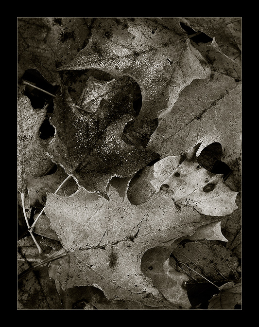
Frosted Velvet
‹ PreviousLandscape GalleryNext ›

Frosted Velvet

by Anthony Vincent

Gallery: LandscapePosted October 14, 2010151 views21 comments
Gosh its hard to keep up this fall. There are so many wonderful shots.

I have a soft spot for sepias but it is really hard to find good intimates that translate well for me. I searched the forest floor one morning and was lucky enough to have a little frost about on the leaves. The warm sun began to slowly awaken the colors of each fallen leaf. I had some nice soft light filtering through creating nice highlights and shadows.

Thanks for your time and comments as always :smile:

Canon 40D
28-300L @ 130mm
2.5 sec @ f18
iso 100

Comments

21 comments
Comment posted by Stan Rose on October 14, 2010 at 7:23 PM
Tell me about keeping up--and its fall colors week in my Challenge Gallery--lots to look at!
Neat subject, i like the conversion too. It's pleasantly imperfect, if you know what i mean. The frost is a bit tricky in monochrome, doesnt immediately scream 'frost!' to me--but that's not necessarily a bad thing here. Id say its a winner. :smile:
Registered on September 15, 2005, 836 Posts, 17099 Comments
Comment posted by Luis Argerich on October 14, 2010 at 7:39 PM
Very nice shot Vicent! It feels metallic surprising rendition of leaves.
Registered on December 22, 2009, 91 Posts, 1349 Comments
Comment posted by Bill Chambers on October 14, 2010 at 7:50 PM
I'm not a big fan of sepia, but I find myself loving this. Excellent conversion - wonderful tonal range and rich detail. Wish you had a larger version to view!
Registered on April 10, 2005, 753 Posts, 21216 Comments
Comment posted by Morris McClung on October 14, 2010 at 8:43 PM
I think compression is hurting you here. Maybe a larger one would have let more of what, I'm sure, is compelling to come through. Another excellent comp and your control of light is here as well.
Registered on May 7, 2007, 670 Posts, 19650 Comments
Comment posted by Shaun Mazurek on October 14, 2010 at 10:00 PM
This is very nice. I love the sepia processing. It is reminiscent of the platinum palladium printing process. There is so much wonderful detail here. :)
Registered on June 12, 2010, 21 Posts, 162 Comments
Comment posted by Tony Kuyper on October 14, 2010 at 11:17 PM
Even without seeing your name these pixels were instantly recognizable as yours. Excellent!
Registered on November 1, 2003, 364 Posts, 22328 Comments
Comment posted by Lon Overacker on October 14, 2010 at 11:18 PM
Anthony,

What strikes me right away has little to do with image here, but that you were actually seeking out a "sepia" image, visualizing ahead of time the look that you wanted. To me that says a lot about where you are at artistically. It's one thing to go through your weekend's cache and see which ones look good in b&w, it's a whole 'nuther thing to set out to capture the medium. And then, to find and produce and image like this, well, kudos to you!

I love this intimate setting. The "frost" could be mistaken for reflections (ie. - anti-polarizer...) at this size, but the tonal range is excellent and your toning works beautifully. If I had a suggestion it would be to experiment with the layout. Opposite to Chip's recent posting, I almost feel like a horizontal presentation (and then flipped horizontally) could be a nice alternative. but that's just a suggestion.

Very impressive Anthony from concept to presentation.

Lon
Registered on November 24, 2006, 521 Posts, 19147 Comments
Comment posted by Chris Chamberlain on October 14, 2010 at 11:55 PM
I knew this was yours, didn't even have to look at the name! :wink: Anyway, I agree about the conversion, it's very nice, and kind of antique looking. The frost adds some nice highlites also.

Chris
Registered on March 13, 2007, 500 Posts, 8365 Comments
Comment posted by Doug Roane on October 15, 2010 at 4:01 AM
I can pick out your stuff just looking at the thumbnail! Superb, as usual - bravo! :toast:
Registered on December 12, 2008, 213 Posts, 2226 Comments
Comment posted by Kevin Trinkner on October 15, 2010 at 7:42 AM
Nice work Anthony, could tell this was yours from the thumbnail. Great mono conversion, love the comp and textures.
Registered on June 30, 2008, 203 Posts, 2641 Comments
Comment posted by Matt Anderson on October 15, 2010 at 7:55 AM
I'm diggin' it.
Looks like a fine art poster.
Registered on September 6, 2007, 346 Posts, 2696 Comments
Comment posted by John Williams on October 15, 2010 at 8:52 AM
Boy, it's not easy to get a tight comp to look this clean. This really comes together nicely. Do you have a color version too? I'd love to see how the frost translates. (I agree with Stan that it's not immediately obvious in this version.)
Registered on September 6, 2007, 221 Posts, 5985 Comments
Comment posted by denise ippolito on October 15, 2010 at 9:26 AM
I really like the sepia tones in this. The leaves have a random look which I like.
Registered on December 17, 2009, 202 Posts, 1529 Comments
Comment posted by Anthony Vincent on October 15, 2010 at 9:32 AM
Thanks everyone
it's not always easy to translate scenes like these especially a web version
I'll throw up a color version when I get home from work but I'm sure the masses will like that better :smile:
Registered on February 5, 2009, 199 Posts, 2775 Comments
Comment posted by Laurent Baig on October 15, 2010 at 12:57 PM
Nice!
Registered on January 12, 2005, 206 Posts, 6784 Comments
Comment posted by Nick Bristol on October 15, 2010 at 2:46 PM
Very nice, Anthony. I think your conversion was excellent as I enjoy the looks of this. I also like the idea that you knew you wanted to do this, and found something that worked very well.

Nick Bristol
Lone Rock, WI
Registered on February 1, 2004, 752 Posts, 14140 Comments
Comment posted by Kurt Budliger on October 15, 2010 at 4:53 PM
Amazing, love the texture and tones in this one, you da man!
Registered on June 11, 2006, 113 Posts, 2116 Comments
Comment posted by Scott Fricke on October 15, 2010 at 8:26 PM
Beautiful tones and nicely composed, can't see anything wrong with this one, I think it would make a really nice print.
Registered on January 19, 2007, 133 Posts, 1448 Comments
Comment posted by Dietrich Gloger on October 16, 2010 at 4:59 AM
You do know how to make captivating intimate compositions! Impressive work. Good idea to get really close and simplify by getting only few leaves into the frame.
Registered on January 26, 2007, 360 Posts, 9876 Comments
Comment posted by Paul Wegemann on October 16, 2010 at 12:35 PM
I love the detail and tones here. Your processing is right on. :toast:
Registered on December 14, 2006, 58 Posts, 1888 Comments
Comment posted by Eva McDermott on October 16, 2010 at 9:14 PM
Almost missed this Anthony! Glad I caught it before it fell off the page. I really like the silvery tones here (at least on my monitor). Nice mix of textures and tones.
Registered on January 4, 2009, 1015 Posts, 13229 Comments