Nature Photographers Network
This is the preserved archive of the original Nature Photographers Network. The community continues at naturephotographers.network.
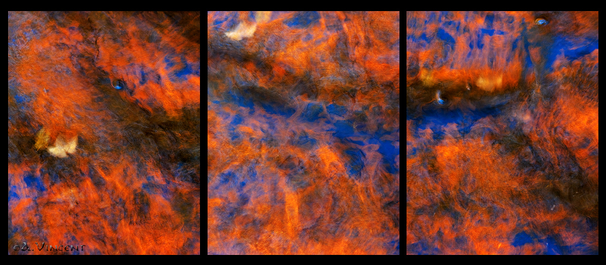
Dragon's Breath
‹ PreviousLandscape GalleryNext ›

Dragon's Breath

by Anthony Vincent

Gallery: LandscapePosted October 25, 2010488 views28 comments
Hi Everyone,

As with any triptych please VIEW LARGE version for better details.

Disclaimer: No fire or lighting devices were used in the making of this image, rather just autumns blaze from both sun and water.

Alright I'll get into the description but first want to assure everyone the image is in fact real.
Artistic liberties where only enhancing the colors but I will attach a screenshot of one of the raw files for reference. This is indeed a reflection shot but it caught my eye in a very peculiar way. It rendered a fire look to it and spent some time composing and playing with shutter speeds which in the end needed to be precise. I wanted to get a low contrast but with the speed portraying a fume or gaseous state. I soon realized it reminded me of a dragons fire over the surface of the water. As some of you know I love playing with shots like these and usually try to find something different in terms of imagination and style.

If you even look closely at the first plate you'll notice the dragons head (look for the eye) followed by its body.

Thanks again for your time and comments

Canon 40D
28-300L @ 120mm
CPL
1/6 sec @ f 5.6
iso 200

Curves and contrast adjustments
Tk's web sharpening

Comments

28 comments
Comment posted by Anthony Vincent on October 25, 2010 at 8:26 AM
Here is the Raw screenshot of the second plate
You can see I didn't add any sat or vib. but just rather in ps

Registered on February 5, 2009, 199 Posts, 2775 Comments
Comment posted by Anthony Vincent on October 25, 2010 at 8:26 AM
First plate in detail with Dragon's Head :smile:

Thanks for looking
Registered on February 5, 2009, 199 Posts, 2775 Comments
Comment posted by Joseph Balcken on October 25, 2010 at 8:34 AM
This is awesome! My favorite are the etheral leaves. My only nit is that this might be one case where sharpening might have hurt the final product. I prefer the soft look of your unsharpened RAW image.

Very creative and artistic. I love it! :toast:
Registered on November 29, 2009, 48 Posts, 249 Comments
Comment posted by Matt Anderson on October 25, 2010 at 8:35 AM
Looks like a Renaissance impressionistic painting. Kind of a Sfumato-Chiaroscuro hybrid. I'm diggin' it, although, I'd put the left panel in the middle. Original, Creative, Captivating, and Unique.

*edit: You see a photo like this, and it reminds you that there are so many original and non cliched images to be had. You have followed your own creative spirit/drive, and the results, imho, are so much more compelling than a clone of some iconic place.

:toast:
Registered on September 6, 2007, 346 Posts, 2696 Comments
Comment posted by Bill Chambers on October 25, 2010 at 8:38 AM
Beautiful colors and wonderful shapes. I was thinking reflection but I wasn't sure at all. If it wasn't reflection my second thought was cosmos. Very painterly and a great variety within the color pallette.
Registered on April 10, 2005, 753 Posts, 21216 Comments
Comment posted by Dietrich Gloger on October 25, 2010 at 9:18 AM
Awesome stuff Anthony! I like the idea of triptychs and this is a great example. Stunning reflection shot as such but you took it to a higher level with your presentation. I agree with Matt too - very creative and unique!
Registered on January 26, 2007, 360 Posts, 9876 Comments
Comment posted by Chris Chamberlain on October 25, 2010 at 9:23 AM
Pretty wild! works tremendously as a tryptych too. I love what you have done with the colors. Very acceptable IMO, epecially with an abstract. Really nice!

Chris
Registered on March 13, 2007, 500 Posts, 8365 Comments
Comment posted by Helio Cristovao on October 25, 2010 at 9:27 AM
AMAZING!
Registered on September 15, 2009, 83 Posts, 434 Comments
Comment posted by Nick Bristol on October 25, 2010 at 9:29 AM
Very cool, Anthony. Its great fun looking at this. You had a wonderful vision and really made it work. :toast:

Nick Bristol
Lone Rock, WI
Registered on February 1, 2004, 752 Posts, 14140 Comments
Comment posted by Anthony Vincent on October 25, 2010 at 9:40 AM
Thanks everyone appreciate your feedback

Joseph- thanks for your comment. I actually tried a softer approach and well it just looked unsharpened. There is always a thousand ways to process an image and this just was my interpretation of that. Of course the product is not hurt since sharpening is a creative step and all original information is still there. I didn't want to stray to far from the fumes look of the image but I see your point

Matt- thanks too kind. I was reminded of a quote from Shakespeare I recently saw on someones blog
"In natures infinite book of secrecy. A little I can read"
that speaks to me on a very high level and fuels my photographic drive
meaning nature will always surprise us and will never become dull :smile:
Registered on February 5, 2009, 199 Posts, 2775 Comments
Comment posted by Doug Roane on October 25, 2010 at 10:41 AM
awesome, Anthony - great stuff here. I actually like #1 as a stand-alone best. The others by themselves are great too. There is alot for the eye to explore in these, and I actually think the triptych is just too overwelming - that's my 2 cents, anyways.
Registered on December 12, 2008, 213 Posts, 2226 Comments
Comment posted by Kent Mearig on October 25, 2010 at 11:09 AM
Besides that the blues come across as a bit too strong in the two frames where they are more prominently featured, I find this both exotic and attractive on the long term. I like seeing the left panel by itself since it has the potential to stand alone, and I find the blue to be less of an issue there.
Registered on September 4, 2006, 237 Posts, 4748 Comments
Comment posted by Preston Birdwell on October 25, 2010 at 11:38 AM
I really like this concept. To me, the blues are a tad overdone and even the larger version the images lack definition in the details; it seems too soft. I do like the warm/cool colors and the reds work well.

I really appreciate the creativity of this, and find it inspirational. :toast:

--P
Registered on November 1, 2003, 471 Posts, 5188 Comments
Comment posted by Tony Kuyper on October 25, 2010 at 12:44 PM
Oh goodness, this is something else, Anthony. One of the best abstracts I've seen, and the triptych puts it way over the top.
Registered on November 1, 2003, 364 Posts, 22328 Comments
Comment posted by SimonRumford on October 25, 2010 at 1:26 PM
interesting photo, glad you explained it because it wouldnt have seemed like a real shot, but the colours are great well done
Registered on June 25, 2010, 28 Posts, 80 Comments
Comment posted by Eva McDermott on October 25, 2010 at 2:33 PM
This is great Anthony! A very unique and spectacular abstract with interesting colors. What more could you ask for...... A fire breathing dragon...... Great work!
Registered on January 4, 2009, 1015 Posts, 13229 Comments
Comment posted by Lon Overacker on October 25, 2010 at 4:20 PM
Anthony,

OH MY, OH MY! One of the most compelling natural abstracts I've seen posted here - and I try very had not to generalize and overuse a statement like that. Almost speechless.

I can easily envision seeing this hung in a modern, contemporary gallery - or on any wall for that matter. Stunning, mesmerizing.

Lon
Registered on November 24, 2006, 521 Posts, 19147 Comments
Comment posted by Ian Plant on October 25, 2010 at 5:04 PM
Freakin' sweet dude :cool:
Registered on July 7, 2008, 271 Posts, 1657 Comments
Comment posted by Jason Kim on October 25, 2010 at 6:08 PM
Fascinating colors and patterns, and these three images work very well as a triptych. Very creative and well done!
Registered on July 1, 2006, 60 Posts, 1233 Comments
Comment posted by Paolo De Faveri on October 25, 2010 at 7:30 PM
This is a stunning creation Anthony, I love tryptichs and this subject is simply perfect for that kind of display. The dragon is a real eyecatcher once you spot it, but this fantastic all around.

:toast: :toast:
Paolo
Registered on August 29, 2007, 318 Posts, 1651 Comments
Comment posted by Daniel Ewert on October 25, 2010 at 7:47 PM
This is pretty spectacular, Anthony. I don't think I have seen anything quite like it!
Registered on June 2, 2009, 103 Posts, 1500 Comments
Comment posted by Dean Sauskojus on October 26, 2010 at 1:35 AM
I have no idea what I'm looking at. All the visual clues have been removed except for a few maple leaves. That's what makes it such a great image. I looked at it many a time trying to fit it in my own world. It could be a lot of things. Tremendous image Anthony. A piece of art. Very creative.
Registered on September 29, 2009, 137 Posts, 2659 Comments
Comment posted by Stan Rose on October 26, 2010 at 3:20 AM
Pretty cool, Anthony! :toast:
Thought of the day: you know it's kinda interesting--if this were a 'clone of an iconic place' to use Matt's phrase, id probably give you grief for pumping up the contrast and sat big time--but since it's presented as an abstract, we are all forgiving.
Not a critique, just a thought... :wink:
Registered on September 15, 2005, 836 Posts, 17099 Comments
Comment posted by Stuart Williams on October 26, 2010 at 3:32 AM
pretty darned cool. well done. i'd put the right one in the middle.
Registered on December 7, 2007, 247 Posts, 4792 Comments
Comment posted by David Chauvin on October 26, 2010 at 4:26 AM
WOW! What a fantastic mix of color and texture. The blurred leaf shapes really bend the mind and would have kept me guessing as to what this is if you hadn't told us up front. The three work great in series, but the lower left quarter of the middle panel doesn't flow from the left panel as well as the rest of the comp. It seems a good bit lighter to me and maybe darkening it a little would give it more continuity. But that is a minor quibble over an amazing series. :toast:
Registered on August 5, 2004, 1007 Posts, 5595 Comments
Comment posted by Kevin Trinkner on October 26, 2010 at 7:53 AM
Very cool Anthony, hard to come up with a unique fall image, this definitely accomplishes that. Love the colors. Great work. :toast:
Registered on June 30, 2008, 203 Posts, 2641 Comments
Comment posted by Aaron Feinberg on October 26, 2010 at 9:29 AM
Freakin' sick. Great catch and even better execution

aF
Registered on October 26, 2009, 399 Posts, 2789 Comments
Comment posted by Morris McClung on October 26, 2010 at 7:34 PM
Amazing art, Anthony! This has it all, vision, skill, and presentation. :toast: :toast: :toast:
Registered on May 7, 2007, 670 Posts, 19650 Comments