Nature Photographers Network
This is the preserved archive of the original Nature Photographers Network. The community continues at naturephotographers.network.
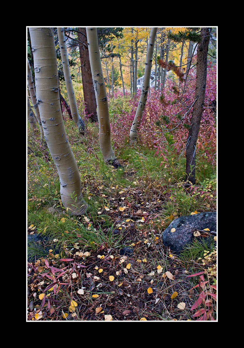
Enchanted Forest ll/ Repost
‹ PreviousLandscape GalleryNext ›

Enchanted Forest ll/ Repost

by Chris Chamberlain

Gallery: LandscapePosted October 25, 2010262 views18 comments
A vertical shot from inside, and looking back the opposite direction of my first post of this spot. Hope you like the perspective, and thank you for your thoughts. A larger version is included as well.

D200,
18-70mm,
8sec, F/19

Thanks,
Chris

Comments

18 comments
Comment posted by Dietrich Gloger on October 25, 2010 at 9:29 AM
Hi Chris - just posted mine :wink:

Sure works for me! Busy and complex, but well arranged. I really like the leaves and pinecones in the fg (yes I checked the large version :wink:). No nits from me!
Registered on January 26, 2007, 360 Posts, 9876 Comments
Comment posted by Anthony Vincent on October 25, 2010 at 9:45 AM
Wow, enchanted it is
perfect framing Chris and stellar work as always :toast:
Registered on February 5, 2009, 199 Posts, 2775 Comments
Comment posted by Nick Bristol on October 25, 2010 at 9:50 AM
This works well for me too, Chris. I especially like the colors in this. The comp seems to work well and I like the extra color from the leaves in the f/g, and the cones. I looked at the large version too :wink: which really makes this look much better imo. Nice work, Chris.

Nick Bristol
Lone Rock, WI
Registered on February 1, 2004, 752 Posts, 14140 Comments
Comment posted by Bill Chambers on October 25, 2010 at 11:23 AM
I like this type of image a lot, and this one is composed flawlessly. Having said that, I find that this does not "pop" like so many of yours, but it's still very enjoyable to look at and explore the details.
Registered on April 10, 2005, 753 Posts, 21216 Comments
Comment posted by Preston Birdwell on October 25, 2010 at 11:29 AM
I like the perspective, here, Chris. I do find the right side to be little busy, though. You might consider burning down the boulder in the BG. The color and exposure are right on.

You had a very productive trip to the East Side!

--P
Registered on November 1, 2003, 471 Posts, 5188 Comments
Comment posted by Mat Malone on October 25, 2010 at 12:43 PM
Hey Chris,

Great colors and depth, and I like the arrangement. But the perspective bothers me -- it actually makes me feel a little dizzy.
Registered on December 15, 2008, 91 Posts, 882 Comments
Comment posted by Tony Kuyper on October 25, 2010 at 12:46 PM
I really like the comp and colors. My preference would be for a bit more saturation, especially in the greens. Maybe a bit more warm in the WB too. Just my preference though. This is certainly lovely as is.
Registered on November 1, 2003, 364 Posts, 22328 Comments
Comment posted by SandyRichardsBrown on October 25, 2010 at 2:12 PM
Chris - a great fall scene.
The perspective sure works for me - nice colors and good comp.
Sandy r
Registered on November 24, 2003, 3937 Posts, 12909 Comments
Comment posted by Eva McDermott on October 25, 2010 at 2:27 PM
I like the perspective and cooler colors Chris. Works for me.
Registered on January 4, 2009, 1015 Posts, 13229 Comments
Comment posted by Lon Overacker on October 25, 2010 at 4:15 PM
Chris,

I like this quite a bit and think it captures quite accurately so much of what is found in the Eastern Sierra. I think the colors are quite natural, but overall just a little flat. The scene isn't popping out. Now don't get me wrong, it doesn't necessarily have to and there is always that fine line between natural and well, too much. It's your call of course.

Not as strong as your other postings from this trip, but certainly a worthy addition to your portfolio.

Lon
Registered on November 24, 2006, 521 Posts, 19147 Comments
Comment posted by Daniel Ewert on October 25, 2010 at 7:45 PM
There are a lot of nice elements here, Chris. Beautiful image.
Registered on June 2, 2009, 103 Posts, 1500 Comments
Comment posted by Chris Chamberlain on October 25, 2010 at 8:49 PM
Thanks, Guys.

You know, I thought is flattened out a bit when I tried to warm the color balance. But i didn't think it was enough to worry about. But after taking another look, and making some curves adjustments, I have to say it needed something. Here's a rework for you consideration.

Thanks,
Chris
Registered on March 13, 2007, 500 Posts, 8365 Comments
Comment posted by Tony Kuyper on October 25, 2010 at 9:10 PM
I like the repost better, but I do like saturation too. The blues are perhaps a bit strong, but as Lon says, it's always your call.
Registered on November 1, 2003, 364 Posts, 22328 Comments
Comment posted by Steve Sieren on October 25, 2010 at 9:19 PM
You didn't have to clone a yellow guy in the bg amongst the rocks. You were going nuts in all that pink :wink:, it was hard to work around ya. I like the mutli colored foreground, the light seemed a little easier to deal with from the other side though.
Registered on January 2, 2008, 360 Posts, 5321 Comments
Comment posted by Lon Overacker on October 25, 2010 at 11:33 PM
Chris,

Repost looks great to me. Just enough punch to make this pop a little more; not too much, just right...

Lon
Registered on November 24, 2006, 521 Posts, 19147 Comments
Comment posted by Anil Rao on October 26, 2010 at 1:30 AM
A very lovely take on the fall season. I love the strong composition that really places me in the scene. My preference is for the lower contrast in the original version.
Registered on November 15, 2003, 234 Posts, 4923 Comments
Comment posted by Paul Breitkreuz on October 26, 2010 at 10:39 AM
The down hill perspective looks very inviting, Chris. Colors and exposure provide a wonderful autumn look and feel too. :cool:
Registered on February 25, 2006, 525 Posts, 8448 Comments
Comment posted by Morris McClung on October 26, 2010 at 7:35 PM
The color makes this one sing. But, the comp is very well put together, too.
Registered on May 7, 2007, 670 Posts, 19650 Comments