Nature Photographers Network
This is the preserved archive of the original Nature Photographers Network. The community continues at naturephotographers.network.
Notecard 3
‹ PreviousFlora GalleryNext ›

Notecard 3

by SandyRichardsBrown

Gallery: FloraPosted November 3, 2010210 views15 comments
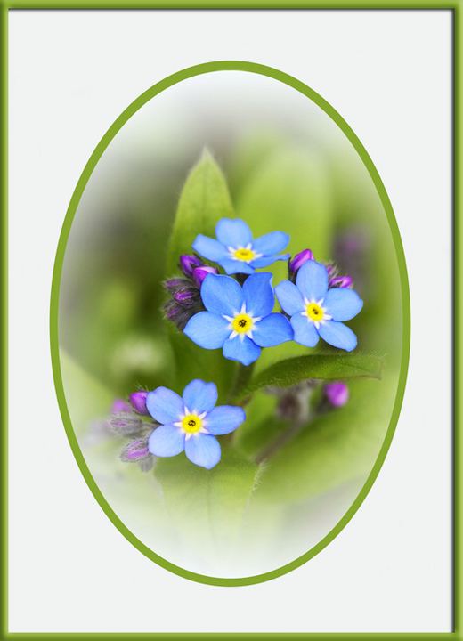
Need critical comments and ideas please !
A friend has "commissioned" me to develop a line of notecards for her gift shop.
This is surely not my forte - but I have agreed, to learn new things.

This is my first attempt - all C and C solicited!

The frame is only for NPN.

D200 (photo taken several years ago)
105mm
1/125 sec, f/5.3
Mode: Program
Metering: Multi-segment
ISO: 125
AF mode: AF-C

Comments

15 comments
Comment posted by Gary Yeoh on November 3, 2010 at 8:12 PM
Sandy:
I have not been involved with anything commercial and my comment is really from the consumer view point - Would I buy this? Yes. The color palette is good and the softness of the flowers works well. The only minor nit is the slight 'bright' spot in the greenery at 9 o'clock.
Registered on September 1, 2009, 588 Posts, 8184 Comments
Comment posted by Pat Sampson on November 3, 2010 at 8:29 PM
Hmmm... Good for you Sandy. I don't really remember the last notecard I bought but I like this image. The color palette is pleasing to me, as is the mood. I do agree with Gary about the bright spot but other than that, I have no suggestions.

Pat
Registered on May 19, 2007, 953 Posts, 15989 Comments
Comment posted by scott lanz on November 3, 2010 at 9:09 PM
Sandy, I think if this image were framed like this, it would sell. The overall presentation is outstanding.
Registered on November 14, 2003, 840 Posts, 12902 Comments
Comment posted by Nathan Buck on November 3, 2010 at 9:25 PM
It is bright and cheery Sandy. I think it would be fitting for a notecard. I would show this to non-photogs because as valuable as our comments are, consumer opinions matter so much more!

The type of flowers are a great sentiment for a note card too - being 'Forget Me Nots'.

Nathan
Registered on November 1, 2003, 1101 Posts, 13589 Comments
Comment posted by Catherine Reilly on November 3, 2010 at 11:57 PM
Way to go on the commission.

I'm guessing this would have a wide appeal. It's a flower people like and find symbolic. The comp makes it look like a little bouquet on Grandma's side table. I like the oval frame, too, except I'd consider moving the flowers a little more to the left within the oval.
Registered on August 16, 2006, 603 Posts, 9192 Comments
Comment posted by Morris McClung on November 4, 2010 at 10:01 AM
Well, you've created a nostalgic piece of art here, Sandy! I like the high key and bright vignette. Beautiful work!
Registered on May 7, 2007, 670 Posts, 19650 Comments
Comment posted by Bob&Charly Nelson on November 4, 2010 at 10:03 AM
I think this is a wonderful presentation Sandy. Great job.
Bob :wavey:
Registered on October 27, 2005, 289 Posts, 4202 Comments
Comment posted by Wayne Jones on November 4, 2010 at 3:08 PM
I think this is really beautiful as is, and I would certainly be interested in it if I were looking for notecards. It looks so nice WITH this frame, I am wondering if removing the fram would detract from the graphic appeal. I guess I might try to make a card with a frame as close to the edge as I could get, and make another w/o the frame, and see which one has the most appeal to potential customers.
Registered on April 18, 2007, 953 Posts, 6435 Comments
Comment posted by beth summer on November 4, 2010 at 11:34 PM
Sanyd, is the picture going to be in an oval frame? If so, then I think you have a winner. I agree with nathan, you need to ask non-photographers as we are way too subjective. Will the greeting cards be blank on the inside? Many things to consider. Have fun and enjoy the fruits of your labors!
Registered on November 1, 2003, 437 Posts, 5220 Comments
Comment posted by SandyRichardsBrown on November 5, 2010 at 12:17 AM
Beth, yes, exactly as shown - and probably including the "frame" as Wayne suggested.
Don't know what my friend will do about the inside - blank or not. I'm only working on the front. She is a writer/poet, so may consider writing the sentiment herself, if there is one.

Thanks, everyone!!

Sandy
Registered on November 24, 2003, 3937 Posts, 12909 Comments
Comment posted by Miro Susta on November 5, 2010 at 6:09 AM
I like it Sandy. I've not any suggestions for improvement. IMO it is OK as it is. :wink:
Registered on August 18, 2006, 719 Posts, 3736 Comments
Comment posted by Giuseppe Guadagno on November 5, 2010 at 4:23 PM
Sandy, it looks like a miniature in an old cameo. Personally, I would darken the background, but only the light and non the color. The yellow/green contrast beutifully with the blu of the myosothis. An image full of elegance and grace.
Cheers.
Registered on February 3, 2007, 827 Posts, 5052 Comments
Comment posted by Wayne Rhodus on November 6, 2010 at 3:34 PM
This is delightful Sandy. I could see this selling well in the right environment. Good luck with this new market.
Registered on November 16, 2003, 157 Posts, 3326 Comments
Comment posted by Bill Fach on November 6, 2010 at 8:58 PM
Sandy: This is a lovely creation and a great start. The framing is very complementary as well. Superior work. >=))>
Registered on November 1, 2003, 1805 Posts, 26981 Comments
Comment posted by Krunal Janani on November 10, 2010 at 12:28 AM
Beautiful Presentation Sandy, gud luck with the project :wavey:
Registered on September 16, 2010, 60 Posts, 1370 Comments