Nature Photographers Network
This is the preserved archive of the original Nature Photographers Network. The community continues at naturephotographers.network.
The Colors of Winter
‹ PreviousFlora GalleryNext ›

The Colors of Winter

by Wayne Rhodus

Gallery: FloraPosted November 12, 201051 views8 comments
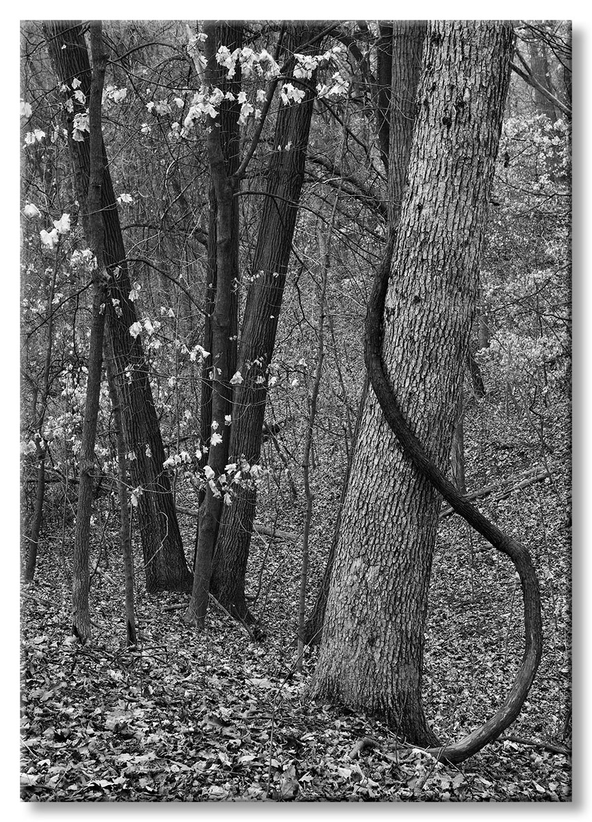
I reworked this winter forest scene image from a few years ago into a b/w. Wasn't sure whether to post it here on on E,S & S. I would appreciate your comments and critiques as I'm continuing to work on learning the nuiances of b/w imagery. Thanks!

Comments

8 comments
Comment posted by Pat Sampson on November 12, 2010 at 7:06 PM
I like this a lot Wayne, particularly the dark trunks. My only reservation is that curving limb. Compositionally, If I were trying to sketch this I'd mostly have the set of diagonal verticals. That limb brings the dark tone into the rest of the image but it also introduces the only real curve that I see in the image. I think the image would be cleaner without it but also less interesting - So... The conversion per se, looks very goodt to me.

Pat
Registered on May 19, 2007, 953 Posts, 15989 Comments
Comment posted by Gary Yeoh on November 12, 2010 at 7:45 PM
Wayne:
I used to only like color images but the more I see of the B&W, the more I am beginning to appreciate the beauty of the monochrome images. The conversion here looks perfect and there are enough tonal elements here to keep the eyes interested. :toast:
Registered on September 1, 2009, 588 Posts, 8184 Comments
Comment posted by Wayne Rhodus on November 13, 2010 at 3:18 PM
Thanks for your thoughts Pat. The "S" curve of the vine is what caught my eye in this scene and I felt it was the one element that makes this image a little unusual and hopefully interesting. I'm not sure too many people would linger on this image were it merely composed with the verticals of the trees alone.

I'll be interested to hear what others think. :smile:
Registered on November 16, 2003, 157 Posts, 3326 Comments
Comment posted by beth summer on November 13, 2010 at 6:31 PM
Interesting, Wayne. I think your conversion looks pretty good...nice tonal contrast and detail. The curved limb is unsettling to me only in the context of the overall picture. I think if it was a different comp, it might work well. Not sure since I wasn't there so don't know what angles could be worked to shoot it differently. But I do have to say, that the more I look at this, the more comfortable I seem to be in viewing the image. Hmm :rolleyes:
Registered on November 1, 2003, 437 Posts, 5220 Comments
Comment posted by Catherine Reilly on November 14, 2010 at 1:35 AM
Just crammed with texture! The tree on the right is unusual and adds a lot of interest.
Registered on August 16, 2006, 603 Posts, 9192 Comments
Comment posted by Michael Lowe on November 14, 2010 at 1:29 PM
I always love the diversity of opinions in this forum. Some like the curving vine and others don't. Personally, I think it's what makes the image. Great B&W conversion. :toast: :toast:
Registered on February 11, 2004, 777 Posts, 5252 Comments
Comment posted by Morris McClung on November 14, 2010 at 4:24 PM
Heresy! Where's the color? :biggrin:
Great conversion imo, and of course it's especially to my liking, because of the strong contrast and rich tones. I like the comp as well with that snaking trunk on the right. :toast:
Registered on May 7, 2007, 670 Posts, 19650 Comments
Comment posted by Larry Lynch on November 15, 2010 at 8:22 AM
I like it. Beautifully crafted.
Registered on September 16, 2006, 773 Posts, 9940 Comments