Gallery: LandscapePosted November 17, 2010465 views14 comments
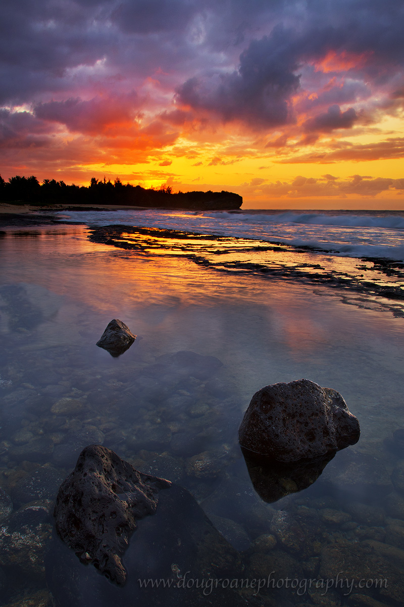
Poipu, Kaua'i, taken 4/10.
Canon 5DII. 24-105 @ 24 mm. ISO 100. f/19. 3 blended exposures of 1/8, 1/4, and 2 sec.
C&C appreciated. See LARGER VERSION for best detail. Thanks!
Comments
14 comments
Comment posted by Bob Miller on November 17, 2010 at 2:11 AM
Super\
Registered on January 24, 2005, 152 Posts, 405 Comments
Comment posted by Dean Sauskojus on November 17, 2010 at 2:55 AM
Awesome colors Doug. I like being able to see down into the water. Nice placement of those rocks. Great job.
Registered on September 29, 2009, 137 Posts, 2659 Comments
Comment posted by Bill Chambers on November 17, 2010 at 11:03 AM
I love the color highlights within the clouds - awesome comp too.
Registered on April 10, 2005, 753 Posts, 21216 Comments
Comment posted by Zack Clothier on November 17, 2010 at 11:31 AM
Looks good Doug, I might tone down the yellows in the sky just a bit though. I love the detail and placement of those "lava" rocks in the FG
Registered on January 28, 2010, 343 Posts, 2257 Comments
Comment posted by Scott Smorra on November 17, 2010 at 4:49 PM
Beautiful shot Doug. Definitely looks like Kauai. I like how you captured the under water details of the foreground pool. Blending looks very good.
Registered on November 2, 2009, 161 Posts, 2143 Comments
Comment posted by Nick Bristol on November 17, 2010 at 8:31 PM
This is really pretty Doug. I like this comp and it is really cool seeing down into the water. The clouds are awesome. I think I would tone the yellow down a bit too, as Zack mentioned. The reflections are also very nice.
Nick Bristol
Lone Rock, WI.
Registered on February 1, 2004, 752 Posts, 14140 Comments
Comment posted by Stan Rose on November 17, 2010 at 8:47 PM
Ok, I'll be the meanie, it's a dirty job but someone's got to do it. I'm guessing a superbly crafted shot like this, with all these intense but very believable colors, would have about 30+ comments by now if this was a strong comp, so let me take a stab at why i don't think it's connecting with a larger audience:
The way i see it, this is two seperate shots with not enough connecting the two subjects. Part of that is my aversion to fg rocks, but even putting aside my bias, just do a simple 50/50 crop of the top and bottom here. The bottom is an awesome subject, those stark lava rocks are super cool, and i think if you had someohow manged to get a shot of just the rocks with some more of that color from the sunset mixing into the lower half of the shot, it would have been a killer shot. Likewise, i think the top could have stood on its own as a killer shot, if you could have tamed some of the tough contrast in the fg surf. It might not have even been an issue at full scale--it just looks at this size like compression is turning those surf contrasts into black and yellow patches, and the defintion is lost. Those waves in the bg look fantastic, of course at this size its tough to see them, but im betting a comp with 2/3 sky and 1/3 water would look amazing. Sooo, in short--i just think you bit off too much here--believe me i understand the temptation--but less is almost always more, as im sure you know!
Registered on September 15, 2005, 836 Posts, 17099 Comments
Comment posted by Doug Roane on November 17, 2010 at 9:10 PM
Thanks folks. Thanks Stan, for the thoughtful critique - you know I can take it!
Registered on December 12, 2008, 213 Posts, 2226 Comments
Comment posted by Vance Gese on November 17, 2010 at 10:09 PM
Gorgeous color, Doug and remarkable clarity of the foreground water. Beautiful work.
Registered on November 13, 2008, 298 Posts, 6629 Comments
Comment posted by Doug Roane on November 17, 2010 at 11:24 PM
Here's a version with the yellow toned down a little - much more and it started to look 'muddy'. It's pretty hard to see a difference without the 2 side by side
Registered on December 12, 2008, 213 Posts, 2226 Comments
Comment posted by Doug Roane on November 17, 2010 at 11:28 PM
Ok, Stan - here's on the lines of your crop suggestion. Honestly, it doesn't excite me much, and I find the pennisula rather obtrusive. If I had been motivated to wade out to that area, got low and used a wide angle to really emphasize the leading lines of the shore breaks, that would have been something!
Registered on December 12, 2008, 213 Posts, 2226 Comments
Comment posted by Arild Heitmann on November 18, 2010 at 8:22 AM
Amazing colours!
Registered on October 13, 2010, 27 Posts, 378 Comments
Comment posted by Stan Rose on November 18, 2010 at 6:34 PM
Hey, water is meant to be waded out into...
Registered on September 15, 2005, 836 Posts, 17099 Comments
Comment posted by Morris McClung on November 18, 2010 at 7:50 PM
One of my very favorite places on earth, and this scene is why. Sunrises and sunsets like this are common to my experiences there. This is as grand as any I have ever seen there. Outstanding shot!
Registered on May 7, 2007, 670 Posts, 19650 Comments

Comments
14 commentsNick Bristol
Lone Rock, WI.
The way i see it, this is two seperate shots with not enough connecting the two subjects. Part of that is my aversion to fg rocks, but even putting aside my bias, just do a simple 50/50 crop of the top and bottom here. The bottom is an awesome subject, those stark lava rocks are super cool, and i think if you had someohow manged to get a shot of just the rocks with some more of that color from the sunset mixing into the lower half of the shot, it would have been a killer shot. Likewise, i think the top could have stood on its own as a killer shot, if you could have tamed some of the tough contrast in the fg surf. It might not have even been an issue at full scale--it just looks at this size like compression is turning those surf contrasts into black and yellow patches, and the defintion is lost. Those waves in the bg look fantastic, of course at this size its tough to see them, but im betting a comp with 2/3 sky and 1/3 water would look amazing. Sooo, in short--i just think you bit off too much here--believe me i understand the temptation--but less is almost always more, as im sure you know!