Nature Photographers Network
This is the preserved archive of the original Nature Photographers Network. The community continues at naturephotographers.network.
Taking a dip
‹ PreviousFlora GalleryNext ›

Taking a dip

by Morris McClung

Gallery: FloraPosted February 26, 2011124 views17 comments
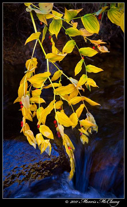
Found this plant, not sure of the i.d., last fall along this mountain stream in Rocky Mountain National Park. Of course I loved the colors. The light reflected on the wet rock is too blue, but I just liked the way it complimented the yellows. Too much?

5d, 28-135mm, tripod, remote shutter release, polarizer,

Comments and critiques always welcome, and thank you for looking,

Morris

Comments

17 comments
Comment posted by Vincent Nobel on February 26, 2011 at 12:31 PM
Great find! The contrast in colors is great! Really like the comp also - thanks for sharing - Vince
Registered on June 16, 2010, 57 Posts, 175 Comments
Comment posted by Robert Stough on February 26, 2011 at 12:55 PM
The colors are pretty intense but in this case I think appropriately so as they really make for a beautiful combination.
Registered on November 20, 2010, 26 Posts, 273 Comments
Comment posted by Carol Hyman on February 26, 2011 at 2:18 PM
Morris, You're right. The blue is too blue LOL
Unfortunately IMVHO, it draws the eyes away from the wonderful leaves. Perhaps just darkening it a tad might keep the same complementary balance but place more attention on the yellow leaves.
Can't help with the ID.

Ciao ;^)

Carol
Registered on January 18, 2007, 597 Posts, 8062 Comments
Comment posted by Pat Sampson on February 26, 2011 at 3:48 PM
Morris,

You're asking the wrong person, in my case, if it's too much. (smile) I like the intense complementary colors very much. Also the red berries. Beautiful image. Ok, one minor gnat in my eye - I might clone out the edge cluster of leaves in the viewer's upper right corner in order to better emphasize the overall shape of the leaves in the rest of the image. I don't really have a reason for it. Just seems cleaner to me. It's a nothing comment though.

I know what it is. They lead my eye out of the frame.

pat
Registered on May 19, 2007, 953 Posts, 15989 Comments
Comment posted by Mark Windom on February 26, 2011 at 4:15 PM
I wouldn't change a thing with the colors....the warm/cool contrast is terrific. Nice find!
Registered on November 1, 2003, 176 Posts, 2302 Comments
Comment posted by David W. Kelly on February 26, 2011 at 5:41 PM
I love the blue and yellow paired together and a little bit of red along for the ride. Very nice Morris.
Registered on October 7, 2005, 883 Posts, 6590 Comments
Comment posted by Brigitte Lorenz on February 26, 2011 at 5:54 PM
Very nice image, Morris...the rock is a bit too blue, but in combination with the yellow and red it works for me...well done!

Brigitte
Registered on January 10, 2009, 187 Posts, 1507 Comments
Comment posted by Bill Fach on February 26, 2011 at 6:56 PM
Morris: Drop dead gorgeous. I usually don't like reflected water this blue but in this case it works great. Wonderful find and a superb image.>=))>

PS: What part of the park?
Registered on November 1, 2003, 1805 Posts, 26981 Comments
Comment posted by Morris McClung on February 26, 2011 at 9:06 PM
Not a problem, Charlie. No controversy to express your opinion. :wavey:
Registered on May 7, 2007, 670 Posts, 19650 Comments
Comment posted by Anne K. Rusk on February 26, 2011 at 9:52 PM
I really like the combo of colors here as well as the mix of flowing water and the berries. Not too much blue for me, Morris! I think the blue is a little bright, actually, but the tone is right on for color contrast. Excellent!
Registered on October 10, 2010, 65 Posts, 904 Comments
Comment posted by Bob Duff on February 27, 2011 at 12:37 PM
Morris, wonderful capture. I really like th ecolour combo as well. I believe the plant id is a solomon's seal. Was this a gold'n'blue polarizer that was used. If so, it worked its charm.
Registered on April 21, 2010, 160 Posts, 1675 Comments
Comment posted by Morris McClung on February 27, 2011 at 3:54 PM
Thanks Bob for the i.d. And no, it was a straight circular polarizer..
Registered on May 7, 2007, 670 Posts, 19650 Comments
Comment posted by Albert Darmo on February 27, 2011 at 5:28 PM
Hi Morris :wavey: Boy!! It's amazing how you can find stuff :eek: here in quebec Its tough to find good images in 3FT of snow :confused: Guess i'll have to go back to my last year files like you did :biggrin: I like the Van Gogh effect on the blue ,red and gold colors here :eek: and the flowing lines and patterns of the leaves .... .I really go for this artistic rendition of the scene, :jump:
Albert Darmo. Canada
Registered on November 25, 2008, 1386 Posts, 11978 Comments
Comment posted by Krunal Janani on February 28, 2011 at 8:31 AM
Great find Morris, i like the too blue reflection really sets the image apart IMHO
i agree with Pat on the URC :wavey:
Registered on September 16, 2010, 60 Posts, 1370 Comments
Comment posted by Derek Yow on March 1, 2011 at 10:03 AM
Nicely seen Morris. The rock would be too blue on it's own, but with the leaves I think it works just fine. Great combination of elements!
Registered on May 18, 2010, 26 Posts, 655 Comments
Comment posted by Barbara Graham on March 2, 2011 at 12:09 AM
Morris, I think this is beautiful as is, comp, light and colors.
Registered on July 27, 2010, 1310 Posts, 5035 Comments
Comment posted by Lorna Taylor on March 5, 2011 at 6:47 PM
This is so beautiful Morris, everything is just perfect!
Registered on November 12, 2010, 254 Posts, 3083 Comments