
Nature Photographers Network
This is the preserved archive of the original Nature Photographers Network. The community continues at naturephotographers.network.
Pictured Rocks
‹ PreviousLandscape GalleryNext ›

Pictured Rocks

by Nick Bristol

Gallery: LandscapePosted March 30, 2011465 views28 comments

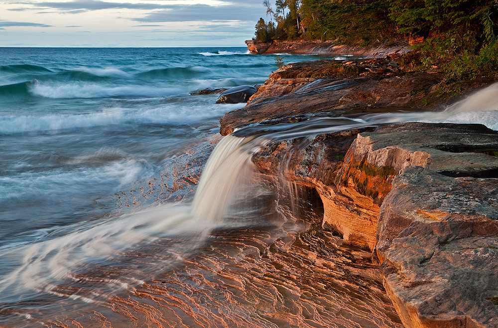
This is another view of Elliot Falls at Pictured Rocks National Lakeshore on Lake Superior. This is just east of Munising in Upper MI. I took this in late afternoon light not long before the sun set. This is a place I enjoy on late afternoons when I'm around the Munising area. I'm also including a crop version because I couldn't really decide on which one. Would appreciate thoughts on which one you like better, and of course any other thoughts too.
5D2, 24-105 @60, iso 200, f/16, 0.8 sec. and Polarizer.

Comments

28 comments
Comment posted by Nick Bristol on March 30, 2011 at 3:07 PM
Here is the crop version.
Registered on February 1, 2004, 752 Posts, 14140 Comments
Comment posted by Sebastian Kraus on March 30, 2011 at 3:49 PM
Greate photo in every single detail... :rolleyes:
Registered on March 17, 2011, 30 Posts, 132 Comments
Comment posted by Joseph Balcken on March 30, 2011 at 3:49 PM
Nick, I definately prefer the 1st version. To me, the most interesting element at this location is the small ridges in the fg rocks. The warm light only enhances the interest. The 2nd version crops the best part IMO. I also like your shutter speed choice.
Registered on November 29, 2009, 48 Posts, 249 Comments
Comment posted by Luis Argerich on March 30, 2011 at 3:56 PM
Hi Nick,
I prefer the 1st version.
You have a very nice composition, excellent light and you nailed the exposure time as it works for both the "waterfall" and the sea at the same time.
A very balanced and powerful image.
Registered on December 22, 2009, 91 Posts, 1349 Comments
Comment posted by Peter Richter on March 30, 2011 at 3:56 PM
Nick, I clearly prefer the uncropped version, as it shows the delightful details in the foreground. There are great lighting conditions and the flow of the water adds a lot. An appealing capture of this moment!

Peter
Registered on November 10, 2010, 218 Posts, 2723 Comments
Comment posted by Larry Reitz on March 30, 2011 at 7:09 PM
Nick, this is an excellent capture. The light is perfect and the composition is classic. I really like it. Now, as far as the 2 versions go, after toggling back and forth I think I prefer the original, but it's a close call. The falls takes up a higher percentage of the frame in the cropped version (a good thing IMHO) and that is what makes it such a close call for me. I would not hesitate to print either.
Registered on September 7, 2007, 32 Posts, 335 Comments
Comment posted by John Mumaw on March 30, 2011 at 7:40 PM
Excellent light, composition and capture! I prefer the cropped version for two reasons...the water runoff falls into the corner and the already truncated rapids on the right are gone. Those rapids were almost a distraction, IMO.
Registered on September 9, 2005, 62 Posts, 2289 Comments
Comment posted by Mark Seaver on March 30, 2011 at 8:06 PM
I'm with Joseph in that I prefer version #1 because of the sunlit rock layers leading into the picture. This is a terrific photo.
Registered on January 23, 2011, 1103 Posts, 17270 Comments
Comment posted by Jared Atencio on March 30, 2011 at 8:11 PM
I like the light you captured here and a great shutter speed with the waves in the BG as well. I agree with John that the rapids on the RHS are a bit of a distraction, but I still prefer the 1st version over the second. I also wish I could see a little more of the stream leading to the falls, so would prefer a bit higher vantage point from where you shot this, but that's being extremely picky. I love "seascapes" shot from the Great Lakes!
Registered on June 23, 2009, 21 Posts, 422 Comments
Comment posted by John Mumaw on March 30, 2011 at 8:29 PM
I forgot about those wonderful rock layers near the bottom, so I hereby change my vote to Jared's choice...a crop on the right side only.
Registered on September 9, 2005, 62 Posts, 2289 Comments
Comment posted by Morris McClung on March 30, 2011 at 8:33 PM
Wonderful light and moment you captured. Excellent work.
Registered on May 7, 2007, 670 Posts, 19650 Comments
Comment posted by Michael J Greene, on March 30, 2011 at 8:47 PM
Hi Nick,

I hope all is well. Both versions are great. I like the second version for the reason John mentioned - the rapids. However, my fiancee likes the first version better. It's kind of close, I think the first version is presented better because of the black matting. Anyways, wonderful image my friend.

Michael
Registered on June 18, 2009, 86 Posts, 2317 Comments
Comment posted by Stan Rose on March 30, 2011 at 8:58 PM
This is gorgeous, NIck! I prefer it uncropped--the more the better here! :smile:
Registered on September 15, 2005, 836 Posts, 17099 Comments
Comment posted by Tom Haxby on March 30, 2011 at 9:09 PM
Nick: Both are very well done. Maybe I will run into you again this fall up there as this is one of my favorite places too. Glad too that we stayed late that one evening with the spectacular sunset.

I think that I prefer the cropped version because the small portion of the stream on the right is bit of a distraction.
Registered on July 6, 2006, 126 Posts, 647 Comments
Comment posted by Nick Bristol on March 30, 2011 at 10:33 PM
Thanks to all of you for your thoughts on this so far. There seems to be good reasons for both comps here, and I have found them very helpful. :smile: Nick
Tom,I will look for you this fall in the U.P.

Registered on February 1, 2004, 752 Posts, 14140 Comments
Comment posted by Nancy Lea Sandy on March 30, 2011 at 11:48 PM
Love the waterfall and the waves. I think both versions work but I like rock, so the uncropped one is my favorite. The texture in the fg is a great foil for that lovely silky water. These are both great though.
Registered on January 24, 2011, 576 Posts, 6942 Comments
Comment posted by Tony Kuyper on March 31, 2011 at 12:09 AM
Nice, Nice. I like the contrast between the warm rocks and cool ocean colors. Crop is maybe a bit better as it emphasizes the falls more.
Registered on November 1, 2003, 364 Posts, 22328 Comments
Comment posted by Vance Gese on March 31, 2011 at 1:01 AM
The light is amazing, Nick, especially on these rocks in the foreground. Excellent composition. I much prefer your first, uncropped version. The water entering the frame on the right had side is a bit of a distraction and simply cropping the right hand side a bit would take care of that, but I wouldn't touch the rest of the image. Beautiful work.
Registered on November 13, 2008, 298 Posts, 6629 Comments
Comment posted by Chris Chamberlain on March 31, 2011 at 2:14 AM
Very nice image and scene! I think the frame is helping too, but still would go for the uncropped version. I could do without the rapids on the right as mentioned. Nice!

Chris
Registered on March 13, 2007, 500 Posts, 8365 Comments
Comment posted by David Chauvin on March 31, 2011 at 5:02 AM
Beautiful shot, Nick. The light on the rocks is the star of the show for me, so I prefer the first version.
Registered on August 5, 2004, 1007 Posts, 5595 Comments
Comment posted by Morkel Erasmus on March 31, 2011 at 9:52 AM
sweet sweet light, textures and colour contrasts!
I too prefer the first post...
Registered on March 22, 2011, 385 Posts, 2068 Comments
Comment posted by Nick Bristol on March 31, 2011 at 9:59 AM
Thanks so much for all of your comments. They have been very helpful deciding what to do for this as far as a print goes. I think a crop that takes some off the right side only sounds like a good way to go for this. That seems to keep what most everybody likes, and take away what they don't. I had not thought of that option, so this has been very helpful.
I did the right side crop and will post it here. If I had added a black border that may have made for a better comparison.
Thanks, Nick
Registered on February 1, 2004, 752 Posts, 14140 Comments
Comment posted by Andreas Resch on March 31, 2011 at 11:58 AM
Very cool shot, Nick. I love the original, uncropped version as I like that bright corner on the foreground and the lines on the rock.
Registered on November 14, 2007, 322 Posts, 6101 Comments
Comment posted by Robert Dayton on March 31, 2011 at 2:50 PM
Lovely light and color, NIck! The FG details are very sharp. Thanks for sharing.
Registered on November 11, 2008, 281 Posts, 3958 Comments
Comment posted by John Mumaw on April 1, 2011 at 7:20 PM
Bingo...cut & print!! :cool:
Registered on September 9, 2005, 62 Posts, 2289 Comments
Comment posted by Nick Bristol on April 2, 2011 at 8:48 AM
Thanks to all of you for your comments and the help. I think this last version will be my print! Nick
Registered on February 1, 2004, 752 Posts, 14140 Comments
Comment posted by Zack Clothier on April 2, 2011 at 9:57 AM
Last version looks great Nick, print large! :toast:
Registered on January 28, 2010, 343 Posts, 2257 Comments
Comment posted by Nick Bristol on April 2, 2011 at 7:42 PM
Thanks Zack, Just what I'm going to do. :wink: Nick

Registered on February 1, 2004, 752 Posts, 14140 Comments