Nature Photographers Network
This is the preserved archive of the original Nature Photographers Network. The community continues at naturephotographers.network.
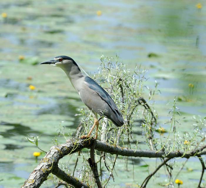
Night Heron (Nycticorax)
‹ PreviousAvian GalleryNext ›

Night Heron (Nycticorax)

by Renzo Dionigi

Gallery: AvianPosted May 12, 201153 views4 comments
Hello everyone! I am a new member of NPN, and this is the first photo I post in the gallery. It has been taken in a wonderful swampland of the Po Valley in Italy (Torrile, Parma). It took me a couple of hours to photograph this lovely medium-sized heron. Hope you enjoy. C&C welcomed and encouraged. Camera - Nikon D3S, Lense – Nikkor 80-400, Exposure – 1/2000, Aperture – f/7, ISO 1000

Comments

4 comments
Comment posted by Marsel van Oosten on May 12, 2011 at 7:37 AM
Not the prettiest heron - they always seem out of proportion to me. I like the tones here, but there's too much space on the right and too little on the left imho. I'd also prefer to see more light on the head and the eye in particular.
Registered on March 9, 2004, 285 Posts, 2277 Comments
Comment posted by Nate Chappell on May 12, 2011 at 10:15 AM
Welcome Renzo, nice looking heron, I like the subtle greens. Compositionally I would prefer more room on the left and less room on the right. :toast:
Registered on February 1, 2006, 1158 Posts, 19528 Comments
Comment posted by Keith Bauer on May 12, 2011 at 12:02 PM
Another Welcome Renzo! Thanks for posting in the Avian critique gallery. I think you've already received some good advice from Nate and Marsel. I'll add that there is a distinct green color cast to the image that could be corrected in post processing. We look forward to more of your work.
Registered on November 20, 2003, 458 Posts, 4836 Comments
Comment posted by Luca Mussato on May 12, 2011 at 4:49 PM
Welcome also from me , Renzo. Very particular birds they are, aren't they?. Some comments from my POV they are all personal opinions. 1) compositionally it could ha benefit if the main subject was placed on the rightmost third of the frame, it seems you cut the picture to square, but i do not know if from the left or from the right or both. 2) my preference goes to have the eye and the head more in lights. 3) i appears too bright, over all, on my screen, so I would reduce a bit the lights/exposure.

Hope it make sense,
Luca
Registered on November 14, 2006, 118 Posts, 855 Comments