Nature Photographers Network
This is the preserved archive of the original Nature Photographers Network. The community continues at naturephotographers.network.
Blue + Reposts
‹ PreviousLandscape GalleryNext ›

Blue + Reposts

by Eva McDermott

Gallery: LandscapePosted May 18, 2011656 views18 comments
Third film image in a row in Landscape...... How different is that?

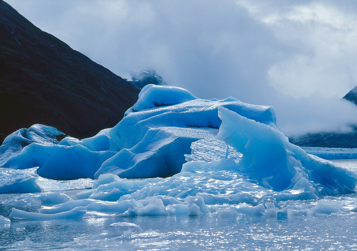
Blue ice floating near Portage Glacier (near Anchorage Alaska) in 1983 with steel gray skies. I know the light may be a little strong for most, but it is that light bringing out the blues in the glacier. Ektachrome Professional 100 medium format film taken with a Mamiya 645. I did crop a little off the bottom since there were some distracting small rocks there. Scanned with an Epson V750 and adjustable holder from betterscanning.com (just received it last week) to refine scanning focus and flatten the film. I have been going through my older work lately so please let me know what you think.

Thanks for looking and for any comments.

I really want to revisit this area to see how it has changed in 28 years.

Here is a link of an image I posted a while ago on NPN from the same area. Portage Glacier 1983

Comments

18 comments
Comment posted by Tom Kennon on May 18, 2011 at 9:05 PM
Very nice image, Eva. I was at Portage Glacier in early September last year. It is a beautiful place and I did not see another photographer the entire time I was there!
Registered on August 20, 2005, 6 Posts, 132 Comments
Comment posted by Nick Bristol on May 18, 2011 at 10:36 PM
Eva, The blue tones and the light on the ice looks wonderful to me. I like the fog in the bg too, but the dark diagonal line doesn't work that well for me. 28 years, yes it would be interesting to see the changes and what you might come back with :wink: .

Nick Bristol
Lone Rock, WI
Registered on February 1, 2004, 752 Posts, 14140 Comments
Comment posted by Vance Gese on May 19, 2011 at 12:26 AM
Love the blues, Eva, and the wonderful forms and shades in the ice. While I like seeing these icebergs in their setting, I could see several crops to really focus on the ice only, trying to minimize the background; guess more of an abstract ice image perhaps. Just a thought. I was last there at Portage in 2005; you would be surprised how much less ice there is in the lake due to recession of the glacier.
Registered on November 13, 2008, 298 Posts, 6629 Comments
Comment posted by Anand Narayanan on May 19, 2011 at 7:05 AM
Made a brief stop at portage while hitching a ride from denali to seward last august. The steel grey skies remain, but a fair bit of the ice has disappeared :frown:
Registered on October 25, 2009, 110 Posts, 835 Comments
Comment posted by Stuart Williams on May 19, 2011 at 7:47 AM
gorgeous blues there eva.
Registered on December 7, 2007, 247 Posts, 4792 Comments
Comment posted by Bill Chambers on May 19, 2011 at 11:44 AM
I never thought I would give up film, and now I can't imagine using anything but digital! Still, I do miss the old days sometimes. Great color and texture in the ice Eva. From reading the other comments, it's sad to think the ice has disappeared to such an extent.
Registered on April 10, 2005, 753 Posts, 21216 Comments
Comment posted by Eva McDermott on May 19, 2011 at 12:16 PM
Thanks for your comments and critiques. Here is a cropped version.
Registered on January 4, 2009, 1015 Posts, 13229 Comments
Comment posted by Rodrigo Sandoval on May 19, 2011 at 12:48 PM
Liked the first photo, even with the strong light.
... but the cropped version is just perfect!!!
Registered on April 4, 2009, 13 Posts, 254 Comments
Comment posted by Scott Miller on May 19, 2011 at 1:56 PM
Love the cropped version, the highlights and texture lead the eye nicely
Registered on May 9, 2011, 23 Posts, 322 Comments
Comment posted by Kent Mearig on May 19, 2011 at 3:02 PM
Count me a strongly opposed to the crop. Don't you think the sense of place is integral to the success of the photograph? Even the cloudy sky works to provide some scale, at least for someone with experience in this type of landscape. The qualities of the ice itself don't hold me without the backdrop.

I think the light is perfect for the subject, but I might be tempted to go less blue overall.
Registered on September 4, 2006, 237 Posts, 4748 Comments
Comment posted by R.Bill Moser on May 19, 2011 at 3:39 PM
Gorgeous light with great textures in the ice.
Registered on January 29, 2010, 285 Posts, 4281 Comments
Comment posted by Luis Argerich on May 19, 2011 at 4:39 PM
A great version of the majestic color of ice. Bluestastic!
Registered on December 22, 2009, 91 Posts, 1349 Comments
Comment posted by Eva McDermott on May 19, 2011 at 7:21 PM
Thanks for the critique Kent. I do like the larger view better myself but the dark slope on the left seems to be problematic to some due to the limitations of the film I used back in the day and I can see why today in the digital world some people have a problem with it. I did lighten it a bit by selecting it and creating an exposure layer since there is some detail in the transparency but a single scan does not capture the dark areas and bright areas well. I scanned for the bright areas. I have many other transparencies as well as negative medium format images from Portage Glacier, Mendenhall Glacier, and Denali from 1982 and 1983 that I am starting to revisit and scan. I am contemplating updating my SilverFast Ai software to Silverfast Ai Studio. This will allow me to blend multiple scans at different scan exposures. The blues are "as seen" in the Ektachrome transparency. I don't remember the degree of blue since it was 28 years ago but this is the level of blue on the transparency. I rarely apply any saturation adjustments to any of my images whether they be film or digital. I do appreciate your input and thanks again.
Registered on January 4, 2009, 1015 Posts, 13229 Comments
Comment posted by Mark Seaver on May 19, 2011 at 9:10 PM
The blues really sing in this shot.
Registered on January 23, 2011, 1103 Posts, 17270 Comments
Comment posted by Santosh Ponnan on May 19, 2011 at 10:01 PM
Eva, I really liked your cropped version. I liked the color and texture of the iceberg but something was not making it a striking image. But I was not able to pin point it. The second version is just perfect. It shows the color and the texture of the ice. Great job again :toast:
Registered on June 15, 2007, 56 Posts, 113 Comments
Comment posted by Eva McDermott on May 19, 2011 at 10:33 PM
Processed without bringing out detail in the dark peak on the left.
Registered on January 4, 2009, 1015 Posts, 13229 Comments
Comment posted by Ian Cameron on May 20, 2011 at 1:49 PM
Eva that looks like a lovely smooth scan with very little obvious shortcomings at all. The textures on the ice berg are superb and even the detail on the slopes is apparent in the shadow so very well done. I am with Kent on the sense of place prevailing.
Registered on August 6, 2004, 1125 Posts, 3318 Comments
Comment posted by Stan Rose on May 20, 2011 at 8:05 PM
Cool--i was at Portage about 1996 or so. I like the first post here best, but to be honest i think the reflections on the ice/water are just a bit too harsh for this to really work well. Great subject though :wavey:
Registered on September 15, 2005, 836 Posts, 17099 Comments