Nature Photographers Network
This is the preserved archive of the original Nature Photographers Network. The community continues at naturephotographers.network.
Eva's Falls +repost
‹ PreviousLandscape GalleryNext ›

Eva's Falls +repost

by Lon Overacker

Gallery: LandscapePosted August 24, 2011419 views32 comments
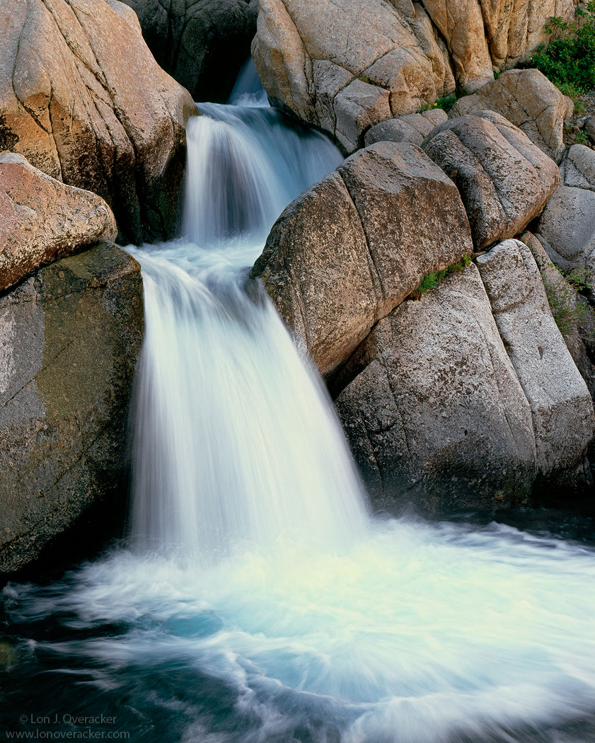
You've seen these falls before. I've posted them as well as Preston has recently posted a couple of versions taken years past. As he tells it, he named these falls after the passing of a fellow fire fighter and friend, Eva, many years ago.

These cascades are located on what is called Deadman's Creek along the Sonora Pass in the Central Sierra. Captured this a few weeks ago. This is early morning before the sun has had a chance to wash away everything, which it does in this part of the country.

Quite a bit of trouble processing this one so I'm especially interested in how you find the colors, saturation, etc. And of course, all comments and suggestions appreciated.

4x5, 210mm, V100f, f/16 @14/2

thanks!

Lon

Comments

32 comments
Comment posted by Navin Sarma on August 24, 2011 at 6:19 PM
Lon,

I like the texture of the falls, but my favorite part is the color of the water, apparent from the top of the falls and in the calm parts of the basin. The teal is refreshing and pleasing to me.
Registered on July 17, 2011, 233 Posts, 1373 Comments
Comment posted by Yiming Hu on August 24, 2011 at 6:31 PM
Lon, somehow the thumbnail looks a little bit dull and has a green color tint. However, the larger version looks perfect to me. I like the soft quality of the lights, your clean composition, and your shuttle speed control.
Registered on April 28, 2011, 38 Posts, 733 Comments
Comment posted by Ian Cameron on August 24, 2011 at 6:37 PM
Like this a wonderfully natural look and great detail.
Registered on August 6, 2004, 1125 Posts, 3318 Comments
Comment posted by Neale Dyster on August 24, 2011 at 6:41 PM
Like everything about it Lon. Composition, detail in the water, colours and clarity all make for a wonderful image.
Registered on February 19, 2008, 94 Posts, 738 Comments
Comment posted by Eva McDermott on August 24, 2011 at 6:43 PM
I like the light and water motion here Lon as well as the touch of blue in the water. Splendid detail in the larger view..
Registered on January 4, 2009, 1015 Posts, 13229 Comments
Comment posted by Alex Mody on August 24, 2011 at 7:10 PM
There is just the perfect amount of texture in the water, and I especially enjoy the delicate colors all around this image.
Registered on December 25, 2007, 163 Posts, 1896 Comments
Comment posted by Michael J Greene, on August 24, 2011 at 7:13 PM
Your processing looks really good Lon. Nice and natural - it doesn't look overdone at all. I especially like the colors in the water and rocks. You might consider adding a vignette to the upper corner the greens there catch my eye a bit and hold it. Overall, I think it looks great. The shutter speed is spot on perfect.

Michael
Registered on June 18, 2009, 86 Posts, 2317 Comments
Comment posted by Lon Overacker on August 24, 2011 at 7:39 PM
Thanks for the comments folks! Much appreciated. I'm glad that the color in the water is noticed because that's one of the things I wanted to maintain. I don't think I've done this before but I thought I would post the unprocessed scan for reference. You can see the typical magenta color cast we get to deal with in most of the Velvia films as well as the purple fringing on the edges of the cascades. That may be part of the scanning inadequacies too. Anyway, this was a challenge, but I'm glad it's passing the bar so far.

Michael, thanks for the tip on the greens in the corner. I'll take a look at that when and if this ever sees print. If anything I just may selective desaturate the greens rather than vignette the corner... have to think about it.

anyway, thanks for the comments.!

Lon
Registered on November 24, 2006, 521 Posts, 19147 Comments
Comment posted by Joe Abounader on August 24, 2011 at 7:40 PM
Like others said, perfect exposure for the water, and perfect colour saturation. I like the details in the rocks. Great shot Lon.
Registered on June 15, 2011, 14 Posts, 58 Comments
Comment posted by John Mumaw on August 24, 2011 at 7:51 PM
This looks a natural and pleasing as can be, and especially since you posted the original scan. I like the composition and the staggered falls very much.
Registered on September 9, 2005, 62 Posts, 2289 Comments
Comment posted by Nancy Lea Sandy on August 24, 2011 at 7:55 PM
Best water shot I've seen: silky texture, wonderful color (love the blues), and great supporting elements.
Registered on January 24, 2011, 576 Posts, 6942 Comments
Comment posted by Yiming Hu on August 24, 2011 at 8:02 PM
Now seeing the original version, I would say that I *might* prefer the middle way between the original scan the the new one. :biggrin: I envision that what will happen if you reduce some blue (adding yellow) and adding some red on the original scan...
Registered on April 28, 2011, 38 Posts, 733 Comments
Comment posted by Michael Hackett on August 24, 2011 at 8:05 PM
Navin pretty much summed up what I was going to say. I really love the teal in the water.
Registered on January 12, 2008, 71 Posts, 192 Comments
Comment posted by Luke Ormand on August 24, 2011 at 9:26 PM
Neat scene with a splash of green. Composition is very strong here with a well maintained "off-balance" look.
Registered on February 4, 2009, 1093 Posts, 7035 Comments
Comment posted by Tony Kuyper on August 24, 2011 at 9:57 PM
Interesting. I really like the comp and the textures throughout. The water and rock textures play nicely with each other. I guess I'm in the minority here on the water color. Water on the upper falls looks right, but the color balance of the highlights on the lower, main falls seems too warm, giving a bit of a greenish cast. I can see that the scene needed significant warming, but I could maybe see painting it off these highlights to restore the whiteness to the water. But that's just a thought. It's a really beautiful image.
Registered on November 1, 2003, 364 Posts, 22328 Comments
Comment posted by Morris McClung on August 24, 2011 at 9:59 PM
The water has a slight yellow tint right where the falls hits the pool, but that could just be my monitor. Or my old eyes. :biggrin:
This is a fine intimate landscape image with great water action and detail in the rocks.
Registered on May 7, 2007, 670 Posts, 19650 Comments
Comment posted by Koveh Tavakkol on August 24, 2011 at 10:14 PM
A nice and simple scene Lon. I bet this would also look great in B&W. :toast:
Registered on September 1, 2009, 41 Posts, 608 Comments
Comment posted by Rudy Ruberti on August 24, 2011 at 11:19 PM
Classic Sierra scene and I can just hear the water rushing by. The processing looks fine to me. Nicely done Lon.
Registered on October 28, 2008, 179 Posts, 1875 Comments
Comment posted by Lon Overacker on August 25, 2011 at 1:05 AM
Thanks everyone for your comments and helpful suggestions.

I thought the bright part of the pool had a bit of a yellow tint and now that Morris and Tony both mentioned it I thought I would take a stab at correcting it. Maybe pretty subtle just scrolling between the two versions, but in PS clicking the layer off and on there's quite a difference to see. I used Tony's "Super Brights" luminosity mask and picked a spot to set the white point in a Levels layer as a starting point and then tweaked it a little. Also, the original processing includes TK's Brights Triple Play which really enhanced and improved the detail in the pool and cascades. Amazing stuff. This version is a tad warmer too as I played with the mid tones too.

Thanks again for the comments. Oh, I also desaturated/burned down the greens in the URC a little bit per Michael G's comment.

Lon
Registered on November 24, 2006, 521 Posts, 19147 Comments
Comment posted by Danny Laureys on August 25, 2011 at 2:45 AM
Detail in the rocks and water are excellent, really like the color of the water. :toast: :toast:
Registered on January 5, 2008, 590 Posts, 1261 Comments
Comment posted by Andreas Resch on August 25, 2011 at 3:08 AM
Excellent comp, Lon and thanks for showing us the original scan of the slide as well. It's really interesting to see how the Velvia rendered the colors in this one and how you corrected/changed that. In the initial post I felt that the highlights looked a bit too yellow and saturated, but as I saw it's a little better in your repost.
You know I like water shots and I still have to catch some good ones on film. My Velvia 50 might be too slow for the water action but I might give my Provia 100 a try. Do you have some expereience on Provia 100 and water exposures?
Registered on November 14, 2007, 322 Posts, 6101 Comments
Comment posted by Svein-Frode on August 25, 2011 at 4:26 AM
Lovely capture!
Registered on November 13, 2003, 9 Posts, 277 Comments
Comment posted by David Edwards on August 25, 2011 at 4:53 AM
Another gorgeous cascade scene, Lon. Wonderful light and clarity, and a well balanced comp. The last repost version is nicer with the warmer tone. A beautiful image.
Registered on December 6, 2008, 142 Posts, 2623 Comments
Comment posted by Bill Chambers on August 25, 2011 at 9:27 AM
Very nice Lon, and nice to hear the story too. I'm on an uncalibrated monitor so I can't help much with the color/saturation, but the comp is excellent, and processing looks fine too. Love the texture of the rocks. Very nice overall.
Registered on April 10, 2005, 753 Posts, 21216 Comments
Comment posted by Harley Goldman on August 25, 2011 at 11:25 AM
Nice, solid image, Mr. O. Although I am on the uncalbrated monitor, I find the last version to be a nice improvement. I like it warmed up.
Registered on November 19, 2003, 586 Posts, 11271 Comments
Comment posted by Vance Gese on August 25, 2011 at 1:55 PM
Lon, this is simply stunning in my book. Love the textures in the rocks but what astounds me is how you consistently can bring out such detail and textures and fluidity and color of the cascades in every image you make of flowing water. Together with a masterful composition, this really sings. Your repost of this image even looks more amazing; and the added warmth works perfectly. Beautiful art.
Registered on November 13, 2008, 298 Posts, 6629 Comments
Comment posted by Stan Rose on August 25, 2011 at 2:10 PM
Repost looks great, Lon! Nice flow and balance here. :smile:
Registered on September 15, 2005, 836 Posts, 17099 Comments
Comment posted by Chris Chamberlain on August 25, 2011 at 9:43 PM
Honestly, I don't see how this could be any better! The warmed up version is great!!!!!

Chris
Registered on March 13, 2007, 500 Posts, 8365 Comments
Comment posted by Alister Benn on August 26, 2011 at 4:10 AM
Super crisp, a masterclass...
Registered on June 9, 2011, 23 Posts, 258 Comments
Comment posted by Abdullaziz Bin Ali on August 26, 2011 at 3:13 PM
Hi Lon,
you have chosen an ideal shutter speed
great job
Registered on May 31, 2009, 112 Posts, 1590 Comments
Comment posted by Preston Birdwell on August 26, 2011 at 3:16 PM
Well, we both have lots of shots of this wonderful little waterfall, and the final repost of this one is excellent. I definitely like the warmer version; especially the water. You nailed this one, and your efforts were amply rewarded!

Just a note: the amount water shown in this image, given it was made in early August, is quite high for this time of year, and is more indicative of the flow in early to mid-July.. Usually, the flow is greatly diminshed by August. This really shows the amount of snowpack the Sierra experienced this past winter.

Nice work, as usual, Lon! :toast:

--P
Registered on November 1, 2003, 471 Posts, 5188 Comments
Comment posted by Mark Seaver on August 26, 2011 at 7:04 PM
The processing looks right on to me. I like the texture and details in the rocks and how they contrast with the silky flow of the falls. My favorite part is the plunge pool with the splash textures and the many subtle blue colors.
Registered on January 23, 2011, 1103 Posts, 17270 Comments