Gallery: LandscapePosted September 30, 2011750 views22 comments
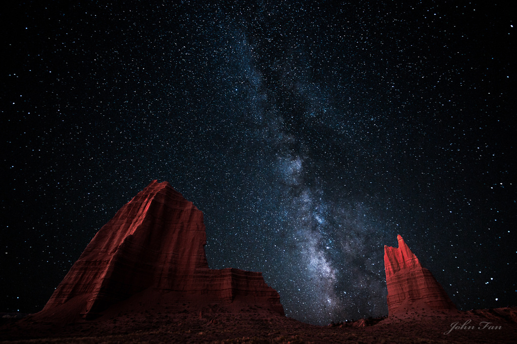
It was taken at Capital Reef, one of the places in US that has least amount of light polution. The Galaxy streches as far as my dream can reach.
Comments
22 comments
Comment posted by Bill Chambers on September 30, 2011 at 1:34 PM
Wow - fantastic John. Truly a beautiful image - well done.
Registered on April 10, 2005, 753 Posts, 21216 Comments
Comment posted by Stan Rose on September 30, 2011 at 1:39 PM
Is this a composite shot? If so, what are the exposures etc?
These Milky Way shots are beginning to really test the boundary between photo art and landscape photography--if there is or should be a line, but that's one for the eternal forum debates (and for the mods to decide...)
On to the critique....
It's very pretty, nice balance and color contrasts--looks like it would make a nice book cover. Cathedral is obviously a great spot for photos! But I can't really relate to it for 3 reasons--the light painting looks very 'staged' or targeted rather than even (which would look more 'natural' to me), the shot looks like a composite, and the distortion is a bit extreme for my tastes. I think i could write a book on why Jared's post appealed to me and this one doesn't as much, but you'd get bored pretty quick so i'll leave it at that.
I respect and applaud your efforts at creativity here, keep at it, i'm just giving you my (often in the minority) opinion. Boost your comment to post ratio a bit and you'll begin to feel my pain
Registered on September 15, 2005, 836 Posts, 17099 Comments
Comment posted by John Fan on September 30, 2011 at 1:53 PM
Thanks Bill & Stan.
Stan: Yes it was a composite shot. Two shots a few hours a part at the same spot. There was no light painting involved. All the light were natural. The second shot was about half an hour to an hour before sunrise so there was sufficient light. Thanks again for taking time to look at the image, and your detailed comments.
Registered on August 24, 2010, 135 Posts, 489 Comments
Comment posted by Luis Argerich on September 30, 2011 at 2:39 PM
Hi John,
In a dark room this looks really good. I imagine it will be a pain to print and display.
I would have liked the brighter part of the Milky Way to be higher in the sky, that would balance better against the rock formations, as-is I feel the top of the image is not very interesting and I would consider a crop to a panoramic format.
The light on the rocks is really beautiful whatever the source is.
Registered on December 22, 2009, 91 Posts, 1349 Comments
Comment posted by Mark Metternich on September 30, 2011 at 3:04 PM
Its all photo art IMO!
I love this! Fantastic shot.
I too wish people would post more about how they accomplished the image and settings and all that...
Again, KILLER image!
Registered on June 19, 2009, 276 Posts, 6240 Comments
Comment posted by Tony Kuyper on September 30, 2011 at 3:50 PM
Very interesting take on this place. The glowing Entrada formations are wonderful landing spots in the frame. I too sometimes wonder what's keeping star shots from simply being composited.
Registered on November 1, 2003, 364 Posts, 22328 Comments
Comment posted by John Mumaw on September 30, 2011 at 3:55 PM
I happen to like the light on the formations. Al;so like how the Milky Way falls between them so well.
But the distortion is almost too much, esp. on the right. I think you can successfully 'de-fish' these should you so desire.
Registered on September 9, 2005, 62 Posts, 2289 Comments
Comment posted by R.Bill Moser on September 30, 2011 at 4:02 PM
This is a fantastic night shot of the milky way. Well done. The distortion doesn't bother me here that much
Registered on January 29, 2010, 285 Posts, 4281 Comments
Comment posted by Jeremy Cram on September 30, 2011 at 4:04 PM
Too cool John!
Registered on June 4, 2006, 204 Posts, 818 Comments
Comment posted by Stan Rose on September 30, 2011 at 4:34 PM
Ah--ok John, that explains it! I was wondering why it looked uneven like that--would have been tough to do with a light! Well, it certainly got me thinking, which is what art is supposed to do. I'm not quite sure what Tony's getting at, but i assume he means there's nothing 'wrong' with compositing--and i certainly completely agree. My point was that i'd rather see it used to create a natural effect rather than a surrealistic effect--in landscape photography (in "Photo Art" anything goes). If it's surrealistic, I can't relate to it as something natural.
Registered on September 15, 2005, 836 Posts, 17099 Comments
Comment posted by Aaron Feinberg on September 30, 2011 at 4:43 PM
Yum! Great job with the light painting...which torch ya use?,,,,nevermind...just read through
Registered on October 26, 2009, 399 Posts, 2789 Comments
Comment posted by Gino Cortez on September 30, 2011 at 7:52 PM
Fantastic! I recognize that background monolith from the floor of Cathedral Valley. The only way your going to light paint that baby is with a German made Scheinwerfer 43, 2.7 billion Hefner candlepower WW II searchlight! Kidding aside, I really like this.The lighting is great and contrasts wonderfully with the galaxy above. The distortion doesn't bother me. In fact, because the two monoliths are leaning towards one another, it adds, for me, a certain visual continuity! Lastly, Cathedral Valley is certainly a distorted, other-worldly place where a straight line would be a lonely geometric inhabitant. I think this captures the areas physical character within its cosmic setting very nicely.
Registered on November 23, 2010, 57 Posts, 396 Comments
Comment posted by Yiming Hu on September 30, 2011 at 9:28 PM
I was standing next to John so I can testify that it was possible to light-paint these two babies with a small flashlight running on 3 AAA batteries The problem is that the dim light required a long exposure time and high ISO, so the picture quality of the resulting photos were rather noisy. So double exposures came and save the day.
Registered on April 28, 2011, 38 Posts, 733 Comments
Comment posted by Raymond Marlow on September 30, 2011 at 9:34 PM
I love the lighting on the rocks and the finished product. The galaxy affect is a terrific look mixed with the rocks. It feels to me more like a finished product with an advanced night telescope set on extreme telephoto, sounds like I'm off though as you probably did not move anything as this developed through simple time. An image that would look great on a cover somewhere as mentioned and blown up would look terrific really just about anywhere. Great work
Registered on October 15, 2008, 158 Posts, 531 Comments
Comment posted by Mark Metternich on September 30, 2011 at 11:01 PM
I like the distortion and think it works well. I agree with Stan about drawing lines with photography as a more literal graphic art (photography is art and is never literal realism) and fantasy art but I think this image is in the grey zone and I don't know where those types of lines should be specifically drawn. I'll let others smarter than myself figure that out.
Registered on June 19, 2009, 276 Posts, 6240 Comments
Comment posted by Nancy Lea Sandy on September 30, 2011 at 11:11 PM
Awesome sky! There is almost zero light pollution where I live but I am still amazed by the vastness you've captured here.
Registered on January 24, 2011, 576 Posts, 6942 Comments
Comment posted by Gary Yeoh on October 1, 2011 at 1:22 AM
Really fantastic John.
Registered on September 1, 2009, 588 Posts, 8184 Comments
Comment posted by Sebastian Kraus on October 1, 2011 at 5:35 AM
pure WOW! fantastic shot!
Registered on March 17, 2011, 30 Posts, 132 Comments
Comment posted by Abdullaziz Bin Ali on October 2, 2011 at 12:17 AM
the side light gives the since of drama here
well location for the milky way
Registered on May 31, 2009, 112 Posts, 1590 Comments
Comment posted by Daniel Rappaport on October 2, 2011 at 1:27 AM
Beautifully done!
Registered on September 9, 2009, 294 Posts, 2006 Comments
Comment posted by Boris Pophristov on October 2, 2011 at 5:21 AM
Wonderful nightscape! Love the colors and composition! Great work!
Registered on February 1, 2011, 15 Posts, 73 Comments
Comment posted by Gary McGhee on October 2, 2011 at 12:11 PM
Fantastic job on this John, I could easily get lost in that sky. The lighting on the sandstone formations is spot on.
Gary.
Registered on April 15, 2010, 142 Posts, 2416 Comments

Comments
22 commentsThese Milky Way shots are beginning to really test the boundary between photo art and landscape photography--if there is or should be a line, but that's one for the eternal forum debates (and for the mods to decide...)
On to the critique....
It's very pretty, nice balance and color contrasts--looks like it would make a nice book cover. Cathedral is obviously a great spot for photos! But I can't really relate to it for 3 reasons--the light painting looks very 'staged' or targeted rather than even (which would look more 'natural' to me), the shot looks like a composite, and the distortion is a bit extreme for my tastes. I think i could write a book on why Jared's post appealed to me and this one doesn't as much, but you'd get bored pretty quick so i'll leave it at that.
I respect and applaud your efforts at creativity here, keep at it, i'm just giving you my (often in the minority) opinion. Boost your comment to post ratio a bit and you'll begin to feel my pain
Stan: Yes it was a composite shot. Two shots a few hours a part at the same spot. There was no light painting involved. All the light were natural. The second shot was about half an hour to an hour before sunrise so there was sufficient light. Thanks again for taking time to look at the image, and your detailed comments.
In a dark room this looks really good. I imagine it will be a pain to print and display.
I would have liked the brighter part of the Milky Way to be higher in the sky, that would balance better against the rock formations, as-is I feel the top of the image is not very interesting and I would consider a crop to a panoramic format.
The light on the rocks is really beautiful whatever the source is.
I love this! Fantastic shot.
I too wish people would post more about how they accomplished the image and settings and all that...
Again, KILLER image!
But the distortion is almost too much, esp. on the right. I think you can successfully 'de-fish' these should you so desire.
well location for the milky way
Gary.