Nature Photographers Network
This is the preserved archive of the original Nature Photographers Network. The community continues at naturephotographers.network.
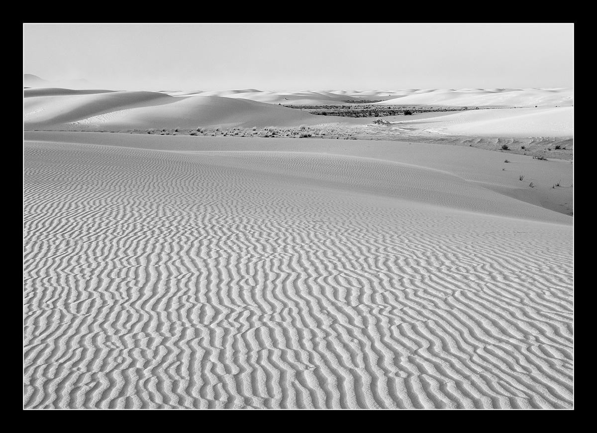
Sands in B&W
‹ PreviousLandscape GalleryNext ›

Sands in B&W

by Tom Haxby

Gallery: LandscapePosted December 7, 2011129 views8 comments
Am going back to some of my older shots and this is one of my favorites from White Sands. I posted a color version of this earlier, but tried it in B&W this time around. Used Nik Silver Efex2 for the conversion. I wish I were there right now. One of my favorite places to photograph.

C&C Welcomed.

Comments

8 comments
Comment posted by Barry Vangrov on December 7, 2011 at 4:42 PM
This works well in B&W. I'd crop just a bit of the blank sky off the top and bring down the highlights on the sunlit sand at top right to try to bring back some detail. Nicely done.
Registered on September 1, 2009, 148 Posts, 749 Comments
Comment posted by David Edwards on December 8, 2011 at 5:15 AM
Love this in b&w, Tom. The fg sand patterns are fabulous. I could see a graduated darkening towards the bg of the image to keep focus on that wonderful fg pattern. Beautiful work.
Registered on December 6, 2008, 142 Posts, 2623 Comments
Comment posted by Nick Bristol on December 8, 2011 at 8:42 AM
I really like this in b/w Tom. I think the patterns, light and shadow in the foreground sand look great in contrast with the background. Your comp works well for me too!

Nick Bristol
Lone Rock, WI
Registered on February 1, 2004, 752 Posts, 14140 Comments
Comment posted by R.Bill Moser on December 8, 2011 at 2:16 PM
Works well in b&w. I like the patterns in the foreground.
Registered on January 29, 2010, 285 Posts, 4281 Comments
Comment posted by Bill Chambers on December 8, 2011 at 6:04 PM
Very nice Tom. Excellent choice for B&W. Composition looks great to me - I wouldn't change a thing.
Registered on April 10, 2005, 753 Posts, 21216 Comments
Comment posted by Lon Overacker on December 8, 2011 at 7:37 PM
Excellent White Sands landscape image Tom. Even though this is displayed against a pure white browser window, this still presents itself and being very white. So I like the overall bright tone here very much. This also gives a big sense of vastness. I like this very much.

Lon
Registered on November 24, 2006, 521 Posts, 19147 Comments
Comment posted by Jean Day on December 8, 2011 at 8:37 PM
Nice conversion and simplicity of this image. The shadowed foreground patterns make a nice lead to the smoothness of the background. :toast:
Registered on April 10, 2011, 36 Posts, 306 Comments
Comment posted by Vance Gese on December 8, 2011 at 11:04 PM
Beautiful tones and textures. Nicely done.
Registered on November 13, 2008, 298 Posts, 6629 Comments