Nature Photographers Network
This is the preserved archive of the original Nature Photographers Network. The community continues at naturephotographers.network.
Mono mesa arch
‹ PreviousLandscape GalleryNext ›

Mono mesa arch

by Peter Coskun

Gallery: LandscapePosted March 26, 2012174 views11 comments
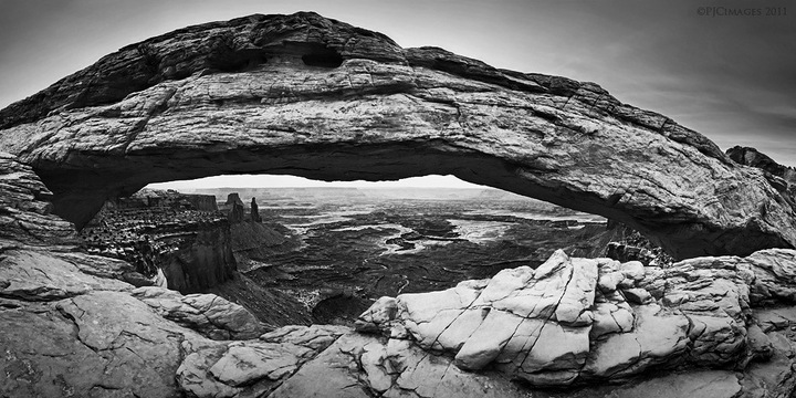
Last year my friend and I decided to go to Moab (Or at least I did) to visit Canyonlands and arches national parks. I totally forgot that it was memorial day weekend, so when we arrived, the town was like a zoo. Luckily, we were able to grab the last campsite at the willow flat campground in Canyonlands. Only two hours in and my tent was destroyed by the extremely heavy winds and blowing sand. With a week ahead of us we were forced to sleep in the car (two 6'+ men). Surprisingly I found the back of my car to be quite roomy. I didn't feel like heading into town to buy a new tent, as I set aside a budget for this trip. So with the crazy winds never really letting up, I really only got two images I was somewhat happy with. One of delicate arch after waiting for three hours between storms and waiting for tourists to move from under the arch, and the other, a panoramic image of mesa arch. With the overcast skies and windy conditions, I wasn't quite sure if there would be a special light display under the arch. We stuck around anyways and I shot this 13 image stitch of the arch while the sun went behind. Since there was no color, I decided to convert this to black and white. I boosted the contrast quite a bit to make this pop and played with some dodging and burning around the edges to emphasize the arch. The winds were so strong, that it made the canyons beneath almost disappear into the distance and the La sal mountains non existent. I always see the typical sunstar under the arch shot, so I went out on a limb and went in a different direction. Let me know what you think. Better quality on my website.


Canon 7d
Canon 17-40mm @ 17mm
ISO 400
f/11
1/800 sec
13 vertical images stitched in PS

Comments

11 comments
Comment posted by Nathan Apodaca on March 26, 2012 at 11:29 PM
I think this is very well done. There's a ton to explore here, and I can't imagine how much more if printed large!

The contrast + B&W look great in this. As for the dodging/burning, IMO, it seems a bit too noticeable in the top corners.

Either I have not been in the 'photography' loop enough, or this is a unique image from this area. I haven't seen anything quite like this. TFS!
Registered on November 16, 2011, 67 Posts, 1127 Comments
Comment posted by Peter Coskun on March 26, 2012 at 11:33 PM
Thanks Nathan. I do plan on getting this printed once I am able to really fine tune everything. Would look really nice big. As for the dodging, I did purposely go a bit overboard on the corners, I don't think it looks as bad in the full size version because the version here is very compressed.
Registered on October 31, 2011, 170 Posts, 1240 Comments
Comment posted by Jeffrey Sipress on March 27, 2012 at 11:55 AM
Nice interpretation of the Arch. I would like to see more sky above, feels a bit tight there.

Interesting, when I do a stitch of just 8 or more images the result is way wider than this.
Registered on February 17, 2004, 236 Posts, 1197 Comments
Comment posted by Michael J Greene, on March 27, 2012 at 4:20 PM
I am really surprised this hasn't received more comments Peter. My initial impression was this is very well done. After viewing it on several different occasions my thoughts haven't changed much. A few suggestions/observations: 1)the sky is pretty bright around the arch and appears to be on the verge on banding. When viewing the thumbnail sized version of the image it looks like a halo 2) the top half of the arch is darker than the bottom half. 3) the foreground rocks could probably handle even more contrast.

Overall, I like your presentation as is. Your composition is nice and it doesn't feel too tight to me personally. I hope this helps.

Michael
Registered on June 18, 2009, 86 Posts, 2317 Comments
Comment posted by Peter Coskun on March 27, 2012 at 4:50 PM
Thanks Jeffrey, I would have liked just a bit more sky at the top, but the reason it doesn't feel wide is that I was pretty close to the arch itself. From what I can remember, If I had shot this in one shot, the rocks beneath wouldn't curve the way they do, almost like a fisheye effect. I did overlap them a bit more than 50% so I didn't have to worry about any stitching problems.

Thank you Michael, The web presentation for this shot doesn't quite hold the quality that I'm hoping to get in a large print. When I open the image up in PS to full size there are no banding issues whatsoever, so it could be just the web. I was however trying to have the light behind the arch almost appear as a halo, to emphasize it. As for the darkness of the top of the arch, I don't quite see it, may be time to recalibrate the monitor.
Registered on October 31, 2011, 170 Posts, 1240 Comments
Comment posted by Kurt Budliger on March 27, 2012 at 6:55 PM
Beautiful range of tones Peter, I'm digging this in bw since we always seem to see the same shots from this location. :toast:
Registered on June 11, 2006, 113 Posts, 2116 Comments
Comment posted by Peter Coskun on March 27, 2012 at 6:59 PM
Thanks Kurt. I suppose it was a blessing in disguise, or else this would be the same old shot of mesa arch.
Registered on October 31, 2011, 170 Posts, 1240 Comments
Comment posted by Nick Bristol on March 27, 2012 at 9:15 PM
This looks great in B/W Peter. Pretty amazing view for sure! I bet it would be really nice to look at this in a very large print.

Nick Bristol
Lone Rock, WI
Registered on February 1, 2004, 752 Posts, 14140 Comments
Comment posted by Peter Coskun on March 27, 2012 at 10:16 PM
Thanks Nick. My only issue now is how big to print it. When blown up big there is apparent noise (from the unnecessary use of ISO 400) that I'm trying to deal with. I really never do noise reduction on regular landscapes.
Registered on October 31, 2011, 170 Posts, 1240 Comments
Comment posted by Mark Metternich on March 28, 2012 at 9:08 PM
Looks great. :toast:

I would consider lowering the burning/halo look just a little.
Registered on June 19, 2009, 276 Posts, 6240 Comments
Comment posted by Kah Kit Yoong on March 29, 2012 at 8:39 AM
Good work - looks quite different from the usual fare here. I like the brooding moody atmosphere.
Registered on September 27, 2006, 636 Posts, 10682 Comments