Nature Photographers Network
This is the preserved archive of the original Nature Photographers Network. The community continues at naturephotographers.network.
A Fairy's Flower
‹ PreviousFlora GalleryNext ›

A Fairy's Flower

by Jaymes Dempsey

Gallery: FloraPosted September 1, 201272 views9 comments
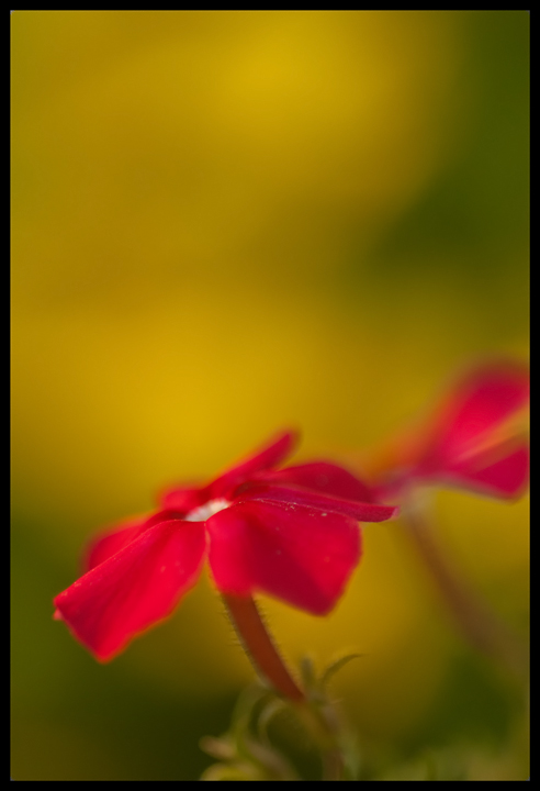
That's what the colors made me think of, anyways...

This was taken on the same night, and probably within 10 feet or so of my previously posted image, Candyfloss.
I played around with removing the out of focus bloom, but then left it in, as I liked the balance it gave. Maybe that doesn't work?

A small crop for composition, selective noise reduction and sharpening...
Nikon D200, 60mm, f/4, 1/320, ISO 250.

All comments and critiques appreciated.
Thanks in advance!

Jaymes

Comments

9 comments
Comment posted by Mark Windom on September 1, 2012 at 5:26 PM
I think the OOF bloom belongs in the frame although I kinda wish there was some separation between it and the main one. Really like the placement of the blossoms in the frame.....the large amount of OOF BG above them gives plenty of room for copy if you were to ever sell this for stock.
Registered on November 1, 2003, 176 Posts, 2302 Comments
Comment posted by scott lanz on September 1, 2012 at 6:29 PM
Jaymes, I really like the soft play of light and contrasting colors at work here. I also like the oof twin in the bg. Very artistic. My only preference, for this presentation, would be for less empty space (cropping the top down to a 4x5 ratio), but I know this would be more conventional, and I also know that Lorna, at least, will disagree and applaud all that space above the subject.
Registered on November 14, 2003, 840 Posts, 12902 Comments
Comment posted by John Neukirch on September 1, 2012 at 9:03 PM
Jaymes, I like the comp. I'm going to assume this is a 60mm macro, if so was this handheld? Otherwise I would have slowed it way down to at least get more depth of field on the subject.
Registered on July 9, 2012, 207 Posts, 1476 Comments
Comment posted by Morris McClung on September 1, 2012 at 10:01 PM
Hmmm, might be your best yet.
Registered on May 7, 2007, 670 Posts, 19650 Comments
Comment posted by Philip Hodgkins on September 2, 2012 at 8:23 AM
Good complementing colors, nice concept of its kind (shallow DOF, Plenty of OOF). From my viewpoint, at least an alternative would be a step down, say 6.3, for a bit more DOF.
Registered on July 24, 2006, 2741 Posts, 12349 Comments
Comment posted by Ian Wolfenden on September 2, 2012 at 4:41 PM
i think the composition is first rate, Jaymes - love the space and bg colour which allow the flowers to flourish so beautifully. A personal preference would be for a touch less softness in the main flower but that's a very minor nit - I really like this a lot !
Registered on May 18, 2007, 1108 Posts, 7647 Comments
Comment posted by Gary Yeoh on September 2, 2012 at 9:00 PM
Jaymes:
I like the comp. The color contrast between the red blooms and the yellow is nice. The large amount of negative space at the top is unconventional but I think it works for this image.
Registered on September 1, 2009, 588 Posts, 8184 Comments
Comment posted by Bob&Charly Nelson on September 3, 2012 at 10:35 AM
I think a small crop would help Jaymes, but I like the overall effect of this image. Well thought out and shown.
Bob :wavey:
Registered on October 27, 2005, 289 Posts, 4202 Comments
Comment posted by Nathan Buck on September 4, 2012 at 12:26 PM
Great color Jaymes. I like the DOF and the OOF bloom. Very nicely done.

Nathan
Registered on November 1, 2003, 1101 Posts, 13589 Comments