Nature Photographers Network
This is the preserved archive of the original Nature Photographers Network. The community continues at naturephotographers.network.
Still Brook Falls +Repost
‹ PreviousLandscape GalleryNext ›

Still Brook Falls +Repost

by Eva McDermott

Gallery: LandscapePosted October 21, 2012715 views16 comments
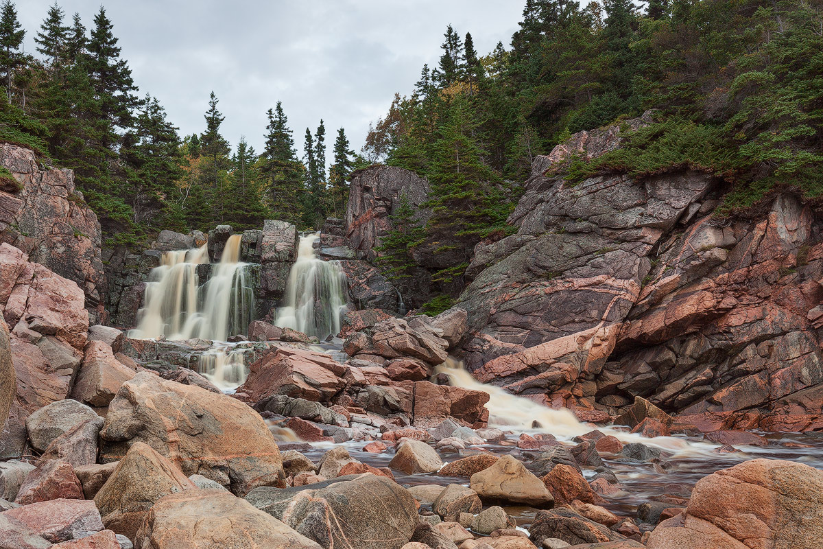
Still Brook Waterfall, Cape Breton Highlands National Park, Nova Scotia

This waterfall flows onto Black Brook Cove Beach and then into the Atlantic Ocean whose pounding surf is crashing behind me. The striations in the granite rock faces of the cliffs surrounding the waterfalls and Black Cove Beach were absolutely beautiful and especially highlighted on this gray, damp day.

BTW - The water flowing down the falls does have a brown color to it which gives the crashing waves a brown color as well.

Canon 5DM2
Canon TSE 24mm f/3.5L
ISO 100 1sec f/22
1.5 Stop ND Gradient for the corner of gray sky

Thanks for looking and for any C&C.

Comments

16 comments
Comment posted by Philip Hodgkins on October 21, 2012 at 4:15 PM
Looks best in the large image. Well taken in some pretty flat light. The detail in the rocks and trees is overwhelming. I wonder how this would look in a medium or large format film rendering.
Registered on July 24, 2006, 2741 Posts, 12349 Comments
Comment posted by Morris McClung on October 21, 2012 at 4:18 PM
You do rocks well no matter where they are, Eva. :biggrin: A fine comp and you brought out every nuance in the rocks. Very well done! :toast:
Registered on May 7, 2007, 670 Posts, 19650 Comments
Comment posted by Patricia Brundage on October 21, 2012 at 5:46 PM
What a great scene, handled beautifully. Was on the Eastern Shore last week... the ride on 104 from Antigonish to Muncton was gorgeous. Unfortunately it poured the whole way.
Registered on March 23, 2006, 1111 Posts, 6531 Comments
Comment posted by Tom Hilton on October 21, 2012 at 6:46 PM
Great comp - great textures- great processing
I like it a lot!
:toast:
Registered on September 19, 2011, 68 Posts, 668 Comments
Comment posted by Luke Ormand on October 21, 2012 at 6:50 PM
Nice spot - I like how the waterfall leads to the stream that takes your eye to the edge of the image.... greens look nice and balance out the other colors of the rock
Registered on February 4, 2009, 1093 Posts, 7035 Comments
Comment posted by Nancy Lea Sandy on October 21, 2012 at 7:52 PM
The color and textures of the rocks are first rate. A pretty waterfall, too. Great job.
Registered on January 24, 2011, 576 Posts, 6942 Comments
Comment posted by Eva McDermott on October 21, 2012 at 11:46 PM
Thanks everyone for your comments. Hey Phil, I also took this with my medium format Pentax 67II and anxiously wait the return of my processed film fromE-Six Lab in Atlanta.
Registered on January 4, 2009, 1015 Posts, 13229 Comments
Comment posted by Daniel Rappaport on October 22, 2012 at 12:31 AM
Nice composition. The rock colors are fabulous.
Registered on September 9, 2009, 294 Posts, 2006 Comments
Comment posted by Harley Goldman on October 22, 2012 at 11:48 AM
Real nice perspective and comp. Love the colors, shapes and lines in the rock. Might be me, but overall, the image looks a touch warm?
Registered on November 19, 2003, 586 Posts, 11271 Comments
Comment posted by Nick Bristol on October 22, 2012 at 3:57 PM
Great shot of a beautiful falls! Really enjoy the look and color in the rocks here too.

Nick Bristol
Lone Rock, WI
Registered on February 1, 2004, 752 Posts, 14140 Comments
Comment posted by Mark Seaver on October 22, 2012 at 4:39 PM
Love all the details in the rocks due to the flat lighting and the nice angle from the outflow to the falls. I think I have a slide from here taken in the early 90's, this sure brings back good memories of Cape Breton.
Registered on January 23, 2011, 1103 Posts, 17270 Comments
Comment posted by Harry Lichtman on October 22, 2012 at 9:27 PM
Wonderful comp for a bright overcast. Great detail in the trees with this lighting. From a procesing standpoint, I might darken and increase the sat of the entire image, except for the water. The water seems to blend into the surrounds too much and maybe this would bring it out more, as well as accent the beauty of the rocks. Compression for the web and web sharpening may have reduced the sat and increased the brightness in this type of image, so maybe just evaluate the large file.
Registered on September 17, 2010, 304 Posts, 3507 Comments
Comment posted by Eva McDermott on October 22, 2012 at 10:01 PM
Here is a repost incorporating some of Harry's suggestions. Let me know what ya think. Original TIFF file darkened a bit with an added curves layer and a vibrance layer to deepen the color. Can't wait to get my Pentax 67II / Velvia 50 version back (ships back to me tomorrow so I am told by the lab (Twenty seven rolls of 120 ...... obviously not of this place only).
Registered on January 4, 2009, 1015 Posts, 13229 Comments
Comment posted by Lon Overacker on October 23, 2012 at 1:48 AM
Eva,

Very nice, excellent comp. This comment may be a bit out there, but there's one element that is the least attractive, yet I think saves the image - and that's the sky. Had the sky been totally blank/gray, it would have really detracted from the image, IMHO. However, with just a tad bit of texture in the clouds, I think it compliments the scene and also describes the light on the scene - diffused.

I think the repost is much better in terms of exposure/color/sat, although I might pull back one small step towards the original in terms of overall brightness - no biggie and certainly personal choice.

Great color and comp. Like it.

Lon
Registered on November 24, 2006, 521 Posts, 19147 Comments
Comment posted by Mark Seaver on October 23, 2012 at 12:47 PM
Eva, I think the repost over does the drama a bit. I do like the added contrast in the sky, but feel like the trees, especially, are too dark and the water is showing too much brown. (Illustrating once again, how hard it is to please the NPN audience. :smile: )
Registered on January 23, 2011, 1103 Posts, 17270 Comments
Comment posted by Bill Chambers on October 23, 2012 at 2:52 PM
Well, I'm going to go against the grain here a little. I prefer the original version overall, although contrast could be boosted a little (emphasis on little). The rocks, especially on the right, are wonderful. I could spend the better part of a day just shooting them! Excellent shutter speed for the water. Well done Eva.
Registered on April 10, 2005, 753 Posts, 21216 Comments