Gallery: Macro & Close-upPosted October 28, 2012492 views18 comments
D300s
18-200mm @ 120mm
1/60 sec, f/5.6
Mode: Av
Metering: Multi-segment
Exp comp: +1/3
ISO: 400
White balance: Auto
Flash: Off
Tripod
Comments
18 comments
Comment posted by Gary Reed on October 28, 2012 at 6:03 PM
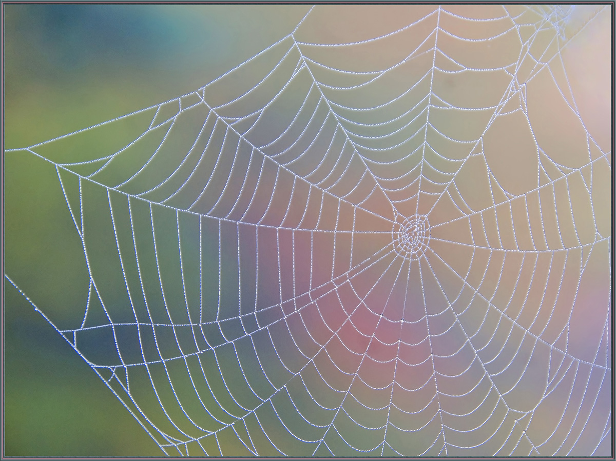
Charlotte's Web... Nice rainbow background.
Registered on September 19, 2009, 198 Posts, 1074 Comments
Comment posted by Patricia Brundage on October 28, 2012 at 6:34 PM
Unique because of the pastel background, perfect symetry and detail. I like it alot.
Registered on March 23, 2006, 1111 Posts, 6531 Comments
Comment posted by scott lanz on October 28, 2012 at 7:54 PM
Wow, this is really nice, Sandy. You hit the trifecta: delicate, artistic and beautiful. The bg is just sublime, and there is good detail in the web as evident in the larger version. Congrats on a very fine image. While I certainly like this as presented, with the soft light and soft colors, I wouldn't mind seeing another version of this with a more contrast just for comparison.
Registered on November 14, 2003, 840 Posts, 12902 Comments
Comment posted by Gary McGhee on October 29, 2012 at 7:26 AM
The soft background colours really make this stand out Sandy,
Gary.
Registered on April 15, 2010, 142 Posts, 2416 Comments
Comment posted by SandyRichardsBrown on October 29, 2012 at 11:17 AM
Scott, I wanted to preserve the soft feel, as it was very misty and foggy this early morning - but here is a version with more contrast. I'm always open to suggestions!
Comments on the second version appreciated...
Sandy
Registered on November 24, 2003, 3937 Posts, 12909 Comments
Comment posted by Carolyn Derstine on October 29, 2012 at 12:17 PM
Great web shot, Sandy, with a fantastic background! Wonderful mixture of pastel colors that provide a great backdrop but don't distract at all from the dewy web. The second version does have more contrast and more "pop" but it has also slightly darkened the background colors. I like the lighter background in the first version but maybe more contrast in just the web if possible? But all this is being a little nitpicky. . . because I also love both of them just as they are!
Registered on February 16, 2011, 610 Posts, 3684 Comments
Comment posted by Rob Graham on October 29, 2012 at 2:10 PM
Beautiful, Sandy. I agree that the pastel colors make this unique. The original maintains the foggy/soft feel you were looking to capture.
Registered on August 22, 2006, 842 Posts, 2824 Comments
Comment posted by Mark Seaver on October 29, 2012 at 3:29 PM
Beautiful combination of dewed web and background colors. Well seen! I like the gentleness of the original post.
Registered on January 23, 2011, 1103 Posts, 17270 Comments
Comment posted by scott lanz on October 29, 2012 at 7:32 PM
Thanks for indulging me. Actually, I prefer the repost, Sandy, because the web stands out a bit more from the bg, but it's purely subjective. Both are great.
Registered on November 14, 2003, 840 Posts, 12902 Comments
Comment posted by Karen Kane on October 29, 2012 at 10:30 PM
Sandy - I really like both versions. If I had to choose, I prefer the first image - where the background is more pastel. For me, it better suits the softness and delicate nature of the web itself.
Registered on August 4, 2012, 66 Posts, 726 Comments
Comment posted by Howard Cheek on October 30, 2012 at 12:29 PM
Unique "rainbow" BG Sandy, love how the webs design stands out so clearly Sandy..
Great job framing this too, well done
Registered on July 24, 2008, 1201 Posts, 10758 Comments
Comment posted by Albert Darmo on November 2, 2012 at 10:01 PM
Hi Sandy A beautiful and creative composition! love both the repost, and the original version
Albert Darmo
Registered on November 25, 2008, 1386 Posts, 11978 Comments
Comment posted by John Tobias on November 3, 2012 at 9:29 AM
Great image! I like the second image best, but only by a slight margin! A different take on a web photo. The colors make this image standout. Thanks for sharing.
Registered on September 12, 2009, 2120 Posts, 6455 Comments
Comment posted by Kathy Barnhart on November 3, 2012 at 7:15 PM
Both are beautiful, but I prefer the first post. Delicate pastels to match the delicate web. Wonderfully seen.
Registered on November 11, 2011, 404 Posts, 1639 Comments
Comment posted by Wayne Jones on November 7, 2012 at 10:50 PM
Wow, I missed a lot by getting into the macro gallery late this week. Wish I had seen this earlier.
Congratulations Sandy. Not many "spidery" images this pretty!
Registered on April 18, 2007, 953 Posts, 6435 Comments
Comment posted by Ian Hutchinson on November 8, 2012 at 2:46 AM
Hi Sandy
Well done one the WP.
A very nice subtle web shot, could almost make it as a fine art pic.
Ian
Registered on September 8, 2012, 9 Posts, 38 Comments
Comment posted by Jim DeWitt on November 8, 2012 at 12:07 PM
Delightful background, Sandy. Congratulations on the EP.
Registered on August 28, 2006, 1240 Posts, 8506 Comments
Comment posted by Albert Darmo on November 8, 2012 at 6:46 PM
Hi Sandy Congrats on winning the WP, very well deserved
Albert Darmo
Registered on November 25, 2008, 1386 Posts, 11978 Comments

Comments
18 commentsGary.
Comments on the second version appreciated...
Sandy
Great job framing this too, well done
Albert Darmo
Congratulations Sandy. Not many "spidery" images this pretty!
Well done one the WP.
A very nice subtle web shot, could almost make it as a fine art pic.
Ian
Albert Darmo